
Color theory is both art and science. In today’s article you’ll learn everything you need to know about color theory, including the color wheel types that deal with pigment, ink, and light.
Brief History of Color
When it comes to color history, this began with Sir Isaac Newton.
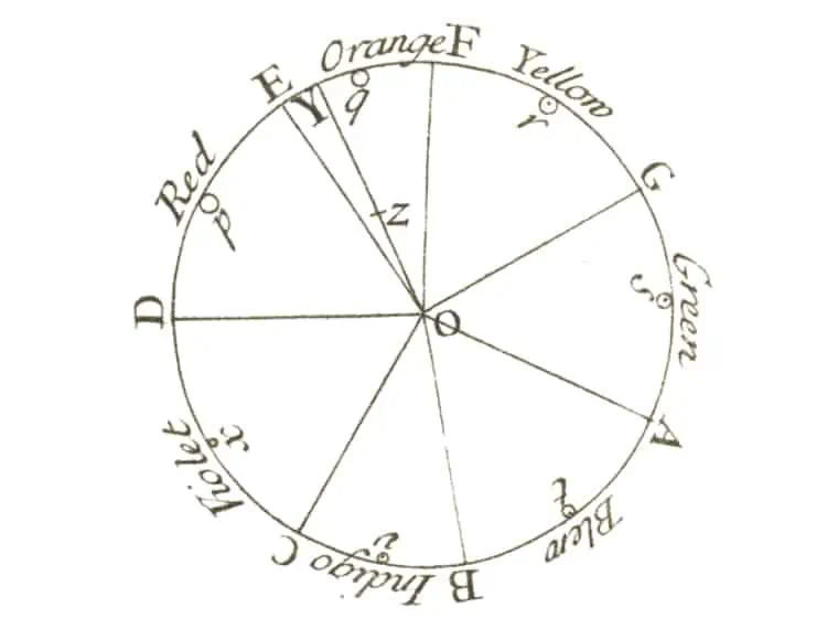
Newton created the first color wheel in the 1660s as a result of his experiments with prisms and sunlight. He demonstrated that passing white light through a prism could be disassembled and reassembled into the seven visible spectrum colors: red, orange, yellow, green, blue, indigo, and violet.
Although Newton’s color wheel was immediately adapted by the art world, this one was based on light, not paint.
Interestingly, at that time, color was perceived as a mixture of light and dark. Thus, red was the lightest, while blue was the darkest.
Newton mapped the seven colors of the rainbow onto a wheel, creating the first color wheel. It looks rather like an octave scheme. To remember these colors more easily, you can use the term ROYGBIV, where each letter stands for the first letter of each color.
In 1704, Newton published “Opticks.” Shortly afterward, Johann Wolfgang von Goethe began his own experiments with color. With extensive experience as a painter and artist, Goethe complemented Newton’s published work.
However, he disagreed with Newton about perceiving darkness as the absence of light. He made an observation that “color in itself is a degree of darkness.”
Goethe’s work holistically approached color, building on Newton’s discoveries, hoping it would help the art world. He also detailed the psychological aspects of color and its relationship to human emotions.
However, his work was more of an analysis of the effects of light and dark on human perception of color.
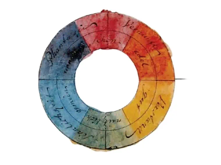
Goethe developed his own color wheel, mapping colors together with symbolism. These are:
- Magenta (Purpur) – beautiful
- Red (Rot) – beautiful
- Yellow Red (Gelbrot) – noble
- Orange (Orange) – noble
- Yellow (Gelb) – good
- Green (Grün) – useful
- Blue (Blau) – mean
- Violet (Violett) – unnecessary
- Blue red (Blaurot) – unnecessary
Goethe created a new color wheel that considers the influence of emissions and reflections on human perception of color. Also, the colors facing each other are antagonistic, being opposites.
In contrast, Newton’s wheel is based on the physical properties of light and how light is split into the color spectrum and then recombined or refracted to create other colors.
Wondering what’s the difference between Goethe and Netwon color wheels? Goethe color wheel is based on the psychological effects of colors, while Newton’s color wheel is based on the physical properties of light.
Also, Goethe’s color wheel has more colors than Newton’s wheel, including blue-red and blue-green. These colors did not exist in Newton’s spectrum and were discovered shortly after the publication of his work.
Thus, the discoveries of Newton and Goethe form the basis of traditional color theory.
But that’s not all.
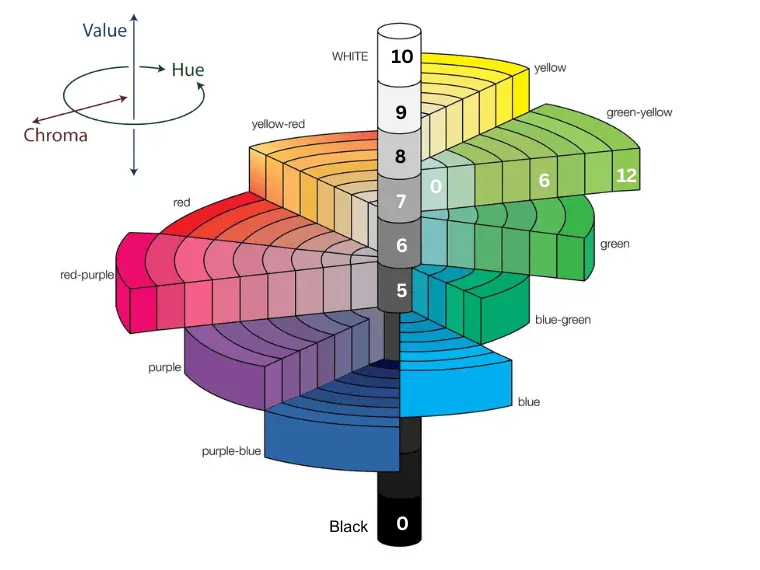
Albert Munsell added two new dimensions to color in the early 20th century: ‘chroma’ and ‘color value.’ Chroma is the intensity of color, also called saturation. Color value refers to how light or dark a color is. These were added to the hue as color properties.
The Munsell color system is a 3D color space created by Albert Munsell which features the attributes of color: chroma (x-axis), color value (y-axis), and hue (z-axis). This is still used today in art, optics, and color mathematics.
What is Color Theory?
Color theory refers to a set of guidelines and rules that help artists and designers combine colors in a visually pleasing way.
In color theory, colors are displayed on a color wheel and grouped into primary, secondary, and tertiary (or intermediate) colors.
In art, color theory is both a guide to color mixing and color harmony. Besides art, this is also the science of using color, explaining how the human eye perceives color.
Color Wheel Examples
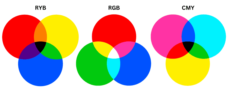
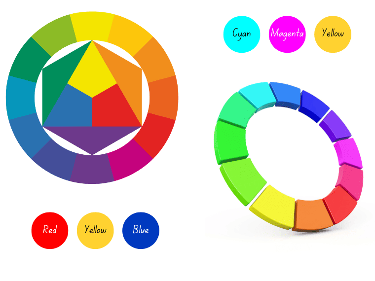
The RYB, CMY, and RGB are the most commonly used color wheels. Each has different uses and, as a result, uses different primary colors. That’s because each color model has its own color wheel.
The color wheel is used as a guide for mixing colors – pigments, inks, or lights, but also to illustrate the geometric relationships between colors that help you choose colors that go well together in paintings, color schemes, or color palettes for designs.
More specifically, their purpose is to help you make better art or design. However, the color wheel differs depending on your working environment.
The RYB color wheel, which is used in traditional art, has red, yellow, and blue as primary colors.
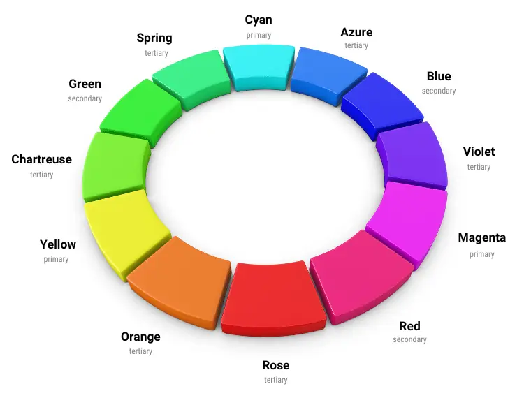
The CMY color wheel is used in modern color theory to mix pigments and inks and uses cyan, magenta, and yellow as primary colors. The CMY color model is also used in the printing world, along with black (to add darkness).
The RGB color wheel is more like a cube using 3 coordinates (or factors). RGB’s primary colors are red, green, and blue. It deals with light.
While RYB is a traditional model used in art, CMY and RGB form a better duo as color spaces of modern color theory, covering both pigment and light.
Let’s detail the most commonly used color models.
Traditional Color Theory
In traditional color theory, everything has been built around the RYB model.
RYB Color Model
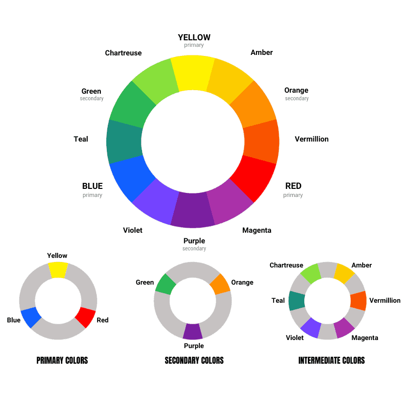
Traditional color theory refers to the RYB color model used in traditional art. The primary colors of the RYB model are:
- Red
- Yellow
- Blue
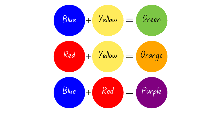
By mixing the primaries, you get the secondary colors:
- Orange (red + yellow)
- Purple (red + blue)
- Green (blue + yellow)
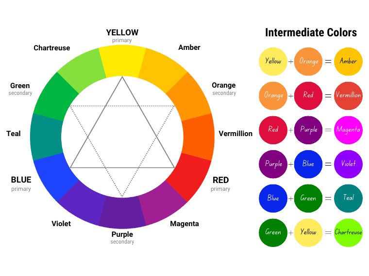
The colors that lie between the primary and secondary colors on the color wheel are called intermediate colors.
Mixing a primary with a secondary color gives you intermediate colors. The intermediate colors are:
- Red-Orange (Vermillion)
- Yellow-Orange (Amber)
- Yellow-Green (Chartreuse)
- Blue-Green (Teal)
- Blue-Purple (Violet)
- Red-Purple (Magenta)
Whem comes to art, tertiary colors are created by mixing two primary colors. When you mix secondary colors, you get dulled shades of brown and gray.
Tertiary colors are often known as intermediate colors, but in art, they differ. However, in other color models, these terms are used interchangeably.
It’s said that RYB is the oldest color model, tracing its origins to the works of Aguilonius (1613) and Le Blon (1725). [1]
Modern Color Theory
In school, you were taught that the primary colors are red, yellow, and blue. This set of primaries is pretty out-of-date.
In 1905, Albert Munsell mentioned in his publication – “A Color Notation” that the notion of red, yellow, and blue as primary colors was a widely accepted error.
When it comes to modern color theory, there are two color models: CMY (a subtractive color model) and RGB (an additive color model). These color wheels work hand in hand, meaning the primary colors of one wheel are the secondary colors of the other.
CMY
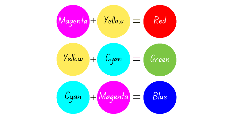
CMY is a subtractive color model that deals with pigments and inks. It starts with white (a piece of paper), and as cyan, magenta, and yellow are added, the result is darker. Although the art world does not fully agree with this, CMY produces a larger gamut of colors as well as brighter hues.
For example, you can’t mix magenta, a bright green, or purple using the RYB model. Furthermore, using cyan, magenta, and yellow, you can produce both red and blue as well as brighter purples, greens, and so on. In contrast, RYB cannot produce as many colors as CMY.
The primary colors of the CMY color model are cyan, magenta, and yellow. They are also considered the primary subtractive colors. The secondary colors in the CMY model (red, green, and blue) are produced by mixing the primary colors and are actually additive colors.
The tertiary colors of the CMY color space are azure, violet, rose, orange, cartreuse, and spring green. They are mixtures of a primary and a secondary color.
CMY is known as CMYK because printers use cyan, magenta, and yellow to print (or produce) colors, along with black (K), which is used to add darkness.
RGB
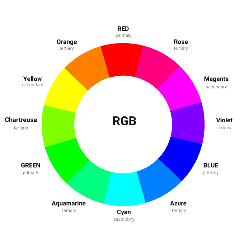
RGB is an additive color model that deals with light. In this model, red, green, and blue are the primary (additive) colors.
Mixing the primary colors of RGB yields the secondary colors cyan, magenta, and yellow – the subtractive colors.
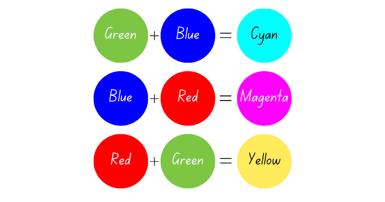
This model starts with black (no light) and gets lighter as color is added. When the three primary colors are combined, white light is produced.
The RGB color model is used by any device that emits colored light, including TVs, computer screens, smartphones, or tablets.
So, there are no real primaries but only sets of primary colors that deal with light (RGB), pigment, or ink (CMY).
So why do we use red, green, and blue (RGB) to represent colors in light? It’s because our eyes and brains work together in a way that allows us to mix these three colors to create almost any color we can see.
Thus, we use RGB not because red, green, and blue are the exact colors our cones are most sensitive to, but because our eyes and brains can combine these colors to make a wide range of other colors.
But what exactly does additive or subtractive mean?
Additive & Subtractive Color Theory
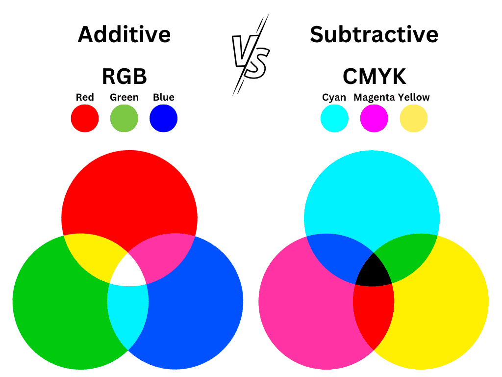
Additive and subtractive colors are two different color models used to create and reproduce colors. They are based on different principles and are represented by the RGB and CMY color wheels.
In modern color theory, the subtractive colors are cyan, magenta, and yellow. In contrast, the additive colors are red, green, and blue.
In additive color theory, when all three primary colors are set to their maximum intensity, they produce white. This is because the additive color model starts with darkness (lack of light) and adds light to create colors.
In subtractive color theory, when all three primary colors are equally combined, they produce black. This model starts with white (a sheet of paper) and absorbs/subtracts specific wavelengths of light to create colors.
So, there is a huge difference between them.
Additive colors (RGB) combine different intensities of red, green, and blue light to create colors and start with black (darkness). On the other side, subtractive colors (CMY) involve mixing pigments or inks that subtract or absorb certain wavelengths of light and start with white (lack of color).
Warm and Cool colors
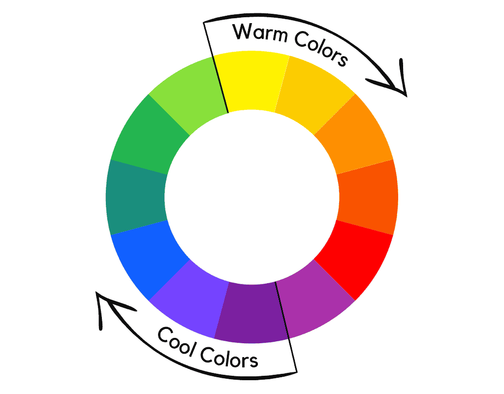
Color wheel, whatever that is, can be divided into warm and cool colors – those on the warmer side generally include reds, oranges, and yellows, whereas those on the cooler side consist of blues, greens, and purple shades.
Warm colors – red, yellow, and orange – evoke a feeling of energy and warmth, while cool colors like green, blue, and purple have calming effects.
Warm colors typically evoke feelings of excitement and energy, whereas cooler colors are often calming and soothing.
Shades, Tints and Tones
Using the attributes of color (hue, saturation, and value), you can create shades, tints, and tones.
Shades
A shade is a darker variation of a hue created by adding black to it.
Tints
A tint is a lighter version of the same color achieved by adding white to it. Tints look less intense.
Tones
A tone is created when gray (an equal mixture of black and white) is added to a color. Adding gray to a color produces a softer tone, dulling its intensity.
Similarly, adding gray to blue can help give the blue a richer appearance and more depth than it would have as just a single hue.
But what exactly does saturation, chroma and value mean? Let’s find out.
Hue, Saturation, and Value
The color wheels describes only one attribute of color: the hue. However, there are 3D models that describe three color attributes: hue, saturation and value.
The HSV color model is a cylindrical-coordinate representation of colors as an alternative representation of the additive RGB color model.
Hue is the color’s family name. Thus, it refers to the base color family displayed on the color wheel, such as red or blue. In the HSV space, this is measured in degrees, between 0 and 360, where 360° means red, 240° – blue, 120° – green, and so on.
Saturation refers to the amount of gray added to a specific hue. The lower the saturation, the more muted the color. The higher the saturation (no addition of gray), the brighter the color.
In the HSV model, saturation is actually a range between gray and the hue. It is usually expressed as a percentage between 0 (gray) and 100 (hue). The closer the saturation is to 0, the duller the colors.
However, you might have heard of chroma.
Chroma is a color attribute of the Munsell color system, indicating the intensity or saturation of a color. This is measured on a scale from 0 to 10, where 0 is completely black, and 10 is white (5 is neutral gray).
Color Value is an attribute describing the relative lightness of the color. This explains how light or dark a color is. Higher values mean lighter colors.
In HSV, this is measured in percentages, from 0 (black) to 100 (the brightest).
In the Munsell color system, color value refers to the lightness of a color. The color value scale ranges from 0 (at the bottom) – which is pure black to 12 (at the top) – pure white.
Another 3D alternative to the RGB space is HSL. HSL stands for hue, saturation and lightness.
The difference between HSL and HSV is that the former is a double hex-cone (bi-cone) representation and the latter an inverted hex-code. Also, lightness in HSL ranges from black (0%) to white (100%), and the color value in HSV runs from black (0%) to the brightest (100%).
So there is a difference in how brightness is calculated. However, the two models are very similar.
The Meaning of Color
It’s no surprise that colors can trigger emotional responses. Moreover, they have been associated with a mood-altering effect. [2]
Here are the meanings of colors:
- Red: passion, energy, action, strength, courage, determination, anger, danger, aggression
- Orange: Positivity, enthusiasm, youth, spontaneity, superficiality, impatience
- Yellow: Happiness, joy, hope, curiosity, intellect, self-esteem, creativity, betrayal, cowardice
- Green: growth, new beginnings, renewal, refreshment, , harmony, abundance, envy, jealousy
- Blue: trust, loyalty, tranquility, wisdom, intellect, freedom, imagination, peace, coldness
- Purple: royalty, luxury, power, ambition, creativity, wisdom, wealth, grandeur, extravagance
- Black: power, elegance, formality, sophistication, authority, mystery, depression, fear
- Gray: balance, neutrality, maturity, compromise, reliability, coldness, sadness
- White: peacefulness, purity, cleanliness, innocence, clarity, emptiness, bland
While warm colors – red, orange, and yellow – are associated by the human brain with feelings of optimism and energy, cool colors – blue, purple, and red – are linked to feelings of calm and relaxation.
Want more? Discover the color meanings.
What are the Major Color Scheme Types?
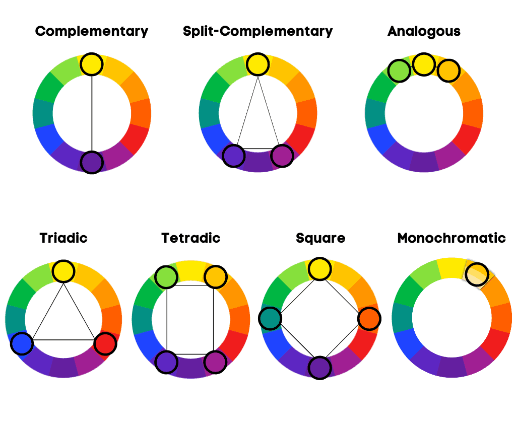
There are seven major color schemes: monochromatic, complementary, split complementary, analogous, triadic, square, and tetradic. As their name suggests, they form different geometric relationships on the color wheel. In addition, they are described as color harmonies.
Monochromatic
A monochromatic color scheme incorporates only one hue or color in various shades, tints, or tones. Even though it lacks contrast, it looks very clean.
Complementary
A complementary color scheme involves using two opposite colors on the color wheel (facing each other). This scheme provides the highest contrast.
Complementary colors are so visually pleasing because they stimulate different color receptors in our eyes.
For example, when we look at red, the red-sensing receptors are activated. In contrast, the receptors for green are less active.
This is how the photoreceptors of the human eye perceive light. Thus, shifting focus between complementary colors provides a sense of balance. However, using a dominant color and its complement as an accent is best.
Since warm colors sit on one side of the color wheel and cool colors on the other half, this color scheme involves one warm and one cool color.
For example, in the RYB model used in traditional art, green and red are complementary colors. When it comes to the CMY space, the opposite of green is magenta.
Split Complementary
A complementary split refers to the use of one color and its two neighbors of its complementary color. For example, yellow, red, and purple.
Analogous
An analogous color scheme involves using colors that are next to each other on the color wheel.
Unlike the monochromatic scheme, which involves variations of a single hue, the analogous scheme uses one hue and its neighbors on the color wheel.
An analogous color scheme example would be red, orange, and yellow; or yellow, chartreuse, and amber.
Triadic
A triadic scheme, as its name suggests, uses three equally spaced colors forming an equilateral triangle.
An example of a triadic scheme on the RYB wheel would be red, yellow, and blue. In contrast, a triadic scheme in CMY would be cyan, magenta, and yellow.
Square
A square color scheme, as its name suggests, involves using four colors that form a square on the color wheel.
If you use a traditional 12-color wheel, you must keep a distance of two slots between the chosen colors.
For example, a square color scheme in the RYB model would be amber, green, violet, and red.
Tetradic (or rectangle)
A tetradic color scheme, also known as a rectangle, involves the use of four colors: two colors separated by one color on the color wheel, along with their complementary colors.
They shape an X on the color wheel, and when connected by a line, they form a rectangle.
A rectangle color scheme on the RYB color wheel would be blue, purple, orange, and yellow.
Last Words
Understanding color theory aids you in both selecting the best color combinations (color harmony) and applying the principles underlying the use of color. It also explains how colors mix and how the human eye perceives color.
Did you like this article? Please let us know how we can improve this piece of content in the comments.