
Secondary colors represent an essential element of color theory. You’ve learned about primary and secondary colors if you graduated from art school. However, we should all understand what they are, and how to create and use them.
Wondering why? Because colors are remarkable. They convey meanings and create unique experiences. This is due to how the human eye interprets visual things.
Because these colors evoke emotions and convey different messages, they are essential in color theory.
Today you will learn what secondary colors are and how to use them appropriately.
What are Secondary Colors?
Any artist or designer needs an understanding of what makes up secondary colors. But they can vary depending on the industry you work in.
In art, you’ll work with paints and pigments that use the subtractive color model. This means that when you mix paints, the color becomes darker. So, therefore, there is a set of primary colors, which, when mixed, create the secondary ones.
Graphic design uses the additive color model (RGB) because it works with light. This means that when you mix colors of light, the result becomes lighter.
So, whereas subtractive mixing with paints and pigments results in increased darkness, additive mixing increases lightness once different wavelengths of light are overlapped.
Unlike the subtractive model used in traditional art, the additive color model is used to mix lights.
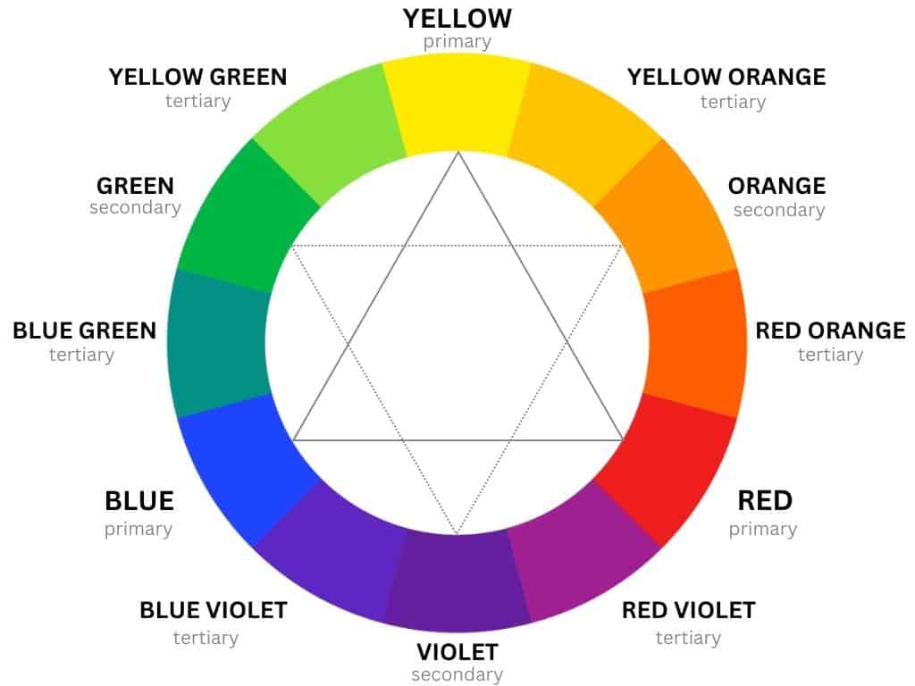
Secondary Colors Definition
Secondary colors differ from one color model to another. If we’re talking about painting, for instance, you’ll use the RYB color model.
When it comes to light, you’ll use the RGB color model. In the printing world, on the other hand, you’ll use the CMYK color model.
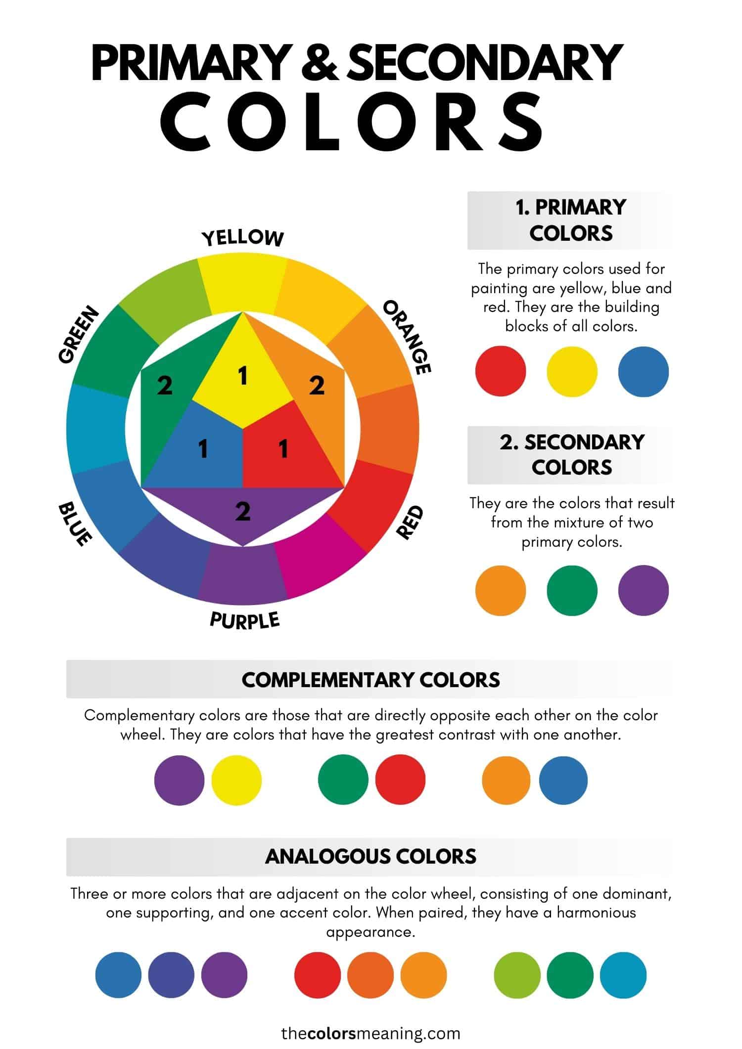
But what are secondary colors? They are a group of three colors that result from mixing two primary colors in equal proportions. They are called “secondary” because they are closely related to the primary ones.
On the color wheel, these colors are located halfway between two primary colors.
So these colors in the art are different from the ones in the world of light or those used in the ink and printing processes. Let’s find out more!
What About the Primary Ones?
When it comes to painting, the primary colors are red, yellow, and blue (RYB). Regarding printing, the primary colors are cyan, magenta, and yellow (CMY).
On the other hand, in the world of physics and light, the primary colors are red, green, and blue (RGB).
Thus, if an artist works with the RYB color model, a graphic designer uses the RGB color model because the digital medium works with light. This model uses the colors the photoreceptors in the human eye’s retina are most sensitive to.
These photoreceptors are known as cone cells.
Secondary Colors in Art (RYB Color Model)
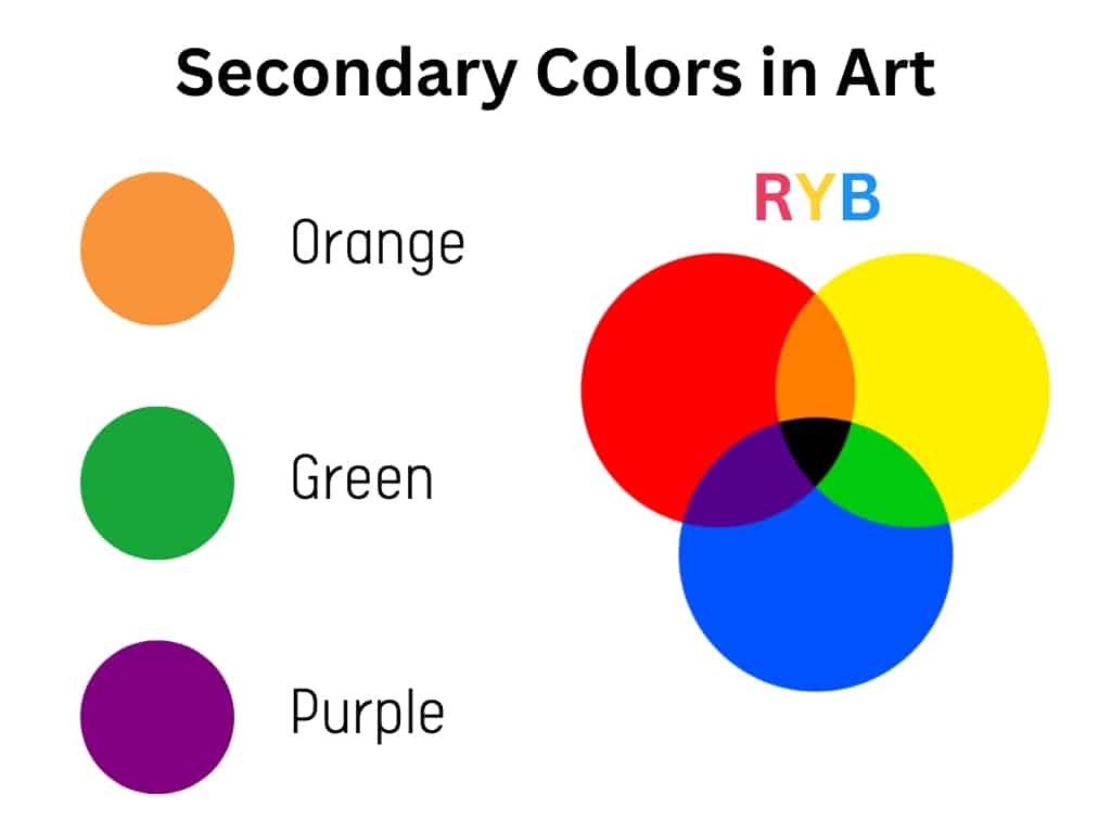
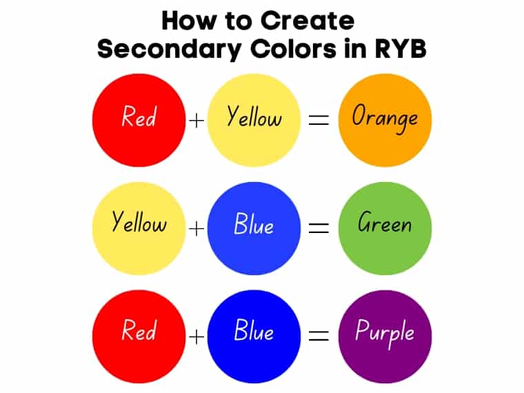
The secondary colors of paint are green, orange, and violet (or purple). They are made by mixing two primary colors in equal amounts.
- Yellow + Blue = Green
- Red + Yellow = Orange
- Red + Blue = Violet (or purple)
Secondary Colors in Light (RGB Color Model)
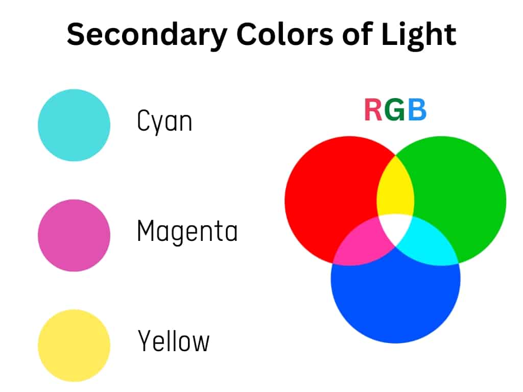
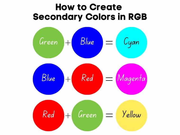
The secondary colors of light are red, green, and blue.
The secondary colors of the RGB space (additive color model) are the primary colors of the CMYK color model, which is a subtractive model. Interesting, isn’t it?
- Green + Blue = Cyan
- Red + Blue = Magenta
- Red + Green = Yellow
What About Printing? (CMYK Color Model)
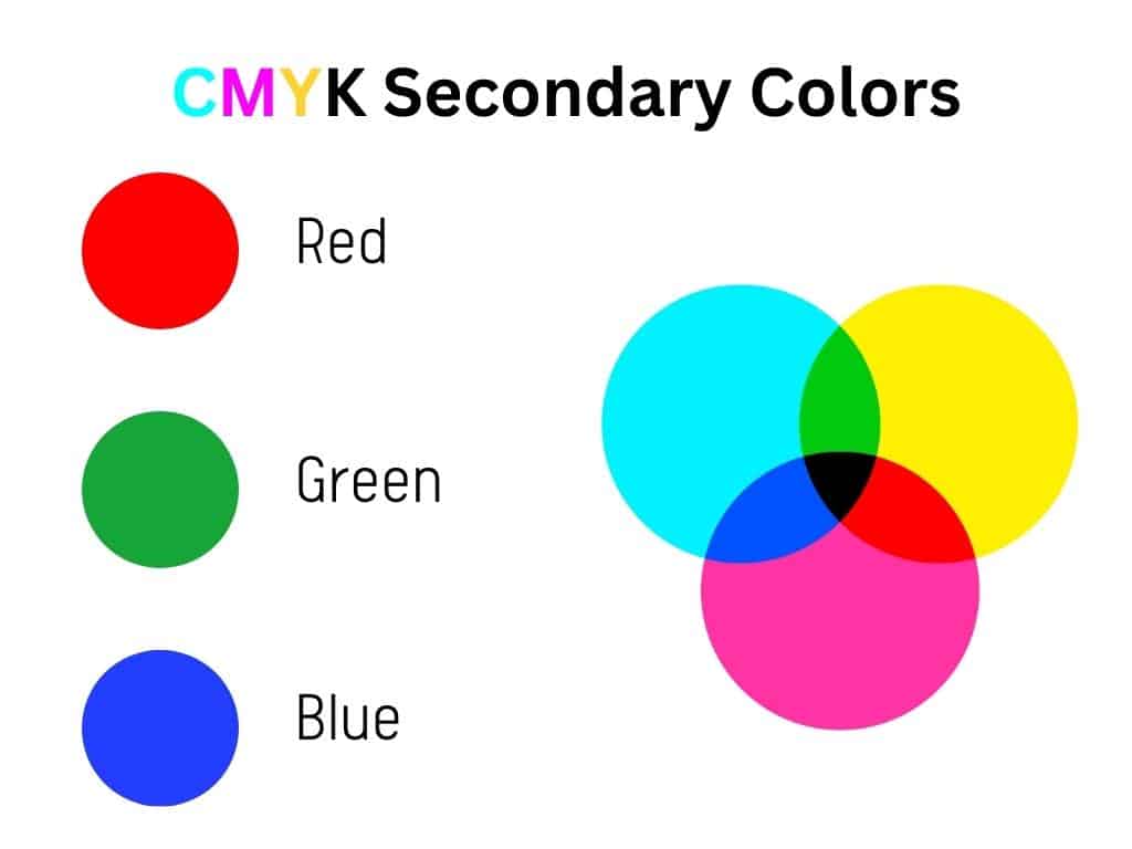
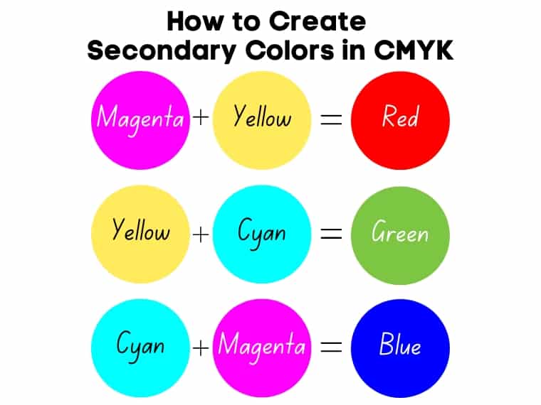
The secondary colors of the CMYK color model (used in printing) are cyan, magenta, and yellow. These are subtractive colors. Black is an additional color used for efficiency and economic purposes.
So if you mix the primary colors of the CMYK (subtractive color model), you get the primary colors of the additive model. So basically, the secondary colors of the CMYK color model are the same as the primary colors of light.
These are created by mixing the primary colors:
- Magenta + Yellow = Red
- Cyan + Yellow = Green
- Cyan + Magenta = Blue
Additive and Subtractive Colors
As you have seen, color models can be subtractive or additive. Subtractive models include RYB (used in traditional art) and CMYK (used in printing). On the other hand, RGB is an additive color model.
If the subtractive model starts with white (a sheet of paper) and, with the addition of color, becomes darker, the additive model starts with black (dark) and becomes lighter as lights of different wavelengths (or colors of light) are combined.
Subtractive colors are created by compounds that absorb (or subtract) specific wavelengths of light. This is in contrast to additive colors, formed by objects that emit (or add) specific wavelengths of light.
Examples of Secondary Colors
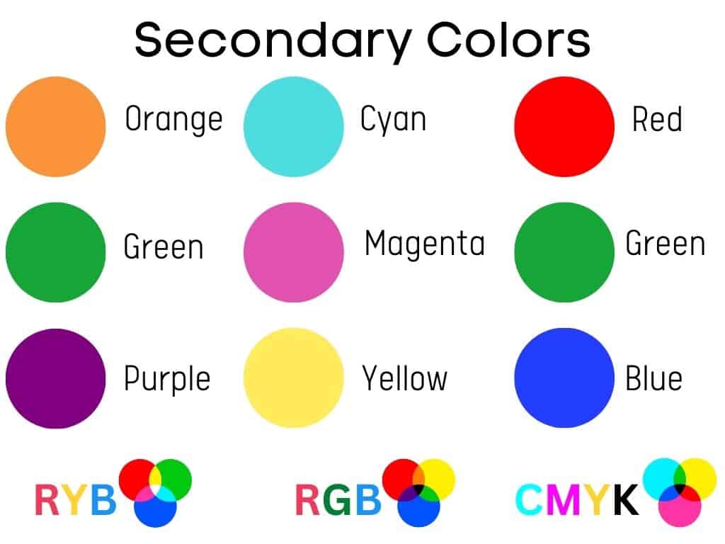
In traditional art, they are orange, purple, and green, while in digital, there is another group which include red, green, and blue. Another example of secondary colors comes from the world of printing, and these include cyan, magenta, and yellow.
So, these are all secondary color examples according to color theory.
How to Make Secondary Colors From Paint Pigments
To make a secondary color using paint, you need two primary colors (any of red, yellow, and blue). To create green, you mix blue and yellow. By mixing red and blue, you will create purple. Also, to make orange, blend red and yellow.
To create a pure hue is important to use an equal amount of both primary colors. Then you can darken or lighten them by adding gray or black and white.
Creating Secondary Colors From Light
The basis of creating secondary colors in the RGB model is to start with red, green, and blue. To create cyan, you mix green and blue. To create magenta, you blend blue and red. Yellow can be created by mixing red and green.
Creating Secondary Colors From Ink
To create secondary colors using ink, mix cyan, magenta, and yellow in equal proportions. For example, take the primary colors magenta and yellow and combine them to create red. To create green, mix cyan and yellow. To create blue, mix cyan and magenta.
If secondary colors are created by mixing primary colors, tertiary colors are made by mixing primary and secondary ones. This approach applies only to the RGB and CMYK color models. These colors are located on the color wheel between a primary and a secondary color.
Mixing Paint Using Secondary Colors
By mixing the primary colors (red, yellow, and blue), you create the secondary colors: green, purple, and orange. Mixing a primary with a secondary color will create intermediate colors. For example, the mix of red and orange makes red-orange. If you mix more red with yellow, you will get a reddish-orange.
Mixing more yellow with blue will give you yellowish green. On the other hand, if you mix more blue with red, you get a reddish purple (or red-purple).
You can also create bluish-green if you mix more blue with yellow. An equal ratio of this mix produces blue-green, known as teal. These are all intermediate colors.
Intermediate colors are yellow-orange, red-orange, red-violet, blue-violet, blue-green, and yellow-green. They are created by mixing an equal ratio of a secondary and a primary color together.
Furthermore, you can create an intermediate color by mixing two primary colors and then adding a primary color.
Intermediate and tertiary colors are frequently misunderstood. Tertiary and intermediate colors are not the same.
Tertiary colors are made by combining two secondary colors, whereas intermediate colors are made by combining a primary and a secondary color.
If you don’t have a good grasp of color bias, mixing a warm yellow with blue can produce brown instead of green.
Warm and Cool Secondary Colors
Depending on the base of primary colors used, you can get warm or cool colors. If you look at the color wheel, you’ll notice that warm colors are on the red side, while cool colors are on the blue side.
So far, it’s pretty simple.
But classifying colors by temperature gets complicated when you find cool colors considered warm or warm ones considered cool. This is determined by the ratio and proportion of its color wheel neighbors.
For example, purple with more red is red-purple and is considered warm, while purple with more blue (blue-purple) is cold. This is called color bias.
On the other hand, a green with more yellow will be a yellowish-green, while one with more blue will be a bluish-green. The former is warm, and the latter is cool.
While warm colors have an energizing effect and evoke cheerfulness, cool colors are calming and relaxing.
However, you need to consider their temperature, whether they are cool or warm.
Warm and Cool Oranges
The warm shades of orange are more intense and reminiscent of the flames. Unlike vibrant warm oranges, a cool orange is more muted. Also, cool oranges contain more yellow, while warm oranges have a red bias.
Warm Orange
Hex: #FA6000
RGB: 250, 96, 0
CMYK: 0, 62, 100, 2
Cool Orange
Hex: #FAA300
RGB: 250, 163, 0
CMYK: 0, 35, 100, 2
Warm and Cool Greens
Warm shades of green have stronger yellow undertones compared to cool ones that have more blue. Therefore, cooler shades of green appear closer to blue than pure shades.
Warm Green
Hex: #A6AD3C
RGB: 166, 173, 60
CMYK: 4, 0, 65, 32
Cool Green
Hex: #3CAD65
RGB: 60, 173, 101
CMYK: 65, 0, 42, 32
Warm and Cool Purples
The warm purples are the ones that have more red in their composition, compared to the cool ones that lean more towards blue. So red-purple will appear warmer compared to blue-purple.
Warm Violet
Hex: #700961
RGB: 112, 9, 97
CMYK: 0, 92, 13, 56
Cool Violet
Hex: #560970
RGB: 86, 9, 112
CMYK: 23, 92, 0, 56
Secondary Color Names
In painting, the secondary colors are orange, green, and purple. However, each of these can have color bias. Thus, there are plenty of shades and tones you can mix. For example, if you add some white paint to orange, you will create a lighter shade of orange, such as peach.
On the other hand, if you add black, you will get a darker shade.
Below are some examples, including their names and hex codes.
Burnt Orange
Burnt orange is a medium-dark orange that reminds us of flames and fire. It was named so in 1915.
However, there is some debate. For example, Auburn University believes that burnt orange should have blue undertones. Still, this opinion is not shared by the University of Texas.
While some argue that burnt orange is associated with aggression or selfishness, others value it for its comfort and warmth.
Burnt orange goes well with a wide spectrum of colors, including grays, navy blues, teals, off-whites, or rich browns.
Burnt Orange
Hex: #CC5500
Peach
Peach is a yellowish-orange resulting from mixing yellow, orange, and white. As the name suggests, it is reminiscent of the peach color. White softens the bright yellow and warm orange, resulting in a comforting shade that evokes joy and happiness.
The peach’s complementary color is Royal blue (#001A4B).
Peach
Hex: #FFE5B4
Tangerine
Tangerine is a vibrant shade of orange that reminds us of the tangerine fruit color, from which it derives its name. It is associated with youth, happiness, and energy.
The complementary color of tangerine is Azure (#0D7AFF). However, it goes well with different shades of yellow and purple to create a cheerful palette. For a more elegant palette, you can pair it with neutrals, which include grays or creams.
Tangerine
Hex: #F28500
Mauve
Mauve, also known as mallow, is a pale purple located between purple and pink on the color wheel. In addition, its name derives from the French word “Malva,” which refers to the mallow flower.
Mauve is associated with femininity, youth, and purity. Furthermore, mauve represents devotion and decadence.
This shade of purple has gained popularity in the fashion world since the 1890s.
The complementary color to mauve is Lincoln green (#1F4F00). More muted variations are well complemented by Cambridge blue (#84B794). This is a greenish blue.
Mauve
Hex: #B784A7
Lilac
Lilac is a pale purple created by mixing blue and red. Its name is derived from the lilac flowers.
First named in 1775, lilac is associated with femininity, gratitude, and affection. Lilac also represents youth, innocence, and even nostalgia. According to color psychology, lilac encourages emotional expression as it is relaxing and soothing.
Lilac
Hex: #B666D2
Indigo
Indigo, one of the seven spectral colors, is situated between blue and purple on the color wheel.
Indigo represents wisdom, higher knowledge, and devotion. Furthermore, indigo is associated with spirituality and intuition.
Indigo pairs well with reds, yellows, and greens, but its complementary color is India green (#378200).
Indigo
Hex: #4B0082
Teal
Teal is a deep blue-green, and its name is derived from the color around the eyes of the teal bird. It is similar to turquoise but is darker.
Teal combines the calmness of blue with the freshness of green. It is associated with open communication and clear thinking. What’s more, it has a revitalizing effect.
Teal goes well with navy blues, pinks, browns, neutrals, and metallics (silver and gold). The complementary color to teal is brown.
Teal
Hex: #008080
Lime Green
Lime green is a bright shade of green whose name reminds us of the skin of the same named fruit.
Lime green is associated with confidence, freshness, and liveliness. Furthermore, lime green is closely related to nature and evokes vitality.
Lime Green
Hex: #32CD32
Painting Tips When Using Secondary Colors
To create these colors in the painting world, mix the primary colors. You can also get the three primary colors if you mix three cool primary colors with three warm primary ones. But sometimes, this takes time.
The easiest way is to buy pure colors. In addition, it is advisable to have three colors with a hot bias and three colors with a cold bias. That means they lean towards the warm side or cool side.
Frequently Asked Questions
Is Green a Warm or a Cool Color?
Green is a cool color in general, but it can have a cool bias (leaning toward blue) that makes it bluish-green or a warm bias (leaning toward yellow) that makes it yellowish-green. In this case, color temperature is relative; yellowish-green is warm, while bluish-green is cool.
What Are Secondary Colors?
Secondary colors are those resulting from mixing two primary colors in equal proportions. In painting, they are green, orange, and purple, but in physics, they are red, green, and blue. In terms of printing, they are cyan, magenta, and yellow.
Is Green a Secondary Color?
Green is a secondary color in RYB and CMYK color models, but when it comes to light, this is a primary color. That’s because the photoreceptors in the retina are of three types, one of which is sensitive to green light.
Is Yellow a Secondary Color?
Yellow is a secondary color in the CMYK color model – used in printing, and in the RYB color model, used in traditional art.
Is Purple a Secondary Color?
When it comes to painting, purple is a secondary color resulting from mixing blue and red paint.
Did you enjoy this article? Then share it with a friend who might enjoy it too.