
Learn about intermediate colors, including what they are, how they are made, and why they are so named.
Intermediate colors are an important part of color theory, so it would be great to learn what they are, where they are located on the color wheel, what relationships they have with primary and secondary colors, and what color combinations they can create.
To summarise, mixing two primary colors results in a secondary color. Furthermore, if you combine pairs of two secondary colors, you get tertiary colors (only in painting). But how do you get intermediate colors?
To do so, we need to go over the color models and their color types, which are primary, secondary, and tertiary colors. The tertiary and intermediate colors are identical in the RGB and CMYK color spaces. However, this is not the case for the color model used in traditional art, known as RYB.
Color Wheel
There are three color wheels, each assigned to a color model: RYB, CMYK, and RGB.
The RYB color wheel is used in painting and is based on red, yellow, and blue as primary colors.
The CMYK color wheel is used in the printing industry and is based on cyan, magenta, and yellow as primary colors, with an addition called K or “key,” which is black. Black is used to produce unsaturated and dark colors or even deeper black tones. Another reason is to save cost on ink.
The RGB color wheel is used when it comes to light. This model deals with red, green, and blue as primary colors.
These colors were chosen because the human eye has three types of cones or color receptors most sensitive to red, green, and blue wavelengths. The RGB color model was created based on human trichromatic vision.
What Types of Colors Are There?
In digital or traditional art, there are four types of colors: primary, secondary, intermediate, and tertiary. Each is a set of colors depending on the color wheel you use.
Primary colors are the building blocks of the color wheel. When it comes to paints and pigments, there are two color models used: RYB (traditional art) and CMYK (printing).
RYB is the traditional color model used by painters and artists. However, when it comes to printing, CMYK joins the game.
The primary colors of RYB are red, yellow, and blue. On the other hand, the CMYK color model uses different primary colors: cyan, magenta, and yellow.
Although we learned in school that primary colors couldn’t be created by mixing other colors, this is a misconception.
For example, by mixing the primary colors of the CMYK model (cyan, magenta, and yellow), you can create the primary colors of light (red, green, and blue). These are also the secondary colors of the CMYK model.
- Magenta + Yellow = Red
- Yellow + Cyan = Green
- Cyan + Magenta = Blue
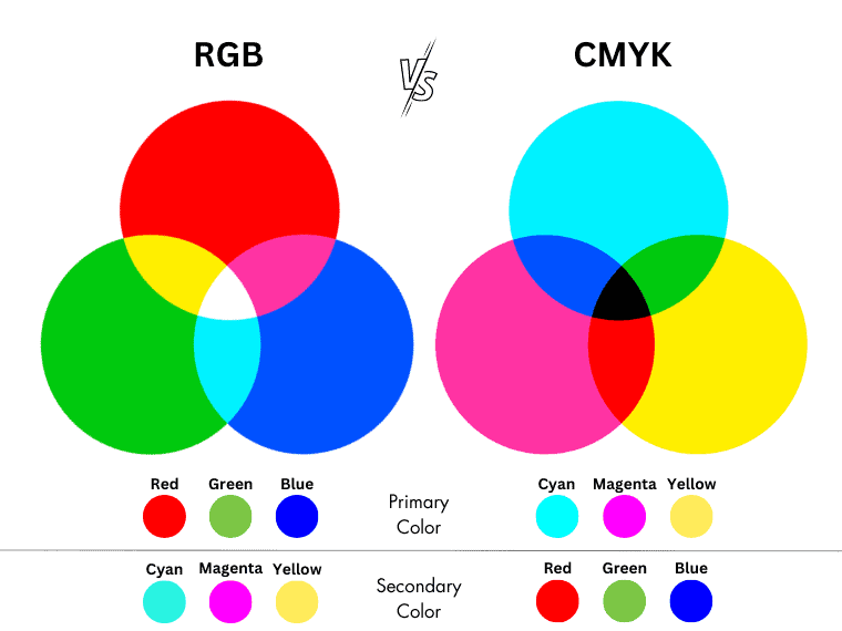
By blending the primary colors of light (red, green, and blue), you create the primary colors of pigment (cyan, magenta, and yellow). These are also the secondary colors of the RGB color model.
- Blue + Green = Cyan
- Red + Blue = Magenta
- Green + Red = Yellow
Thus, the primary colors in the RYB color space can be created by mixing other colors.
We hope the primary color type is now covered. Let’s move on to the secondary color type.
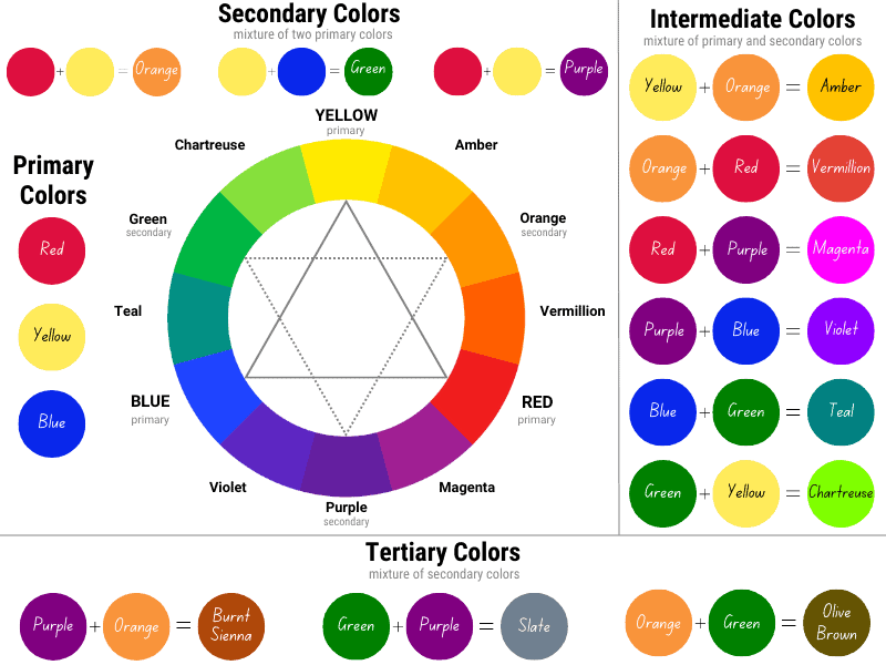
Secondary colors are created by intermixing pairs of two primary colors.
In painting, the secondary colors are made this way:
- Red and yellow make orange.
- Blue and yellow make green.
- Red and blue make purple.
When it comes to the printing industry, the secondary colors are the primary colors of light:
- Magenta and yellow make red.
- Yellow and cyan create green.
- Cyan and magenta produce blue.
As expected, the secondary colors of light (RGB) are the primary pigment colors (CMYK).
- Blue and green create cyan.
- Blue and red make magenta.
- Red and green produce yellow.
Is it now clear what the primary and secondary colors are? Let’s move on.
In painting, intermixing pairs of two secondary colors produces tertiary colors. These are often referred to as intermediate colors. But tertiary colors differ from intermediate colors. At least in painting!
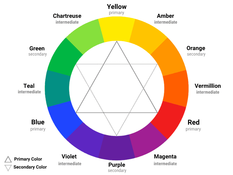
What Are Intermediate Colors?
Intermediate colors are made by mixing a primary color with a secondary color. They are called “intermediate” because they are situated on the color wheel between a primary and a secondary color.
Intermediate Colors in Painting
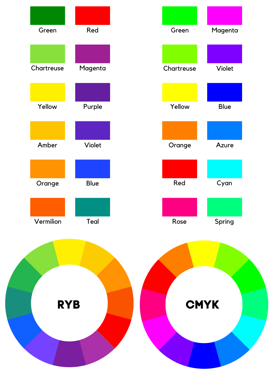
Intermediate colors are red-orange, yellow-orange, yellow-green, blue-green, blue-violet, and red-violet. They are also known as vermillion, amber, chartreuse, teal, violet, and magenta.
- Mixing yellow with orange creates yellow-orange.
- Red and orange make red-orange.
- Red and purple make red-purple.
- Blue and purple create blue-purple.
- Blue and green make blue-green.
- Yellow and green make yellow-green.
These are technical names, and people rarely use them. To make it easier to remember, use these color names:
- Amber
- Vermillion
- Magenta
- Violet
- Teal
- Chartreuse
However, practice helps to improve the experience. So, depending on the type of colors you mix, you can get different shades or tints.
Although things seem simple, they get complicated when you want to get intermediate-based tones. Trial and error is the best way to get to the shade you want.
Examples of Intermediate Colors
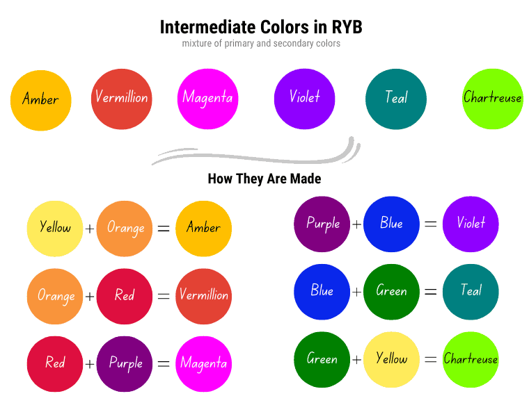
- Yellow + Orange = Amber
- Orange + Red = Vermillion
- Red + Purple = Magenta
- Blue + Purple = Violet
- Blue + Green = Teal
- Green + Yellow = Chartreuse
Intermediate Colors in Digital Art
The digital world uses the RGB color model. The primary colors of the RGB model are red, green, and blue, while its secondary colors are cyan, magenta, and yellow.
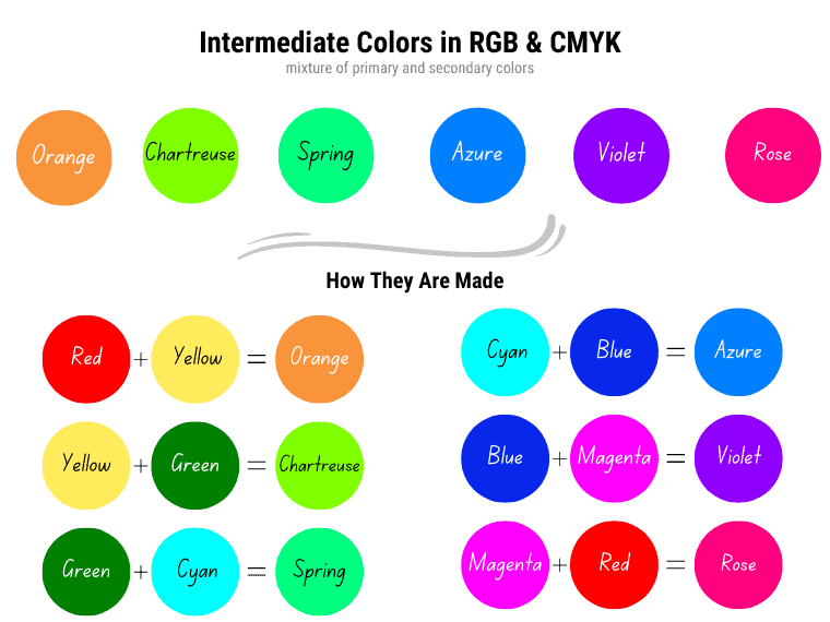
Intermediate colors in digital art are orange, spring green, turquoise, ocean, violet, and raspberry. These are located between primary and secondary colors on the RGB color wheel.
- Red + Yellow = Orange
- Green + Yellow = Spring Green
- Green + Cyan = Turquoise
- Blue + Cyan = Azure
- Blue + Magenta = Violet
- Red + Magenta = Rose
What is a Tertiary Color?
A tertiary color is created by mixing two secondary colors. This definition only applies to painting. Although they do not appear on the RYB color wheel, these colors are essential when mixing paints and pigments, especially when you want to achieve brownish and grayish tints.
So, when it comes to painting, we apply the definition of Moses Harris, a color theorist who says that secondary colors are mixtures of two secondary colors. When dealing with light or print, a tertiary color is a mixture of a primary with a secondary color.
Examples of Tertiary Colors in Traditional Art
- Slate
- Russet
- Olive Brown
How are tertiary colors created? In short:
- Green and purple make slate.
- Purple and orange create russet.
- Orange and green produce olive brown.
The Difference Between Intermediate and Tertiary Colors
The difference between intermediate and tertiary colors refers to the type of colors mixed. This difference exists only in the RYB model, dedicated to traditional art.
Intermediate colors are mixtures of a primary and a secondary color and are situated between them on the color wheel. Tertiary colors, on the other hand, are mixtures of two secondary colors and do not appear on the 12-part color wheel.
When it comes to light (RGB) or ink (CMYK), the term “intermediary” or “intermediate” is used interchangeably with “tertiary.”
Different Ways to Classify Colors
We have already discussed the types of colors. While there are primary, secondary, intermediate, and tertiary colors in the traditional world, there are only three types in the printing or digital world. Intermediate colors are referred to as tertiary colors in the printing and digital worlds.
As we have seen, these types of colors differ depending on the color model used.
Colors of Light vs. Colors of Pigment
Each color model is used for different environments. For example, the RGB color model deals with light. For this reason, its primary colors have been chosen according to how the human eye perceives color. [1]
Specifically, they are closely related to three types of photoreceptors or cones in the retina of a healthy eye, which are sensitive to different wavelengths:
- S-cones: 380-540 nm (blue light)
- M-cones: 440-780 nm (green light)
- L-cones: 440-670 nm (red light)
That’s why these colors are used on all digital devices, including TVs, monitors, computer screens, and smartphones.
Basically, each pixel of any digital screen is composed of three sub-pixels, one for each primary color.
When it comes to pigments, paints, and dyes, we use the RYB or CMYK color models.
While RYB is a traditional model used in art, CMYK is a modern model used in the printing industry.
While the RYB is a traditional model used in art, the CMYK is a modern one.
Color of light are additive colors, while those dealing with pigments or dyes are subtractive colors.
The colors of light are red, green, and blue (RGB), while the colors of pigment are cyan, magenta, and yellow. However, the CMY colors do not have the helpful quality of opacity, which is so loved by artists. For this reason, they use the traditional RYB color model.
Basically, the pigments of the CMYK model are semi-transparent (cyan) or transparent (magenta and yellow).
However, the CMYK model is said to be able to produce a wider gamut of colors with greater accuracy.
Additive vs. Subtractive Colors
While the RGB color space is an additive model, the CMYK color space is a subtractive model.
The additive colors are red, green, and blue – the colors of light. On the other hand, the primary subtractive colors are cyan, magenta, and yellow.
These colors are called “additive” because they work by adding different wavelengths of light together. When two or more colors of light are combined, their wavelengths add up, resulting in a new color. For example, when red light and green light are mixed together, the wavelengths of these two colors add up to create yellow light.
In contrast, colors created by mixing pigments or dyes, such as paint or ink, are called “subtractive” colors.
This is because the pigments or dyes absorb certain wavelengths of light, subtracting them from the overall color spectrum. When different colored pigments are mixed together, the resulting color is the result of the wavelengths of light that are not absorbed by the pigments.
This is why mixing all the colors of paint or ink together usually results in a muddy brown or black color rather than white, as in the case of additive colors.
Warm vs. Cool Colors
Understanding the concept of warm and cool colors is another important lesson in color theory. They can help you achieve the desired impact.
The easiest way to differentiate between them is to look at a classic color wheel and divide it in half where chartreuse and yellow meet. Those on the red side are warm colors, and those on the blue side are cool colors.
- Warm colors: red, orange, yellow, and their mixtures (red-orange, yellow-orange, and yellow-green). Warm colors are often perceived as appearing closer to the viewer.
- Cool colors: green, blue, purple, and their mixtures (blue-green, blue-purple, and red-purple). Cool colors are frequently perceived to be further away from the viewer.
Thus, these colors can help you create dimensionality.
Chartreuse is green with a yellow bias and is a warm color. Magenta is a cool color because it is red with a blue bias.
However, any color can have color bias. For example, green can be perceived as a warm color if it has a yellow bias.
So, color temperature is relative.
For example, a bluish-red is cooler than a yellowish-red one. If a reddish-blue is perceived as warm, a greenish-blue is perceived as cool.
Complementary Colors
Complementary colors are pairs of two opposite colors on the color wheel. They create a strong contrast and a powerful visual impact when placed next to each other. Complementary colors are also known as direct color harmony.
The complementary colors are:
- Red and green.
- Blue and orange.
- Yellow and purple.
- Amber and violet.
- Teal and vermillion.
- Magenta and chartreuse.
Interesting to note is that the complementary colors of the intermediate colors are also intermediate.
Using Intermediate Colors in Art & Design
Beyond their appearance, the intermediate colors carry symbolism. Moreover, the intermediate color meanings are closely linked to the color emotions.
Amber is a yellow-orange color associated with warmth, energy, happiness, vitality, and confidence.
Vermillion combines the warmth and optimism of orange with the energy and strength of red. Furthermore, vermillion is associated with energy, action, courage, optimism, emotion, and spontaneity.
Magenta is the color of emotional balance and combines the power and passion of red with the wisdom and compassion of purple. Moreover, magenta is associated with harmony, kindness, and change. Magenta is rational. On the other side, magenta can be related to anger and a lack of patience.
Violet is associated with creativity, wisdom, spirituality, and sensitivity. Moreover, violet represents encouragement and intuition. Violet uplifts, inspires, and motivates.
Teal is a blue-green color associated with peace, honesty, wisdom, seriousness, and rejuvenation. Moreover, teal relaxes and brings clarity to the mind. It combines the revitalizing properties of green with the tranquility qualities of blue.
Chartreuse combines the happiness of yellow with the growth characteristics of green. Moreover, chartreuse represents youth, enthusiasm, and joy. On the other side, it can be associated with cowardice, jealousy, and sickness.
Orange stands for energy, optimism, and enthusiasm. Moreover, this color stimulates and uplifts with its warmth. However, orange can be associated with superficiality and exhibitionism.
Spring green is associated with freshness, growth, and new beginnings.
Azure is associated with freedom, peace, tranquility, and calmness. Its name is derived from the French word “azure,” which means sky blue. Thus, it brings to mind the color of the sky and ocean.
Last Words on Intermediate Colors
In conclusion, there are primary, secondary, intermediate, and tertiary colors in traditional art. The terms “intermediate” and “tertiary” can only be used interchangeably in RGB and CMYK models.
We hope this article has helped to clarify the intermediate colors. If you liked this article, please share it with your friends.