
Do you want to know what cool colors are and how to use them in art and design? Then you’ve come to the right place.
Whether you paint, work on a web design, or want to redecorate your home, you need to master warm and cool colors. And do you understand why? Because any serious definition of cool colors entails more than just the use of blues and greens.
In this article, we will look at what cold colors are and what they mean, as well as how to use them in art, interior design, and web design.
Don’t worry if you don’t know what cool or cold colors are or how to use them – that’s what we’re here for. Let’s get started!
What are Cool Colors?
In order to understand cool colors more efficiently, it is essential to look at the color wheel.
The color wheel is a visual representation of all colors, including primary, secondary, and tertiary colors, and those in between.
Designers and artists often use the color wheel to visualize the relationship between different colors.
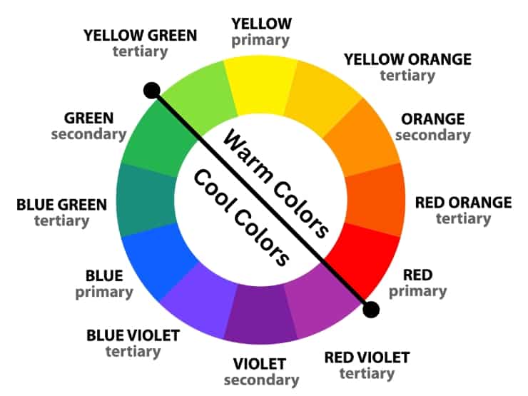
Although there are different versions of the color wheel, the most popular is the traditional version, which is created from 12 colors. The 12 colors are divided into three main categories:
- Primary colors: red, yellow, and blue
- Secondary colors: green, orange, and purple
- Tertiary colors: red-orange, yellow-orange, yellow-green, blue-green, and blue-violet
Secondary colors are made by mixing two primary colors, whereas tertiary colors are created by combining a primary color with a secondary color.
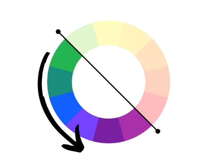
Within the color wheel, you can easily separate cold colors from warmer colors. So, if you have the color wheel handy, this visual example will allow you to understand which colors are cool.
Now let’s think about the terms “cool” and “warm” and try to associate them with colors. For example, red, yellow, and orange evoke a feeling of energy, warmth, and enthusiasm.
On the other hand, cold colors make you think of nature and freshness while having a calming effect.
Cool colors are blue, green, violet, and their combinations: blue-green, blue-violet, and red-violet.
In the world of physics, color is seen as light, and cold colors have shorter wavelengths than warm ones. For this reason, you tend to see red faster than blue when they are put together.
So this is the basic definition of cool colors. Artists often use cool colors to bring out warm colors. Thus, cold colors do not stand out as much as warm colors.
Also, if you use neutral colors such as shades of white or grey, you should be aware that they can also lean towards cooler undertones such as blue. We’ll discuss this below! But before that, let’s take a look at cool tones and their meaning.
Blue Cool Colors
Blue is the the world’s favorite color. [1] But it’s also logical; blue is the color of the sea and the sky, which provide us with their calm and serenity.
What’s more, blue has a calming and relaxing effect. But where does this calming effect come from? It is said that blue light can slow down your heart rate and even lower your blood pressure.
Cool, right? So, these cool blue colors really do provoke feelings of calm and well-being.
Therefore, cool tones are linked to a sense of well-being, which translates into feelings of safety. For these reasons, it is often used in bedrooms, spas, relaxation areas, or even hospitals.
In addition to its calming properties, blue is associated with freedom, imagination, loyalty, and confidence. It’s the color of open spaces where your imagination runs free.
At the same time, cool shades of blue can also be associated with feelings of sadness, melancholy, or even depression.
Curious about where this association comes from? It has been shown that exposure to blue light can decrease body temperature, which may lead to feelings of sadness or depression.
Another theory says that it is an association specific to certain cultures. However, this perception of how you see blue differs depending on your cultural background and life experience.
Violet Cool Colors
Violet is a color that can borrow from both the calm of blue and the warmth of red. Wondering why? Violet is located between red and blue on the color wheel.
In physics, violet is located at the end of the visible light spectrum, with wavelengths ranging from 380 nanometers to 450 nanometers.
Violet is associated with royalty, nobility, luxury, and power. Moreover, it is the color of spirituality and higher consciousness. Violet is also linked to imagination, inspiration, and creativity.
Although violet is a color that encourages self-discovery, it also has negative connotations, being associated with immaturity, arrogance, conceit, and indifference.
Green Cool Colors
Green, the color of nature, is associated with freshness, growth, renewal, and new beginnings. Green also symbolizes hope, prosperity, and security. Also called the color of life, green has a relaxing and revitalizing effect.
Green is the most visible color to the human eye because it stimulates the highest number of cones (photoreceptor cells) in the human retina compared to other colors.
Do you understand why? Well, the cones in our eyes are responsible for detecting color, and there are three types of cones that are sensitive to different ranges of the color spectrum.
Thus, the most sensitive to green light cones are the most abundant in our retina, making green the most visible color to us.
Moreover, green is peaceful and healing. It brings freshness and attracts prosperity.
Using Cool Colors in Art
Colors provoke emotions, change moods or create feelings of warmth or coolness. That’s why it’s essential to understand how cool colors work when mixing paints.
Also, to better define cool colors, it is vital to understand the concept of color temperature, an essential part of color theory.
The use of cool colors in art is often used to alter the perception of size or awareness of distance.
Moreover, cool colors are used to create dimension because they appear more distant, tending to recede when compared to warm colors.
For example, imagine a painting of a mountain landscape in cool tones and houses in the foreground drawn in warmer tones.
I hope that clarifies this point. Let’s move on!
If you want to make bright colors, mixing similar color biases or colors with similar qualities is advisable. That way, you will avoid a muddy color mix.
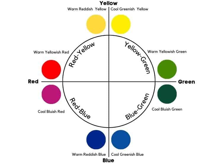
If you don’t know what bias refers to, remember that each color can encroach on a neighboring color on the color wheel. Thus, a specific color may lean towards cooler or warmer colors. For example, green may have a yellow or blue bias, while blue may have a green or red bias.
Let’s take ultramarine as an example. Although many consider ultramarine a cool color, it is actually a warm blue because it leans more toward purple than green.
Furthermore, even warm colors can be cool. For example, shades of pink that lean more towards purple are cool colors.
When it comes to red, it is a warm color, but certain shades have a cool bias. Alizon crimson is an example of a cool red. This cool red is often mixed with blues to make “pure” purples in art.
Do you understand why choosing colors with similar qualities or “color bias” is so important? Otherwise, it can affect your color outcome.
The Importance of Color Temperature in Art
Color temperature, or color bias, plays an important role in both art and graphic design. Thus, it can change moods, create dimension or even alter distance perception.
Although you use both warm and cool tones when painting, it is important to avoid using these color temperatures equally.
For example, when painting the water of a lake, you can use color temperature to create depth. When painting a landscape with trees and leaves, it is important to use cool and warm colors, as they help to create a nice contrast.
The best solution is to choose the main color temperature you want and consider using more of these.
If you want to create dimension, paint in warm colors in the foreground and the background in cool colors.
Moreover, you can use both warm and cool colors to add a focal point.
But be careful because warm colors can easily change to cool colors, but vice versa is more complicated.
However, cool colors have a specific relativity when compared to other shades. For example, if you use a shade of lemon yellow – a cool shade of yellow, it can look warm next to shades of blue.
How to Identify Cool Colors
To identify cool colors in art, use the RYB color wheel and analyze color temperature or color bias. While green, blue, and purple are pure cool colors, there are also examples of cold color biases:
- Greenish Yellow
- Bluish Green
- Greenish Blue
- Bluish Red
If we talk about the RGB color model, the cool colors are those with small amounts of red and higher amounts of green and blue.
When it comes to print, thw subtractive model uses the CMYK color wheel. Cool colors in the CMYK world are those with higher values of cyan and black, and lower values of magenta and yellow.
However, color temperature is relative.
How to Use Cool Colors
Art
You probably know that artists use the traditional RYB color wheel, which has red, yellow, and blue as its primary colors. Of these, only blue is a cool color, while yellow and red are warm colors. Orange, located between red and yellow on the color wheel, is also warm.
While cool colors appear further away, they have a calming and relaxing effect and make you think of nature, water, sky, and cold. In contrast, warm ones appear closer and exude feelings of warmth, joy, energy, and optimism.

Interior Design
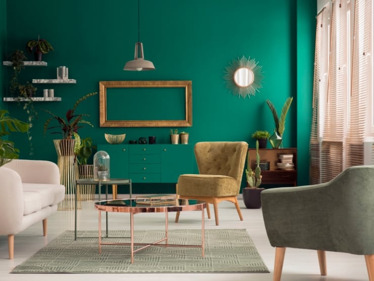
In interior design, cool colors have a calming and refreshing effect. As a result, they are popular for creating a calming environment in bedrooms and bathrooms.
Also, cool light colors can make the room appear larger, as opposed to warm dark colors, which have the opposite effect. This is because cool colors appear more distant.
By contrast, warm colors symbolize feelings of happiness, optimism, and energy. They can help create a more intimate and comfortable environment. Interior designers use them, especially in living rooms and kitchens.
But be careful not to use them in small spaces as they can create a shrinking effect.
You can also add an impression of cool colors through finishes. For example, brushed nickel or chrome are some of the finishes that produce cool tones.
Furthermore, using too many cool colors in a room can make it less inviting. That’s why you need to use a well-balanced scheme with colors with the same temperature.
Cold Color Palette
A cold color palette might include icy blues, cool grays, lavender, mint green, and seafoam.
Here are two examples of a cold color palette with colors of the same temperature.
- Blue and purple
Royal Blue
Hex: #4169E1
Orchid
Hex: #DA70D6
Using blue and white shades with the same temperature creates a beautiful harmony. Learn what color blue and purple make when mixed.
- Blue and white
Blue
Hex: #3944BC
Rhinestone White
Hex: #DEE0DE
Blue and rhinestone white is the second fantastic color palette for the bedroom This white color has a cool undertone. So, based on what we discussed above, both colors have the same color temperature.
But if you want to use both warm and cold colors, use the 80 20 rule: 80% cool tones, 20% warm tones, and neutral colors.
Moreover, you can pick a complementary or monochromatic palette if you want to use color combinations.
Above all, before painting a wall in your home, test the paint in different lights to avoid surprises. Surprises can often occur because, as mentioned above, colors may have different biases that change their overall appearance.
Web design
In web design, cool colors are more pleasing and relaxing to the eye. So using cool shades is a smart choice to increase the average user session duration.
However, you should keep color harmony in mind and use complementary, split-complementary, analogous, or triadic palettes.
Using more than 3 colors in your web design is not advisable.
However, using cool colors in web design is dependent on the emotions they convey to the reader or end user.
If you didn’t already know, the colors used in web design are aligned with the RGB color model. Of the primary ones, green and blue are considered cool colors.
In web design, while blue is used to convey confidence, trust, and reliability, green symbolizes positivity, safety, and success. In contrast, another cold color is purple – a tertiary color in the RGB world, often associated with luxury and rarity in web design.
F.A.Q.
What is the cool colors definition?
Cool colors are a subset of colors that are associated with nature, water, and cold and evoke feelings of calm, tranquility, and serenity. These colors include blue, green, purple, and their combinations. They are low in saturation and tend to recede in space, producing a relaxing effect.
Is gray a cool color?
Gray can be a cool color if it has blue, green, or purple undertones, but it can also be a warm color in the case of red or pink undertones. In addition, gray can complement both warm and cool colors if it has no undertone.
Can red be a cool color?
Yes, certain shades of red can be cool if they have a blue or purple bias, meaning they lean toward the purple side of the color wheel. However, red is more commonly classified as a warm color.
Did you find this article about cool colors interesting? Then share it with a friend who may find it useful as well!
I would like to thank you for the efforts you’ve put in penning this blog. I really hope to view the same high-grade content by you in the future as well. In truth, your creative writing abilities has motivated me to get my very own site now 😉
There’s definately a great deal to know about this topic. I like all of the points you made.