
Color is a generic term describing tints, shades, and tones. They all have one thing in common: a color hue.
That’s why many people use these terms interchangeably when referring to a color.
However, there is a difference between them.
In today’s article, you will understand each term’s meaning and their differences.
What is a Hue Color?
In art, hue is a pure pigment with no added white or black. So it has no tint or shade.
Furthermore, hue color refers to the dominant color family or the origin of the color you see.
Hues comprise a few colors because they are the root color of tints, shades, and tones. Examples of pure hues include red, yellow, green, and blue.
Since the 17th century, the concept of unique hues has been around. The four unique hues include red, yellow, green, and blue. All others are said to be perceived as mixtures of the four colors.
However, pure hues are debatable as they refer to colors without adding white, gray, or black.
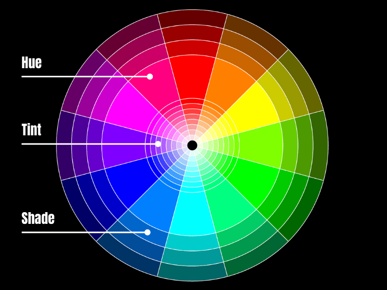
The traditional color wheel consists of 12 hues displayed on a circle. The main hues, also known as primary colors, are red, yellow, and blue, equally spaced. The secondary hues – green, orange, and purple – are created by mixing two primary hues.
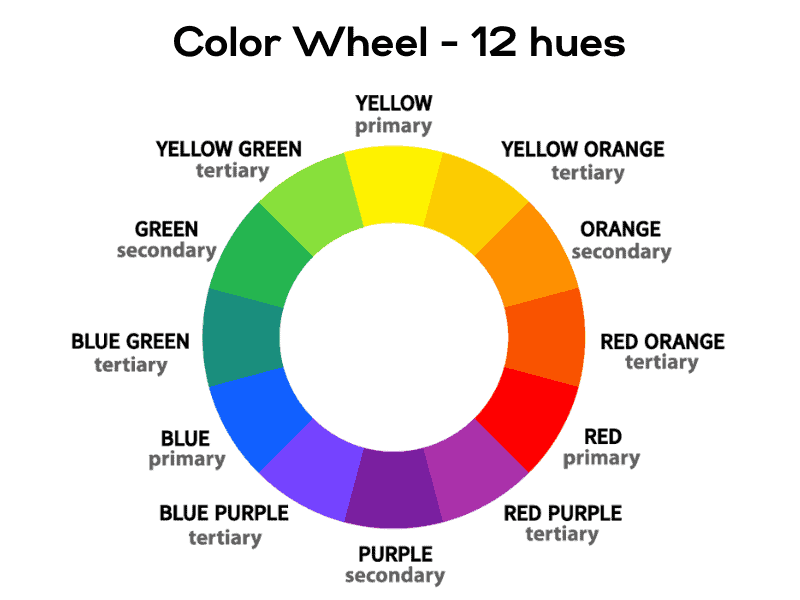
Red, yellow, and blue are the primary pure hues in painting since they cannot be made by combining other colors. Green, orange, and purple – the secondary colors – are also considered hues because they do not contain white, gray, or black.
There are also six intermediate hues such as red-orange, yellow-orange, yellow-green, blue-green, blue-purple, and red-purple.
They are referred to as “intermediate” because they don’t have a dominant hue.
Also known as intermediate colors, these are created by mixing a pure hue with a secondary hue.
So there are 12 basic hues: yellow, yellow-orange, orange, red-orange, red, red-purple, purple, blue-purple, blue, blue-green, green, and yellow-green.
In the Munsell color system, there are five main hues: red, yellow, green, blue, and purple; in addition, as well as five intermediate hues: yellow-red, green-yellow, blue-green, purple-blue, and red-purple.
But is pink a hue? No, pink is not a pure hue; it is a tint of red resulting from adding white to a red base.
The Properties of Color
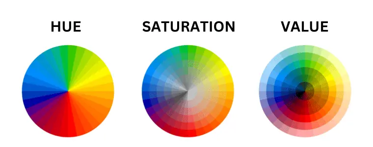
Color is usually defined by three qualities: hue, saturation, and value.
What is Hue?
Hue is the base color displayed on the color wheel, without any tint or shade. This one is most associated with the color’s name. So, for example, when we say red, we’re referring to the red hue.
Technically, hue is an angle that varies between 0 and 360 degrees. For example, red falls between 0 and 60 degrees, and yellow between 60 and 120 degrees.
When it comes to light, hue can be defined as the dominant wavelength of light emitted by an object and perceived by our eyes.
What is Saturation?
Saturation (also known as Chroma or Intensity) refers to the intensity of a color.
Saturation is measured as a percentage ranging from 0 to 100. The lower the saturation (closer to zero), the closer to pure gray. The more saturated the color, the more vibrant it is.
Thus, color is at full saturation when it contains no gray or a mixture of black and white. This results in a bright, vivid color.
As a color gets desaturated, it becomes duller – a tone of a hue.
What is Color Value?
Value (also known as Lightness or Brightness) relates to how light or dark the color is. So value describes the brightness of a color and is measured between 0 and 100 percent, where 0 means all black and 100 is the brightest.
If you were to take a color and convert it to grayscale, the resulting shade of gray is the value of the color.
This quality of color is important because it helps us perceive the shape and form of objects by showing how light interacts with their surfaces.
So what is the difference between saturation and value? While saturation refers to the brightness or dullness of a color, value describes its lightness or darkness.
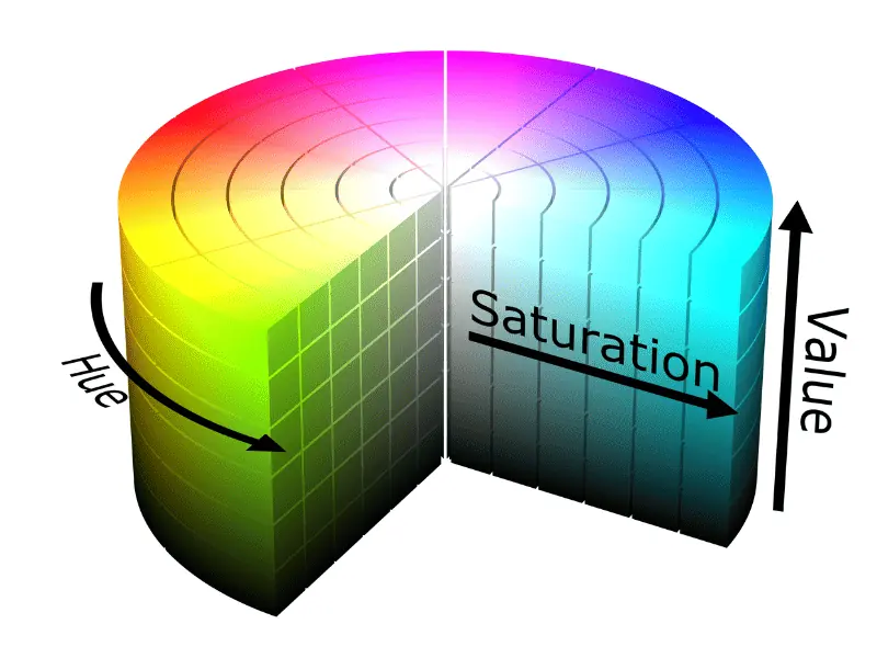
HSV Color Model
Unfortunately, the color wheels only describe one attribute of color, namely the hue. Thus, to see saturation and brightness (or value), it is best to use a 3D color space, such as HSV or HSL. They describe all three attributes of color: hue, saturation, and brightness (or lightness).
HSV is a 3D (or cylindrical) color model that translates RGB colors into friendlier dimensions. This model works with all three color attributes: hue, saturation, and value (or brightness).
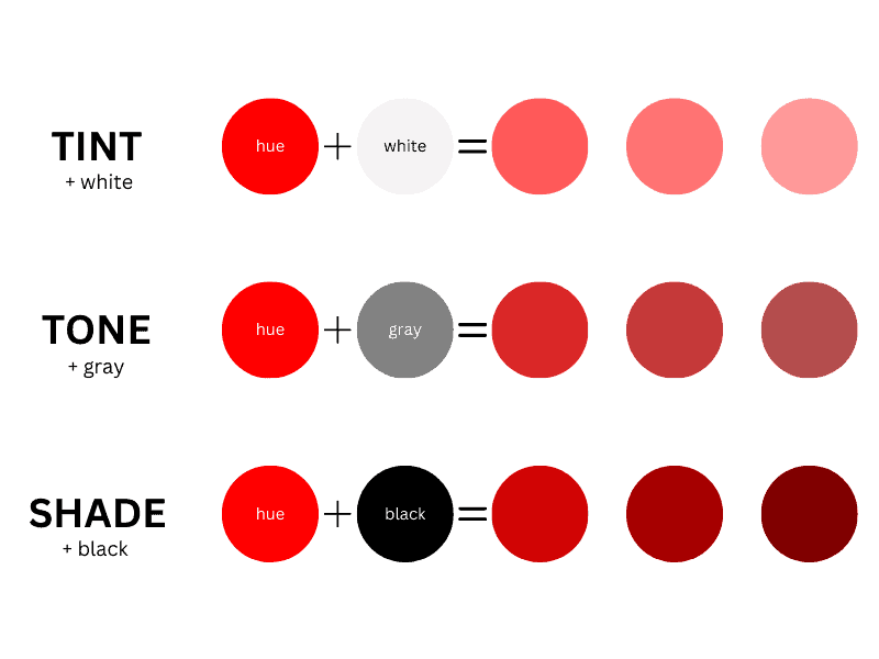
What is a Tint?
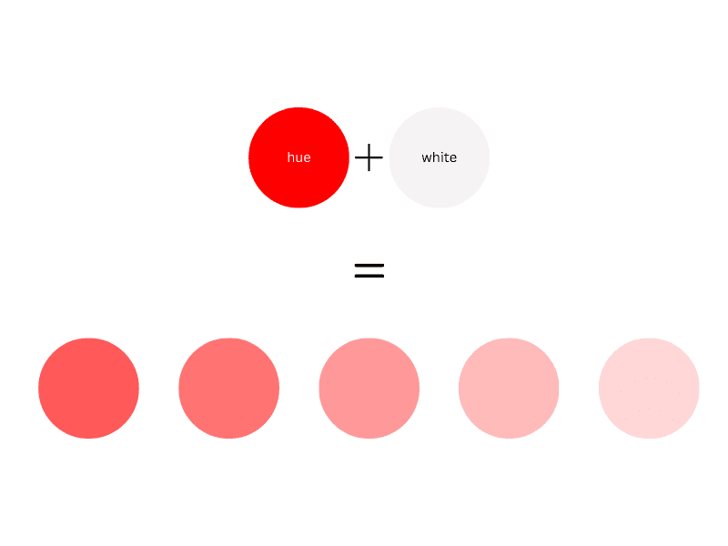
Tint is any hue or mixture of pure colors to which white is added. A tint color is a whitened color, resulting in a paler shade. In general, pastel colors are tints.
To mix a tint in art, start with a white base and gradually add the color you want to lighten.
A tint is always a lighter version of the color, not brighter because adding white makes the base hue desaturated.
Unlike tones, tints don’t contain gray.
Here are some examples of tints:
- Pink is technically a tint of red as it combines red and white.
- Celeste and baby blue are tints of blue because they are pale versions created by mixing a pure hue (blue) with white.
- Apricot is a tint of yellow-orange.
- Peach is an orange tint with lots of white added.
What is a Tone?
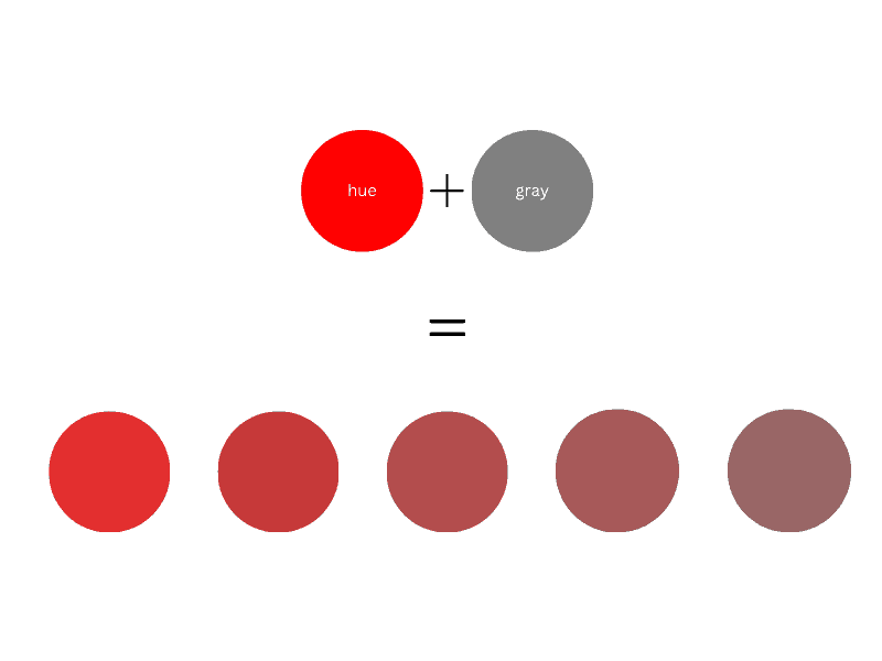
Tone refers to any hue or mix of pure colors to which gray (or an equal mixture of black and white) is added. Thus, the final color will become duller.
Adding too much gray to a pure hue can make the color over-dulled. Once you have dulled a color, you cannot go back to its brightness.
Thus, a tone, unlike tint, also contains some black since gray is a mix of black and white.
Adding too much gray to a pure hue can make the color over-dulled. You cannot regain its brightness once you have dulled a pure hue.
Tone in art refers to the brightness or darkness of a color. In short, it means how light or dark a color is. Any color can have infinite tones, generally classified as dark, light, and mid-tones. Tone can also refer to the color itself.
What is a Shade?
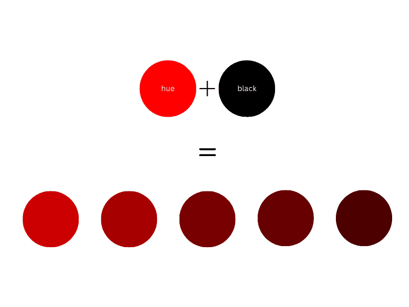
A shade refers to a hue or mix of pure colors to which only black is added. Adding black will make the color darker but also more intense. Unlike tint and tone, a shade does not contain white or gray.
But what is a shade in art? In art, as in design, shade is a darker color resulting from adding black to a mixture of pure hues. Even if black darkens the color, its hue remains the same. To mix a hue, start with the base hue and add black a little at a time.
But what is a shade in art?
The Difference Between Tints, Shades, and Tones
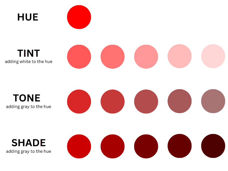
Tint increases the brightness of a base hue by adding white to it. Tone makes a color duller by adding gray or an equal mix of white and grey. Shade increases the darkness of a color by adding black to a base hue.
Tint vs. Shade
A tint is made by mixing white into a pure hue or a mixture of pure colors, while a shade is created by mixing black in. In addition, tint is a paler version of a pure hue or color, as opposed to a shade that represents a darker color.
An example of tint vs. shade is pink vs. Carmine. Pink is a tint (light version) of red, while Carmine is a darker variation – a shade of red.
Pink – a tint of red
Hex: #FFC0CB
Carmine – a shade of red
Hex: #8F0018
Tone vs. Shade
Tone is created by adding gray or an equal mix of black and white to a base hue or a mix of pure colors, while shade is a combination of a base hue with black.
In addition, tone makes a color duller, while shade increases its darkness.
In Brief #
Color Hue
There are 12 basic hues on the color wheel that are bright and fully saturated.
They consist of three primary hues (red, yellow, and blue), three secondary hues (green, orange, and purple), and six intermediate hues (yellow-orange, red-orange, red-purple, blue-purple, blue-green, green, and yellow-green).
Pure hues are just red, yellow, blue, green, orange, and purple – the primary and secondary colors of the RYB color model.
However, some consider only red, yellow, blue, and green as pure hues. That’s because orange and purple don’t have a dominant hue. Orange is a red and yellow mixture, whereas purple is a color made up of equal parts red and blue.
Shades
- Shades are made by mixing a hue with black.
- They increase the darkness of the colors, keeping the basic hue the same.
Tints
- Tints are hues with the addition of white.
- They increase the brightness of the colors while the base hue remains the same.
Tones
- Tones are created by mixing gray with a pure hue.
- They make colors duller. Thus, they appear less vibrant.
How to Use Shades, Tints, and Tones in Art
Shade, tint, and tone are important concepts in art and design, affecting everything from color theory to color psychology. They contribute to the richness and depth of color and are crucial for creating mood, emphasis, and visual harmony.
Shade: any color mixed with black, which increases the darkness of the color
Moreover, using different shades can help you establish depth and volume. Additionally, shades can add drama or moodiness to a design or artwork.
Tint: any hue mixed with white, which increases lightness
Tints are often used to soften colors. Moreover, they’re associated with calm and soothing moods.
In addition, tints can be used to draw attention or create a visual hierarchy because the human eye is naturally drawn to lighter colors.
Tones: created when gray (black and white) is added to a color.
This generally reduces the color’s intensity, making it less vibrant.
Tones can help balance a color scheme by adding complexity and sophistication. They can also create a calming and soothing effect, making them ideal for spaces where tranquility or focus is desired.
Understanding these concepts is, therefore, essential in painting, graphic design, and interior design.
The Importance of Tints, Tones, and Shading in Art
Artists often use tints, tones, and shades for many reasons. Those can create depth, add visual interest or convey different moods.
Creating Depth
One of the most crucial aspects of realistic art is the ability to create an illusion of three-dimensionality on a 2D surface. Using these concepts, you can simulate the effects of light and shadow to give depth and volume to your subjects.
Adding Interest
Artworks that use a variety of tints, tones, and shades are often more visually engaging. These variations can prevent your artwork from appearing monotonous. Moreover, they provide richness.
Conveying Moods
Tints and shades usually evoke different emotions. For example, light pink – a tint of red – represents love, innocence, and romance. On the other side, dark red has meanings of energy, courage, willpower, and anger.
Creating Color Harmony
The use of tints, tones, and shades of a pure hue leads to the creation of a monochromatic scheme – one of the color harmonies. You can achieve a sense of unity this way.
Capturing Attention
The human eye is generally drawn to light and bright colors, so you may use tints to highlight areas of importance. On the other hand, dark shades can be used to create areas of less interest or to add mystery and ambiguity.
Last Words on Tints Shades and Tones
On the color wheel, there are 12 hues, and each of them has different tints, tones, or shades.
Tint is a paler version of a hue made by adding white but it keeps the same hue. Tone is a duller version created by adding grey. Shade, on the other hand, is a darker variation of a base hue, created by adding black.
We hope this article has helped you understand these terms. Don’t forget to share this post with your friends who might be interested in this topic.