
Want to learn about color harmony? Or what exactly are harmonious color combinations? You’re in the right place.
Color harmony is crucial in any visual art project, from painting to interior design to graphic and web design.
Choosing a suitable color scheme can make all the difference. But what color scheme should you choose?
In this article, we’ll debate color harmony definition, color types and why it is essential to understand them, types of harmonious color schemes, and color harmony examples.
Types of Color Wheels
According to color theory, there are several types of colors: primary, secondary, and tertiary.
There are three primary colors, three secondary colors from mixing the primary ones, and six tertiary colors from combining the primary colors with the secondary ones. The exception is the CMYK model, where there are four primary colors.
Although the color types are the same, their colors may vary depending on the color model used.
There are several color models: RGB – used in lights, RYB – used in traditional art, and CMYK – used in printing.
RGB
The primary colors of the RGB color wheel are red, green, and blue. These are primary colors of light, and they are additive colors. The secondary colors in the RGB model are cyan, magenta, and yellow – the three subtractive colors.
The tertiary colors in the RGB color wheel are blue-green, blue-violet, red-orange, red-violet, yellow-orange, and yellow-green.
RYB
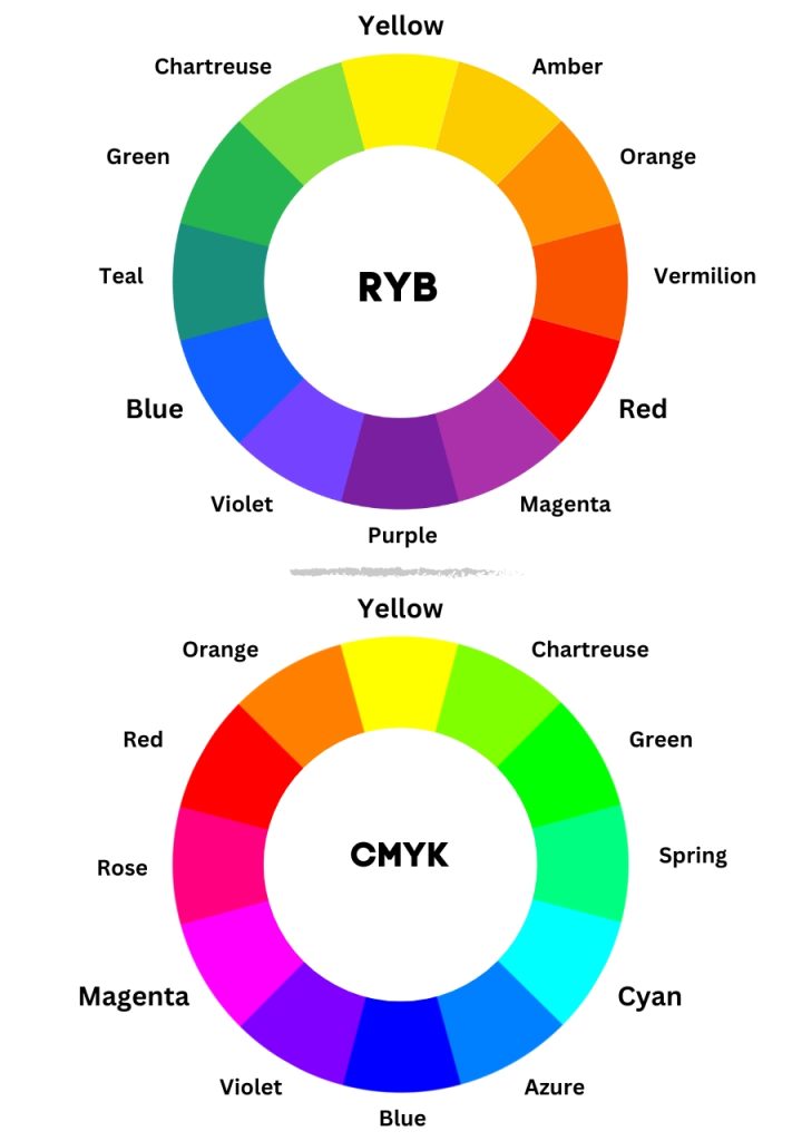
When it comes to RYB and CMYK, things differ from RGB. RYB and CMYK are subtractive color models, while the RGB model is additive.
The primary colors in the RYB color wheel are red, yellow, and blue. These are the traditional colors of pigment.
The secondary colors in the RYB wheel are purple, orange, and green.
The tertiary colors in the RYB color wheel are amber (yellow-orange), vermilion (red-orange), magenta (red-purple), violet (blue-purple), teal (blue-green), and chartreuse (yellow-green).
Thus, these types of colors are used in traditional art and painting.
Regarding pigments and paints, Moses Harris and Josef Albers say that tertiary colors are pairs of mixed secondary or complementary colors. [1]
CMYK
If you want a more accurate set of primaries for pigment, use the primary colors of the CMYK model: cyan, magenta, and yellow.
CMYK (cyan, magenta, yellow, and black) are the primary colors of printing.
Cyan, magenta, and yellow are subtractive primary colors. That means that cyan absorbs red, while magenta absorbs green. Also, yellow absorbs blue.
The secondary colors of the CMYK color wheel are red, green, and blue – the additive colors.
The tertiary colors in the CMYK color wheel are orange, chartreuse, spring green, azure, violet, and rose. These are the result of mixing a primary color with a secondary color.
The CMYK is a more comprehensive model than the RYB and can produce about 16,000 color combinations.
Color Harmony
Color harmony is a basic technique of color theory and refers to colors that look aesthetically pleasing when combined. It’s about harmonious color combinations.
Furthermore, color harmony is a set of geometric relationships on the color wheel. Thus, each type of color scheme has a geometric relationship that gives it its name.
Let’s find out more about each type of color scheme.
Types of Color Schemes and Harmonious Color Combinations
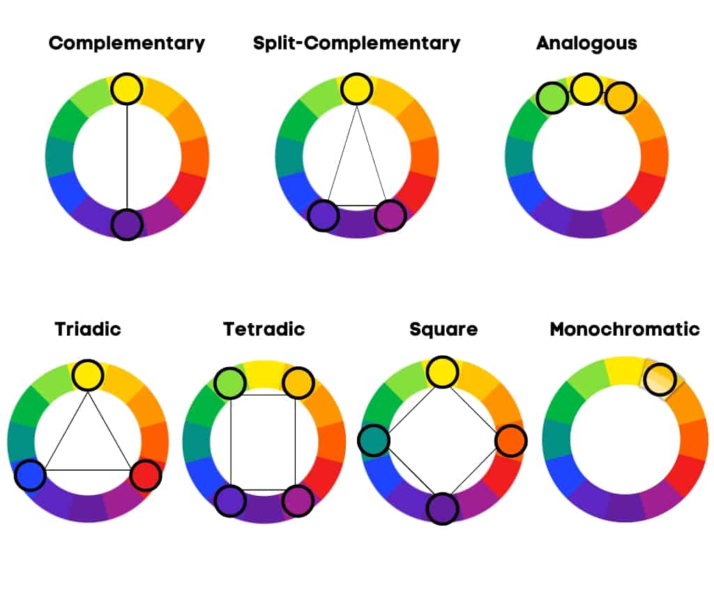
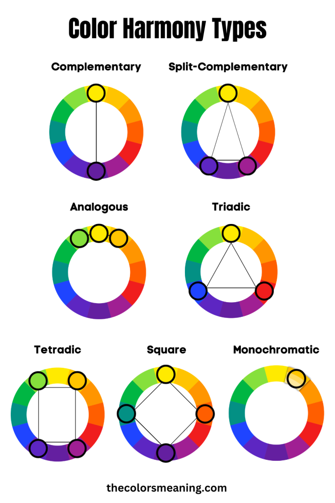
There are seven types of color schemes: complementary, split-complementary, analogous, triadic, tetradic, square, and monochromatic.
Visit our color wheel picker to create your own palettes using these color schemes.
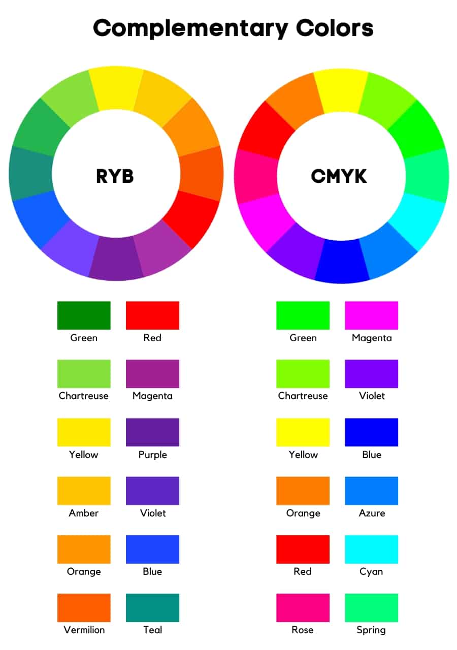
Complementary
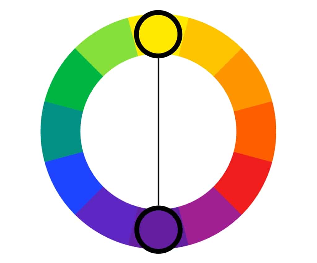
Complementary colors are two colors facing each other on the color wheel. These color combinations are aesthetic and bold, providing the highest contrast and an incredible visual impact.
The complementary color scheme is based on two opposite colors on the color wheel. This color harmony is the most well-known color scheme.
Examples of complementary color combinations include: orange and blue; yellow and purple; green and magenta; red and green;
This color combination is eye-catching. Even at Christmas, we use a complementary color scheme: red and green.
However, you should be careful how you use these harmonious color combinations in a scheme.
Using one predominant color and the other as an accent is best.
Split Complementary
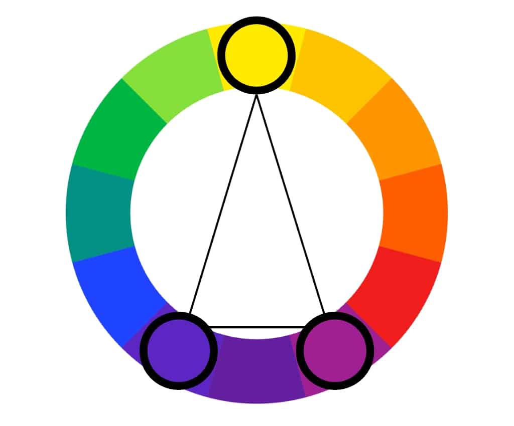
A split complementary color scheme is based on a dominant color and the two neighboring colors of its complementary color.
In contrast to the complementary color scheme, the split complementary scheme uses the adjacent colors of the dominant color’s complement, not the complement color.
As an example, we choose red. Its complementary color is green, and its adjacent colors are chartreuse and teal. This split complementary combination includes red, teal, and chartreuse.
Examples of split complementary color combinations include: yellow, amber, and orange; green, chartreuse, and yellow; green, teal, and blue; purple, violet, and blue; orange, vermilion, and red;
This type of color scheme maintains the benefits of contrasting colors but creates a more complex, nuanced color palette. However, the biggest challenge of the split complementary color scheme is finding a balance.
It is best to use a predominant color (the base color) and the adjacent colors for highlights and accents.
Analogous
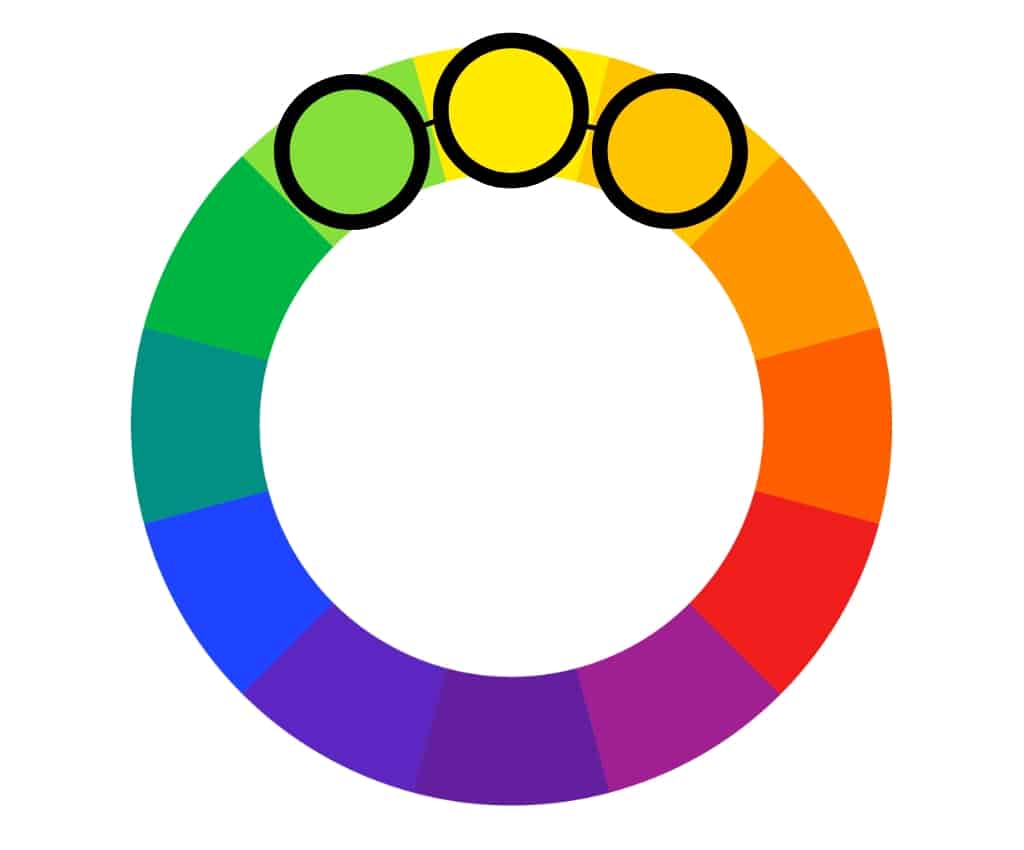
Analogous color schemes are based on a main color and its two neighboring colors on the color wheel. For example, you can use any three consecutive colors on the color wheel.
If you need a five-color scheme, you can also add the neighbors of the neighbors.
Examples of analogous color combinations include: yellow, amber, and orange; green, chartreuse, and yellow; green, teal, and blue; purple, violet, and blue; orange, vermilion, and red;
As opposed to complementary and split complementary schemes, analogous schemes offer a better color balance. Furthermore, because it does not use contrasting colors, this color harmony is softer and more pleasing to the eye.
In addition, it is used in interior design, decoration, and web design.
Triadic
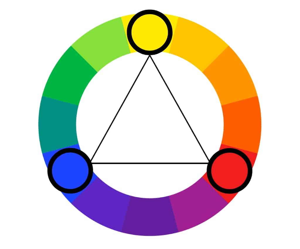
Triadic color schemes are based on three equally spaced colors on the color wheel.
As a simple rule, the numbers one, five, and nine are triadic colors when looking at a color wheel.
You can also draw a triangle with equal sides on the color wheel to set your colors in harmony. Three colors will always be left out.
The triadic color examples include: red, yellow, and blue; orange, green, and purple; amber, teal, and magenta;
Triadic color harmony offers highly contrasting colors but keeps a similar tone to split-complementary. However, it is more color balanced.
Choose one predominant color and use the other two sparingly to balance your triadic color harmony.
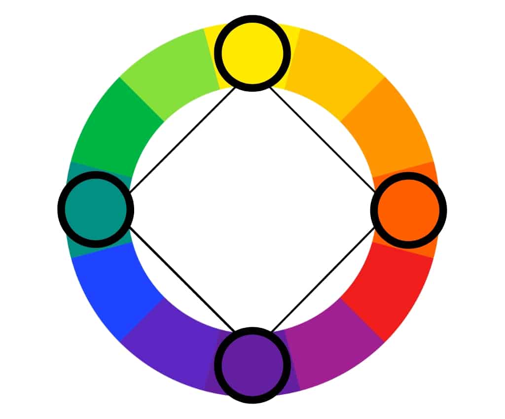
Tetradic
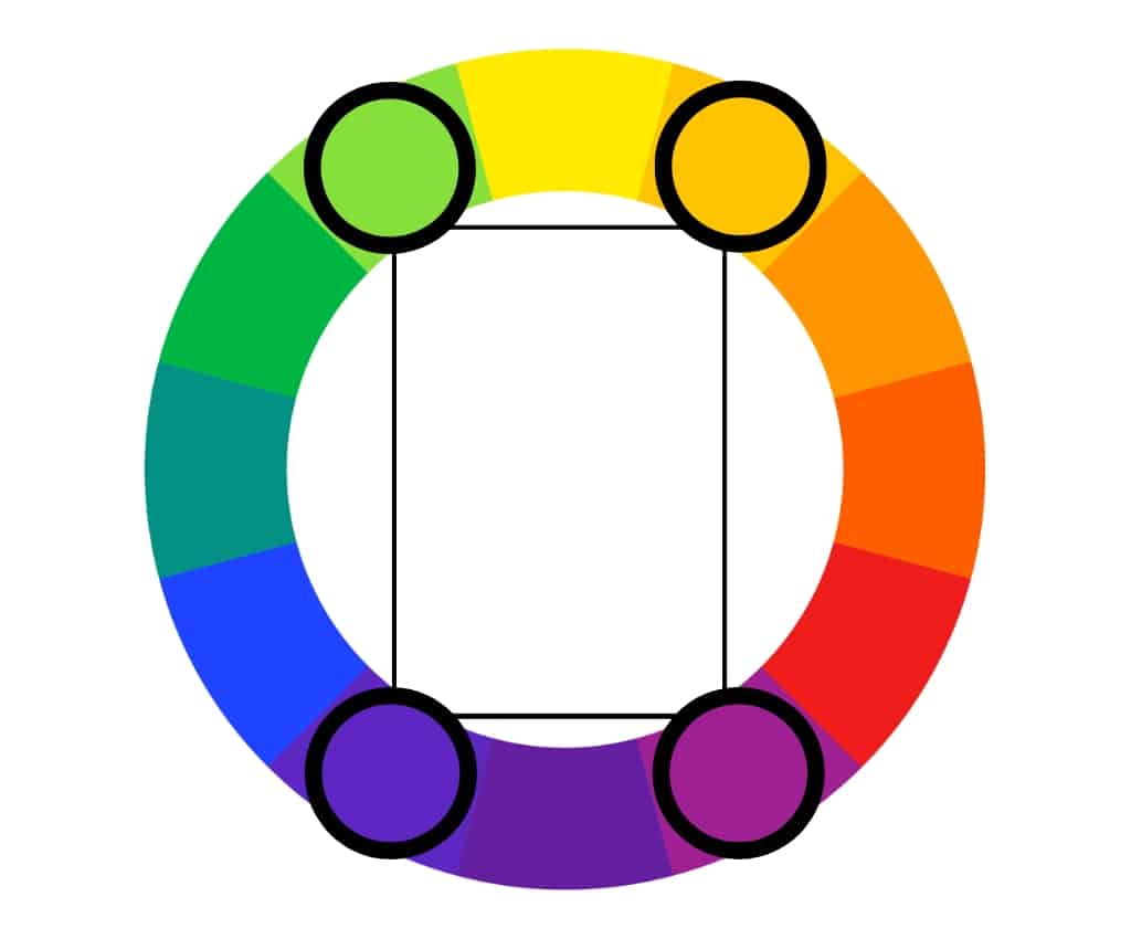
Another way of using color harmony is the tetradic color scheme.
The tetradic color scheme, or rectangle, is based on four colors forming a rectangle on the color wheel.
It is also called the double-complementary color scheme because it uses the complements of the first two colors chosen. So, it consists of two pairs of complementary colors spaced evenly around the color wheel.
This color harmony type provides a vibrant palette of contrasting colors.
To use the tetradic color scheme, choose colors one and three and their complements on the color wheel. One and three means to pick the first and third colors in any direction.
Or place a rectangle on the color palette and choose the colors of each corner.
Examples of tetradic color schemes:
- Red, green, yellow, and purple.
- Orange, blue, red, and green.
- Yellow, purple, orange, and blue.
- Amber, violet, vermilion, and teal.
However, this color harmony is complex and can be overwhelming if not chosen by a professional.
Square
The square color scheme uses four colors equally distant from each other on the color wheel. Using these equidistant colors creates a strong contrast but can be challenging to balance. Therefore, it is preferable to use one dominant color.
Examples of square color schemes:
- Red, green, amber, and violet.
- Blue, orange, magenta, and chartreuse.
- Yellow, purple, teal, and vermilion.
It’s similar to the tetradic color scheme, except that the square color scheme is based on four colors equidistant from each other.
Square color schemes are often used in web design because they are vibrant and playful.
Monochromatic
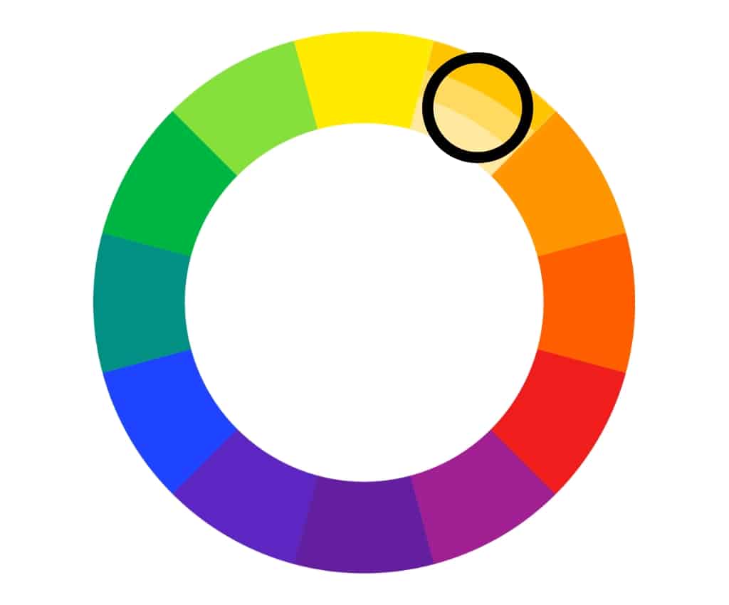
The monochromatic color scheme uses variations of a single color. You can use any base color and make variations by adding white, black, or gray. These variations are referred to as shades, tones, or tints.
Red, for example, can be turned pink by adding white, or maroon by adding black. Red, pink, and maroon together form a monochromatic scheme.
Furthermore, this scheme has four components:
- Hue: any color on the color wheel.
- Tone: created by adding gray (or black and white) to the base hue.
- Shade: created by combining a hint of black with the base hue.
- Tint: created by adding white to the primary hue.
This harmonious color scheme appears balanced and visually pleasing. However, it lacks color contrast and is less vibrant than the other ones.
Monochromatic color scheme examples include burgundy, madder, and crimson; misty rose, cherry blossom pink, and rose pompadour; Lapiz Lazuli, Prussian blue, and steel blue.
Color Harmony Chart
Here’s a chart of color harmony types so you can save it for future inspiration. However, these color combinations use the RYB color wheel used in traditional art.
Pros and Cons of Color Harmonies
Complementary color scheme
Pros: The complementary color scheme offers the most color contrast, making the design more eye-catching and vibrant.
Cons: Harder to balance compared to analogous or monochromatic schemes.
Split-complementary color scheme
Pros:
- The split-complementary color scheme contrasts similarly to the complementary color scheme but is more nuanced and subtle.
- It allows for more color choices while maintaining a strong contrast.
Cons:
- It requires a good understanding of color theory to execute properly and can be challenging to balance.
Analogous color scheme
Pros:
- The analogous color scheme creates a harmonious and soft palette by using colors adjacent to each other on the color wheel.
- It creates a calming effect.
Cons:
- It can be boring.
- Less contrasting than complementary, split-complementary, triadic, tetradic, or square color schemes.
Triadic color scheme
Pros:
- The triadic color harmony creates a high contrast between each color.
- Looks more balanced and harmonious.
- It is more dynamic than analogous or monochromatic schemes and offers more color variety.
Cons: It can be difficult to balance and visually overwhelming.
Tetradic color scheme
Pros:
- The tetradic color combination helps the bolder colors stand out.
- It offers more color variety than triadic schemes, allowing for more opportunities to create contrast.
Cons: It can be visually overwhelming if not used with one dominant color.
Square color scheme
Pros:
- The square color scheme provides a substantial contrast.
- Adds interest to your web design.
Cons:
- It is a less common color scheme but can create a unique and exciting look.
- Overwhelming if not used with one dominant color.
Monochromatic color scheme
Pros:
- The monochromatic color combination uses variations of a single color to create a clean and polished look.
- It is easy to use and creates a calming effect.
Cons:
- It can be seen as monotonous, as it relies on subtle variations in value and saturation to create interest.
- It lacks color contrast.
Last Words on Color Harmony Schemes
According to color theory, color harmony refers to color combinations that look pleasing to the eye, no matter how contrasting they are.
By using colors in harmony, you can create an aesthetically pleasing design that conveys different emotions, from warmth and serenity to playfulness.
Whichever color harmony examples you choose, your piece of art will stand out.
Did you enjoy reading about color harmony types? Please help us spread the word. Share it with your friends who might be interested as well.