
Wondering what the term “warm colors” refers to? Do you know what the word “warm colors” means? In today’s article, you’ll discover all about warm colors and the difference between cold and warm colors. Furthermore, here is a detailed warm color definition in art, design, or science.
Understanding cool and warm colors is essential part of color theory, whether you are an artist, graphic designer, or digital designer. Warm colors elicit a different set of emotions than cool colors. Let’s see what emotions they evoke and what color temperature is.
A Short Definition of Cool and Warm Colors
Since the beginning, the colors have been linked to the four elements: earth, water, air, and fire.
In 1704, Sir Isaac Newton discovered the color wheel, placing the light spectrum colors in a circle, like slices of cake. These were red, orange, yellow, green, blue, indigo, and violet.
In 1758, the chemist Robert Dossie published The Handmaid To the Arts, where he referred to the terms “warmth” and “coolness” used as color temperature by painters.
Robert Dossie said that the terms “warmth” and “coolness” refer to the emotions and feelings that the colors on the color wheel convey.
According to what he said, red and yellow lean towards “warmth,” while blue and green towards “coolness.”
In short, some colors evoke warmth while others evoke coolness.
In the last three centuries, the color wheel has become a 12-color wheel, with three primary, three secondary, and six intermediate colors, also called tertiary colors (in RGB).
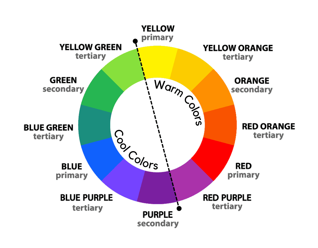
Primary colors in art are red, yellow, and blue, while secondary colors are those made up of their mixtures, such as green, orange, and purple.
The six intermediate colors sit between a primary and a secondary color.
So the traditional color wheel displays 12 colors.
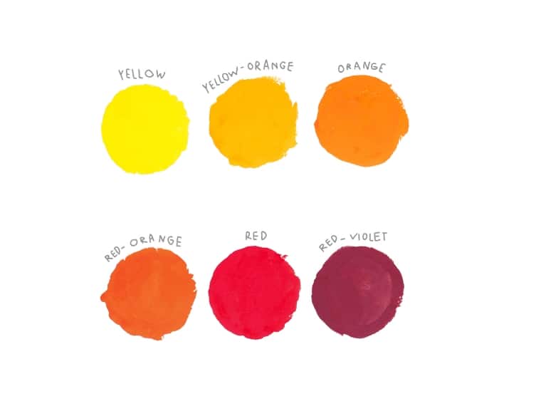
So what are warm colors? The warm colors are red, orange, yellow, yellow-orange, red-orange, and red-purple. They are associated with optimism, energy, and joyfulness.
But what is different between cool and warm colors? Warm colors have a red, orange, or yellow hue. On the other hand, cool colors include blue, green, and purple, as well as the colors in between.
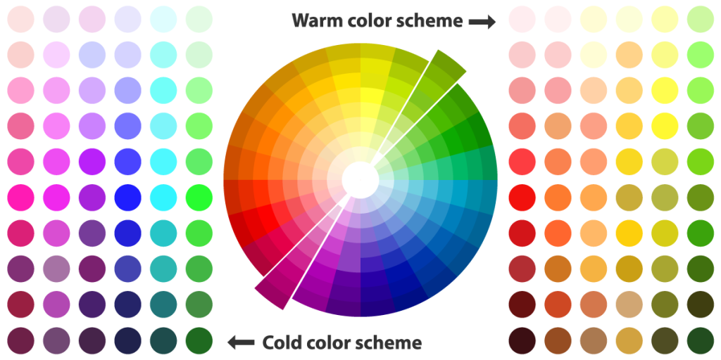
To make it easier, draw a line dividing the color wheel into two equal parts, where green makes contact with yellow. This way, you will have warm colors in the yellow half, and in the other half, cool ones.
While differentiating between colors facing each other on the color wheel seems simple enough, things get complicated when dealing with two neighboring colors.
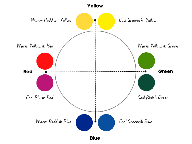
Each color carries a bias, known as color bias. It is biased towards a primary or a secondary color on the color wheel.
For example, red can lean towards blue or yellow.
When it leans towards yellow, it is a warm yellowish red; when it leans more towards blue, it becomes a cool bluish red.
Another example is green, which can lean towards yellow and become a warm yellowish-green or towards blue and become a cool bluish-green.
So Albert Einstein’s theory of relativity applies even in color theory. Everything is relative. Even color temperature is relative.
What is Color Temperature?
Color temperature describes the bright appearance of a light bulb, and is measured in degrees Kelvin (K). Colors above 5000 K are cool colors, colors between 2700 and 3000 K are warm colors.
However, color temperature refers to the warmth or coolness of a color. It is a characteristic of light sources and can also be applied to pigments used in art.
Color temperature is typically classified into three main categories: warm, cool, and neutral.
It is interesting that people prefer warm colors and bright light. Warm light with a temperature of 3000 Kelvin (K) is the most relaxing and calming. [1]
Cool versus Warm Colors
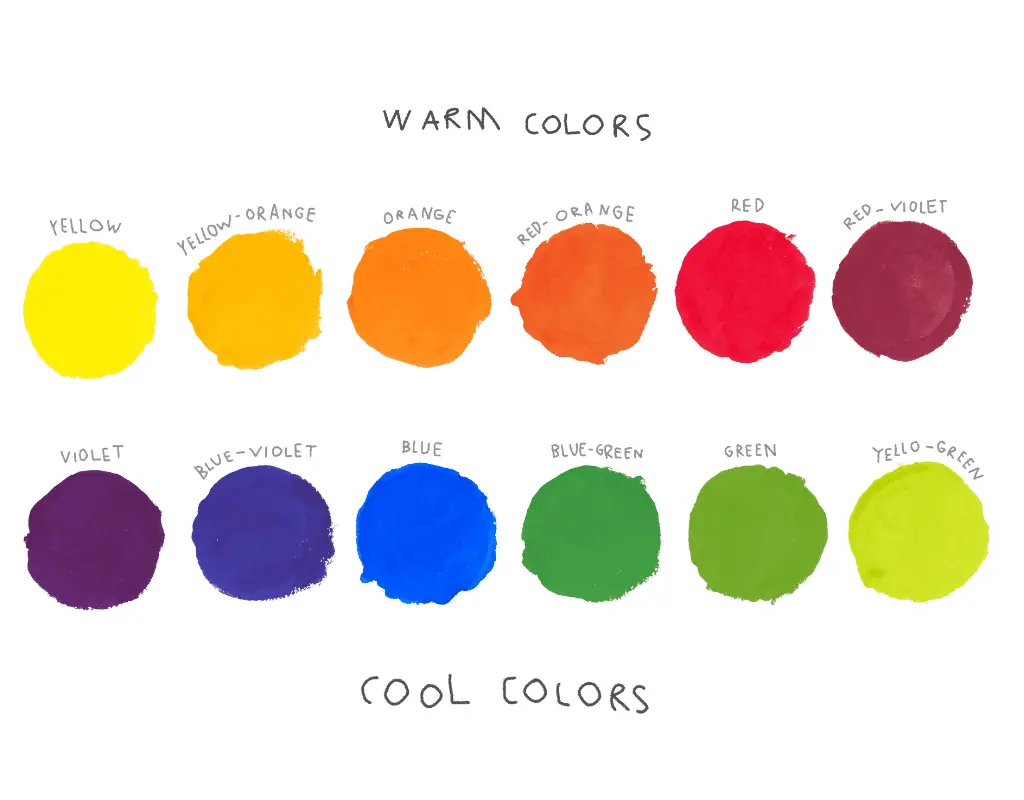
Warm colors include red, orange, yellow, and their variations (red-orange, yellow-orange, and red-violet). In addition, warm colors are associated with warmth, energy, and vibrancy.
On the other side, cool colors include blue, green, blue-green, purple, and blue-purple. They are associated with coolness, calmness, and tranquility.
Warm colors are associated with joy, excitement, and positivity, and they tend to advance in space, whereas cool colors are associated with relaxation, serenity, and introspection, and they tend to recede.
The Meanings of Warm Colors
Red, orange, and yellow are warm colors. If yellow and orange are associated with warmth, red is more associated with passion, courage, and energy.
Red means power, energy, action, courage, determination, passion, and desire. On the other hand, red can be associated with violence, dominance, anger, danger, and alertness.
Orange – a mixture of yellow and red – evokes warmth, positivity, optimism, enthusiasm, youth, and excitement. On the other hand, it can also be perceived as superficial and impatient.
Yellow is the color of happiness, associated with intellect, creativity, and optimism. In addition, yellow clarifies, energizes, inspires, and amuses.
Yellow also has negative meanings associated with cowardice, egotism, deception, and caution.
The Temperature of Neutral Colors
Now that you know what cool and warm colors are, let’s take a look at neutral colors.
Neutral colors have a balanced color temperature. They do not lean towards warmth or coolness, providing a sense of stability, balance, and neutrality.
Neutral colors include white, gray, beige, brown, ivory, taupe, and black.
Let’s not forget gold, silver, and pink. Is pink a warm color? The short answer depends on the red and white used in the mix. Pink is a desaturated shade of red, meaning a tint of red.
However, neutral colors change the temperature to a large extent depending on the surrounding colors.
Some artists consider gold and brown warm colors, while gray, silver, and white are cool. On the other hand, interior designers consider black, white, gray, and brown neutral colors.
Let’s see what each neutral color means.
Beige is associated with simplicity, calmness, and relaxation. Furthermore, beige symbolizes modernism, being friendly and welcoming. It really pleases the eye. Others perceive it as boring, plain, or bland.
Brown represents comfort, honesty, stability, and reliability. Brown also stands for simplicity, security, and practicality. Sometimes it can seem dull, overly conservative, and flat.
Gray is associated with neutrality, maturity, reliability, and intellect. It is a contrasting color that, despite appearances, calms and relaxes. However, gray can be associated with sadness and pessimism.
Black represents power, elegance, and sophistication. It is seductive, mysterious, and sometimes intimidating. Moreover, it is associated with formality, authority, and prestige. In its darkest meanings, this color represents pessimism and sadness.
Taupe is derived from the brown family and is associated with relaxation, modernism, and comfort. Taupe is rational, mindful, and insightful. On the other hand, it can be perceived as stubborn and closed-minded.
Silver is part of the gray family and is associated with modernism, sophistication, and intelligence. Silver also symbolizes healing and dynamism. Sometimes it can be seen as enigmatic and moral.
Gold represents wealth, prosperity, prestige, and success. It is a color that inspires, enlightens, and uplifts. This mix of yellow and orange is full of compassion, generosity, and optimism. The negative meanings are related to arrogance and selfishness.
Ivory is a color associated with elegance, softness, purity, calmness, and relaxation. Its delicacy comes from the mix of white with a splash of yellow.
Cool and Warm Colors in Interior Design
In interior design, there are neutral, cool, warm, and hybrid colors.
Warm colors include red, yellow, orange, gold, creamy neutrals, beige, tan, and brown.
Cool colors are blue, dark green, slate, gray, and deep purple.
Neutral colors include white, gray, brown, and gray.
Hybrid colors include various shades of green and purple, which may lean more toward the warm or cool side of the color wheel. This means they can be warm or cool.
How to Use Warm Colors in Design
The warm colors range from red to yellow and evoke happiness, energy, joy, and playfulness. Used in interior design, they tend to make spaces seem smaller, cozy, and more intimate. This contrasts with the cold ones, which have a more calming and soothing effect, promoting rest and relaxation.
As they transmit energy, it is advisable to use warm colors in dining or living rooms. Or even in kitchens.
However, using light neutrals on the walls, such as whites or cool grays, is advisable. This will help keep the room light.
The Relativity of Cool and Warm Colors
Although warm colors include red, orange, yellow, and those in between, they can also be cool.
For example, reds with a blue bias (such as Alizarin Crimson) are considered cool shades of red. On the other hand, reds with a yellow bias, such as Cadmium Red Light, are considered warm shades.
This is also the case for cool colors. Thus, Ultramarine Blue is a warm yellowish blue, while Cerulean Blue is a cool greenish blue. The difference is that one has a yellow bias, while the other has a green bias.
Color Temperature in Art
Warm colors in art refer to hues that convey emotions of warmth, cheerfulness, and energy. These are red, orange, and yellow, as well as the intermediate colors that contain these colors as a base hue.
Color temperature is vital in influencing our psychological and emotional responses to art. Different color temperatures can evoke specific feelings and moods.
In art, as in design, colors can be categorized as warm or cool. However, in art, in order to identify the temperature of one color, it is necessary to compare it with another.
Thus, to identify a cool red, you need to compare it with a warmer red.
Categorizing all shades of red as warm and all shades of blue as cool will only limit your use of color temperature in your paintings.
Artists, in general, have developed the art of using color relativity through experience. To acquire the art of color relativity, you must train your eye to perceive color temperature.
In this way, you will be able to enhance contrast and depth, highlighting nuances, expanding color possibilities, and creating different moods, balance, and harmony.
F.A.Q.
Is green a cool or warm color?
Green is generally a cool color, but when you compare two shades of green, you’ll notice that one can lean towards yellow (a warm yellowish green), and the other can be cooler.
Is black a warm or cool color?
Black is not a warm or cool color but rather is considered a neutral color. However, some colors close to black can have warm or cool undertones.
What is the difference between warm and cool colors?
Warm colors evoke warmth, energy, joy, and optimism, including reds, yellows, and oranges. On the other side, cool colors are those associated with water and nature, conveying feelings of calm and relaxation. These include greens, blues, and purples.