

Choosing the best color combinations is essential, whether you want to use them in fashion, art, or web design. Here is a selection of great color scheme ideas to inspire your next project!
Colors produce symmetry both spectrally and symbolically when they are nicely paired. This symmetry is called color harmony (aesthetic colors), which means eye-pleasing color combinations.
In today’s article, we’ll discuss the best color combinations in combos and color scheme ideas.
Color Theory
Color theory is a set of rules and guidelines that artists and designers use to communicate with their audience through harmonious and visually appealing color schemes.
Color Wheel
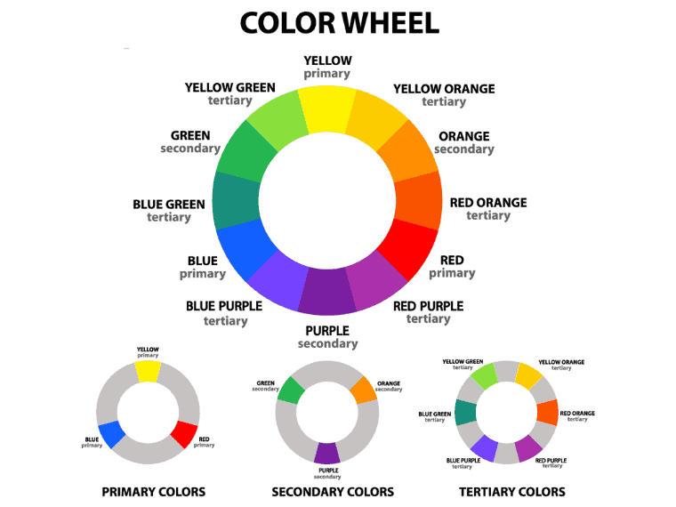
The color theory’s collection of rules and guidelines underlies the traditional color wheel, which was designed by Sir Isaac Newton in 1666.
The color wheel is an organization of color hues in a circle, showing the relationship between them. This visual representation is the basis of color theory.
There are several types of color wheels, but the traditional one consists of 12 colors:
- Three primary colors: red, yellow, and blue;
- Three secondary colors: orange, green, and purple;
- Six tertiary or intermediate colors: red-orange, yellow-orange, yellow-green, blue-green, blue-purple, red-purple
While secondary colors are made by mixing primary colors, intermediate colors are created by combining a primary and a secondary color.
Warm vs. Cool Color Combinations
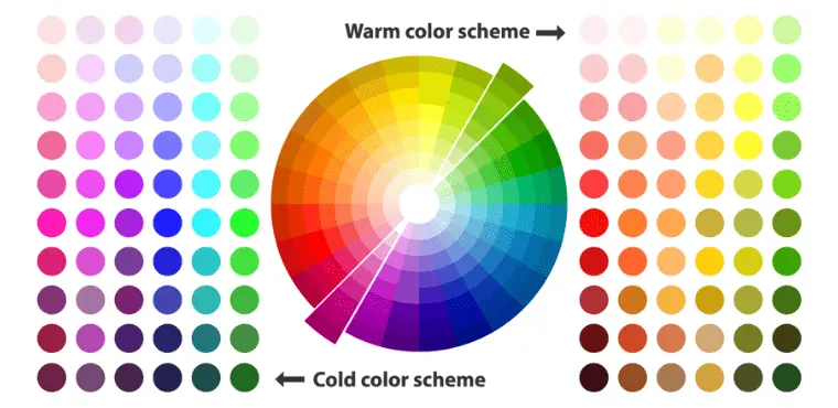
The color wheel is half warm colors and half cool colors.
Warm colors include red, orange, and yellow, as well as their mixtures.
On the other hand, the cool colors include green, blue, and purple, as well as their variations.
While warm colors are linked to emotions of joy, optimism, and energy, cool colors are calming and relaxing.
Learn more about warm vs. cool colors.
Types of Color Combinations
Color combinations come in several types. They can be complementary, split-complementary, analogous, triadic, square, or monochromatic.
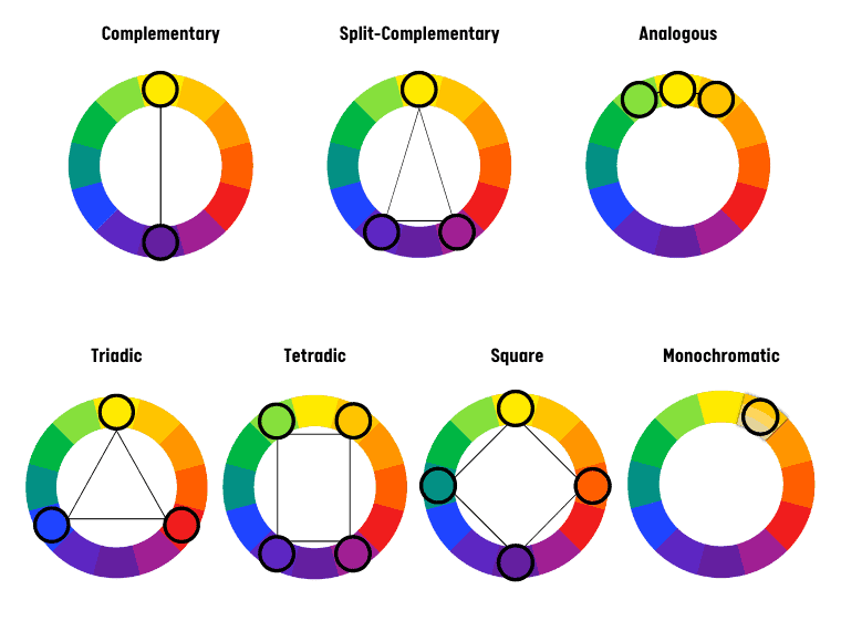
Complementary Color Combinations
Complementary color combinations include two colors that face each other on the color wheel. These combinations are eye-catching because they offer the greatest contrast. Furthermore, they represent the most basic type of color scheme.
Complementary color combinations include:
- Red, green
- Yellow, purple
- Blue, orange
- Yellow-green, red-purple
- Blue-green, red-orange
- Blue-purple, yellow-orange
Split-Complementary Color Combinations
This type of scheme is more complex than the complementary one as it contains three colors. Split-complementary color combinations include a base color and the neighboring colors of the opposite color. Examples include red, yellow-green, and green-blue.
This scheme, which forms an isosceles triangle on the color wheel, is often used by graphic designers because it provides strong contrast and vibrant colors.
Analogous Color Combinations
Analogous color combinations include two to five adjacent colors on the color wheel. Because they are close together, they offer a more pleasing harmony.
An example of an analogous color combination is red, red-orange, and red-purple.
To form an analogous color combination, choose three colors that are adjacent to each other on the color wheel.
These color combinations are used especially in interior design because they are eye-soothing and provide visual cohesion without becoming overwhelming.
Triadic Color Combinations
Triadic color combinations include three colors that form an equilateral triangle on the color wheel. For example, the primary colors are red, yellow, and blue.
To check that you have chosen them correctly, remember that you must have a three-color space between two colors.
This color combination is used to achieve a vibrant color palette.
Tetradic Color Combinations
Tetradic color combinations involve using four colors in the shape of a rectangle. This is two pairs of complementary colors, also called a “double-complementary color combination.”
Square Color Combinations
Square color combinations include four colors at the same distance on the color wheel, forming a shape similar to a square.
Thus, there are two pairs of complementary colors that offer an eye-catching result. These combinations are suitable if you want to convey a sense of playfulness.
Monochromatic Color Combinations
Monochromatic color combinations include a base hue and between 2 and 6 shades, tones, or tints of it. So this type of combination includes four shades:
- Hue: any color on the color wheel;
- Shade: a deeper version of a base hue that is created by adding black;
- Tone: a subtler version created by adding white to a base hue;
- Tint: a less intense color created by adding white to a base hue;
These are very pleasing to the eye.
Examples of monochromatic color combinations include:
- Navy blue and light blue
- Soft green and olive green
- Pink, red, and maroon.
Best Color Combinations to Inspire Your Next Design
Here are some of the best color combinations to inspire your next design.
1. Black and yellow
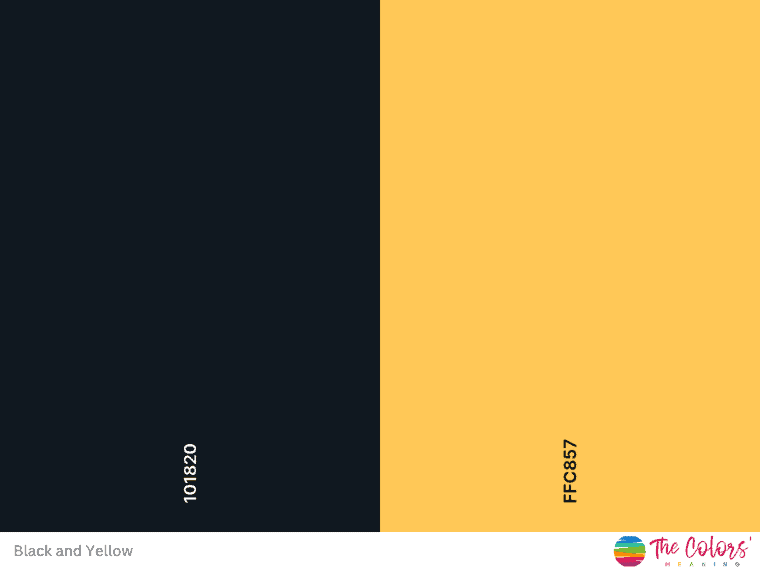
Yellow and charcoal (or black) is one of the most beautiful color combinations. Moreover, it is vibrant and offers a strong contrast.
Black is an elegant color associated with power, sophistication, and formality. On the other hand, yellow adds a note of happiness and optimism. It is energizing, inspiring, and playful at the same time.
Hex codes: Charcoal #101820, Yellow #FEE715
2. Royal blue and peach
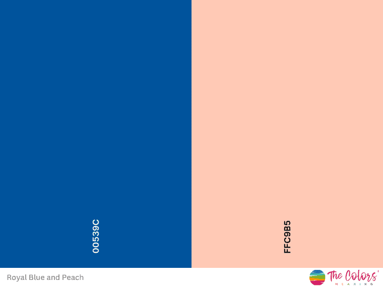
Royal blue and peach make a perfect color combination. The coolness of blue is balanced by the warmth of peach.
Peach is perceived as friendly, sweet, and pleasant. Moreover, peach evokes playfulness and vitality.
On the other hand, blue conveys trust, loyalty, and depth to this combination. It is associated with freedom, imagination, and wisdom.
Hex codes: Royal Blue #00539C, Peach #EEA47F
3. Lavender and teal
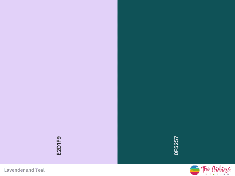
Lavender & teal is a trending combination nowadays.
Lavender is associated with grace, devotion, serenity, and calmness. This color is derived from purple – the color of royalty.
On the other hand, teal combines the freshness of green with the calmness of blue. Moreover, it is a color that offers clarity of thought.
So, they form a gorgeous combination. Both go well with neutrals such as off-white, smoke, or gray.
Hex codes: Lavender #E2D1F9, Teal #317773
4. Coral and teal
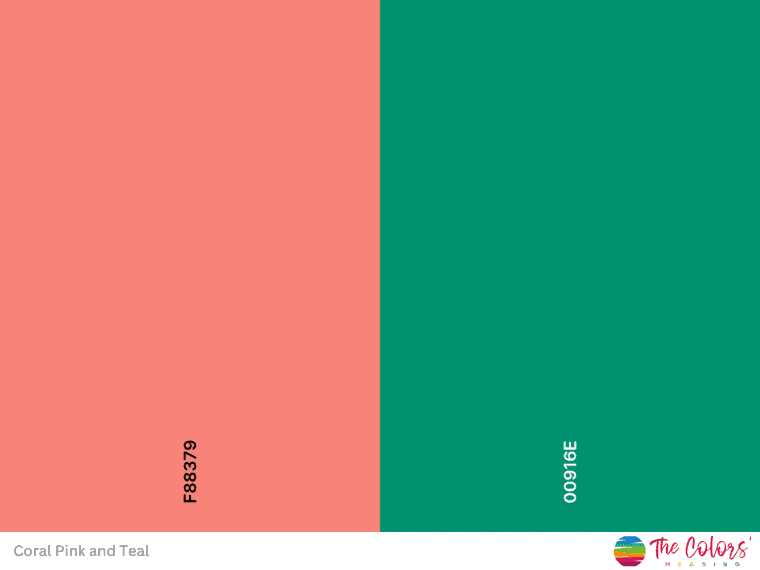
Coral and teal pair well together because they are variations of the intermediate colors red-orange and blue-green, which are complementary. Thus, they create a relaxing and visually pleasing color palette.
Coral is an orange-pink associated with joyfulness and freshness, borrowing from the softness of pink and the energy of orange.
Teal, the color of faith and truth for ancient Egyptians, relaxes and brings clarity of thought.
Wondering what color goes with teal and coral? The short answer is gray or soft gold.
Hex codes: Coral Pink #F88379, Teal #00916E
5. Blue and pink
Blue and pink go well together, creating a luxurious vibe.
Pink is a hint of red or a subdued red – a warm color. What’s more, pink is nurturing and playful, gently contrasting the coolness of blue.
Hex codes: Blue #2F3C7E, Pink #FBEAEB
6. Red and yellow
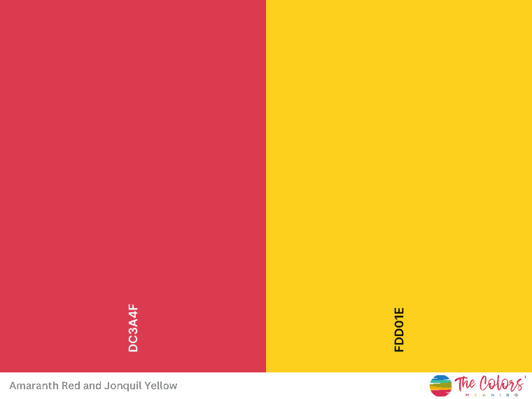
If you’re looking for a bold color combination, choose red and yellow.
Red is energetic, symbolizing passion, vitality, and courage. Yellow is more playful and is associated with enthusiasm, spontaneity, and optimism. So this combination inspires and energizes.
Hex codes: Amaranth Red #DC3A4F, Jonquil Yellow #FDD01E
7. Baby blue and white
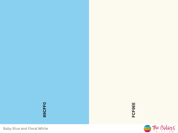
Baby blue and white (or off-white) is a soothing and relaxing combo. Blue stands for trust and reliability but soothes and relaxes at the same time. White is the color of simplicity and perfection. It refreshes and balances.
So this color combo works great for companies in the childcare or even healthcare industry.
Hex codes: Baby Blue #89CFF0, Floral White #FCF9EE
8. Orange and black
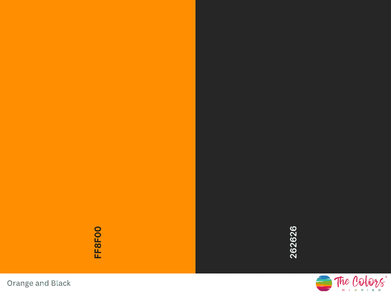
Even though they are diametrically opposed, orange and black make a striking and dramatic combination.
They represent warmth and cold, as well as light and darkness.
On the other hand, the mystery, power, and seriousness of black complement the enthusiasm and warmth of orange.
Hex codes: Princeton Orange #FF8F00, Eerie Black #262626
9. Sherbet orange and lilac
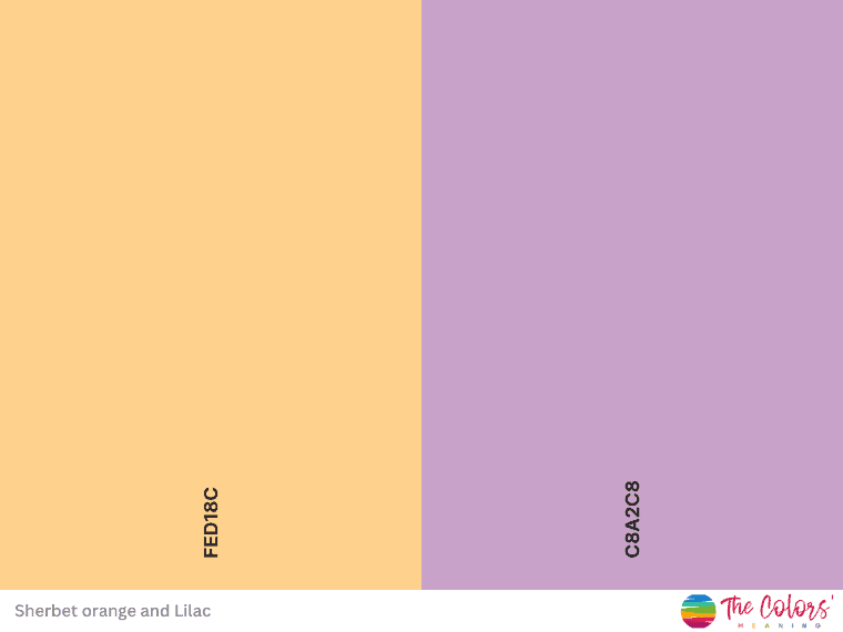
Lilac and sherbet orange combination incorporates relaxation and warmth, a perfect balance for a lovely color palette.
Lilac is the color of innocence, associated with youthfulness and friendliness.
Light or muted variations of orange are also associated with friendliness but are also soothing.
Hex codes: Sherbet orange #FFD2A6, Lilac #C8A2C8
10. Gold and magenta
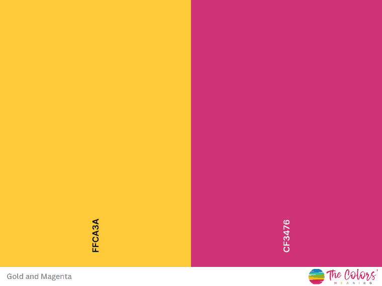
Gold and magenta combine to form an enchanting color scheme. Magenta is bold, passionate, and romantic, whereas gold is regal and elegant.
Moreover, magenta is deeper than pink but redder than purple.
In addition, gold contains 15% cyan, 81% magenta, and a small amount of black. As a result, it makes sense why it works well with magenta.
Add cyan if you desire a more striking trio to complement this color scheme. This will result in a triadic color combination.
Hex codes: Gold #FFCA3A, Magenta #CF3476
11. Emerald green and blush pink
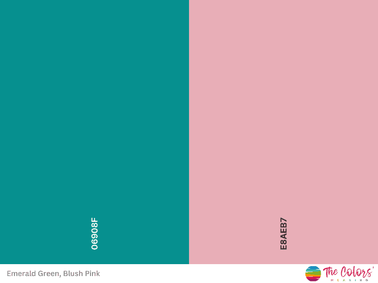
The combination of jewel and pastel tones gives a luxurious vibe. So emerald green and blush pink go well together. Although they offer high contrast, the dusty pink is quite soft for the emerald green.
Hex codes: Emerald Green #06908F, Blush Pink #E8AEB7
12. Hot pink and cyan
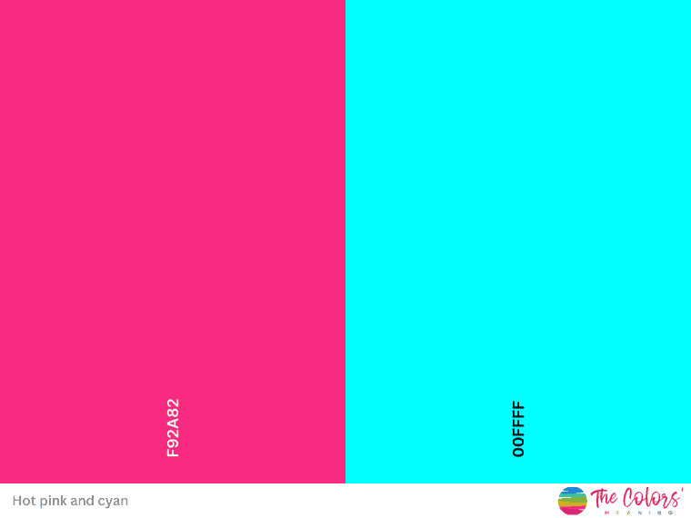
The combination of hot pink and cyan is an upgrade of the baby pink and baby blue combo in a more playful version.
This hot pink is similar to magenta. Furthermore, magenta and cyan are primary colors in the subtractive color model, known as CMYK.
Hex codes: Hot Pink #F92A82, Cyan #00FFFF
13. Forest green and burgundy
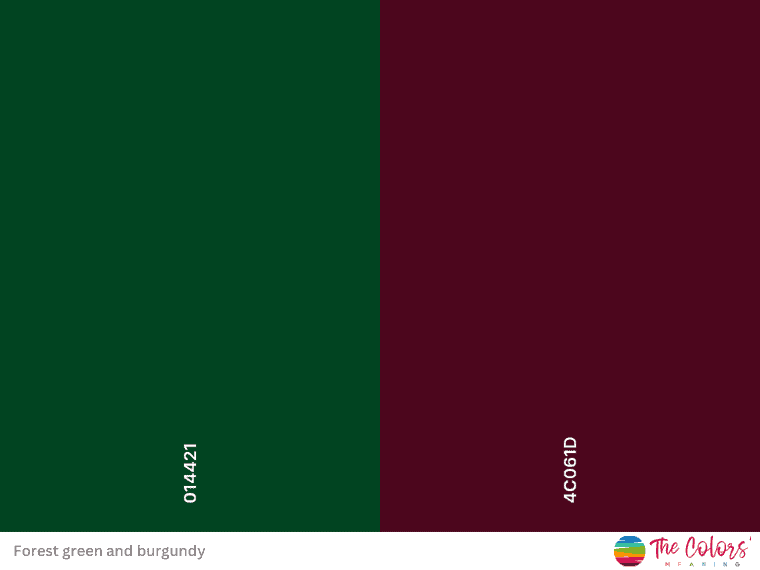
If you want a more traditional look, combine burgundy and forest green.
Burgundy, believe it or not, looks great with forest green and adds a formal touch. However, plenty of natural light is required to bring out their best qualities.
Alternatively, an off-white, such as #FBFFF9, could be added.
Hex codes: Forest Green #014421, Burgundy #4C061D
14. Turquoise and mustard yellow
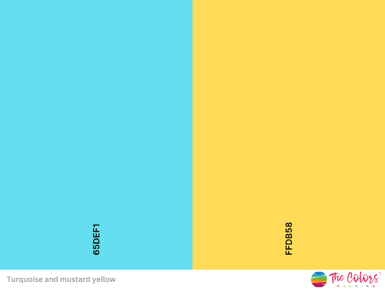
Turquoise is a blue and green color with some yellow undertones. As a result, it contains some of the yellow’s energy.
As a result, turquoise goes well with mustard yellow, which is a little lighter than gold.
Hex codes: Turquoise #65DEF1, Mustard Yellow #FFDB58
15. Gold and slate Gray
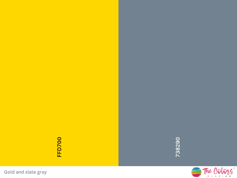
Any warm, deep-tone neutral, such as slate gray or charcoal, will complement the metallic gold. Furthermore, gray serves as a soft backdrop for gold.
Hex codes: Gold #65DEF1, Slate Gray #738290
16. Light Red and charcoal
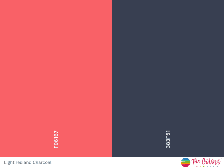
Light red and charcoal create a contrasting color combination that is visually striking.
The light red brings warmth and vibrancy to the palette, while charcoal adds depth and richness.
Paired together, these colors create a sophisticated look.
Hex codes: Light Red #F96167, Charcoal #383F51
17. Cardinal red, navy blue, and alabaster
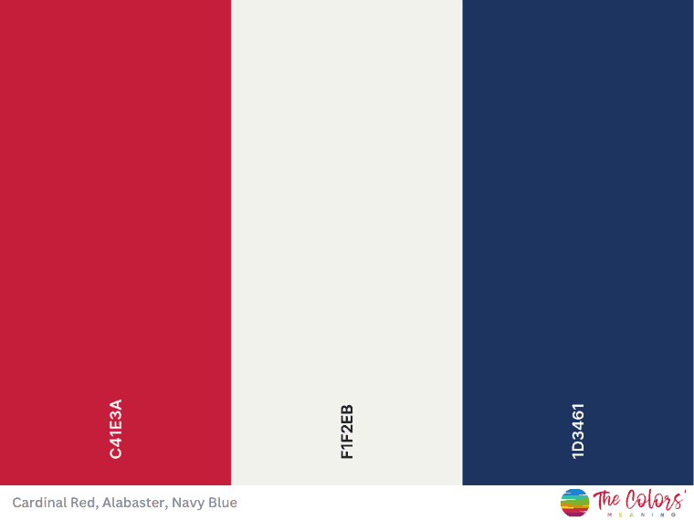
If you’re looking for a complementary color to navy blue, cardinal red is the best fit.
As a result, with both shades facing each other on the color wheel, this combination provides excellent contrast.
Furthermore, navy blue represents trust and stability but is a little more conservative and conventional. Cardinal red, on the other hand, evokes energy and determination.
Don’t forget to include an off-white to round out the color scheme.
Hex codes: Cardinal Red #C41E3A, Alabaster #F1F2EB, Navy Blue #1D3461
Stunning Color Scheme Ideas
18. Dark green, yellow, and burnt sienna – A bright color palette
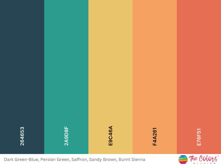
Suppose you’re looking for a bright color palette. In that case, this is for you: charcoal, Persian green, saffron, sandy brown, and burnt sienna – all paired together. These colors create an appealing color scheme.
Saffron is a warm, golden yellow-orange that adds a pop of color, while sandy brown is a neutral earthy tone that brings warmth and balance to the palette. Moreover, burnt sienna adds a touch of earthiness, while the first dark shade of greenish-blue serves as a rich and grounding base color.
Hex codes: Dark Green-blue #264653, Persian Green #2A9D8F, Saffron #E9C46A, Sandy Brown #F4A261, Burnt Sienna #EF6F51
19. Red and blue – Modern serenity
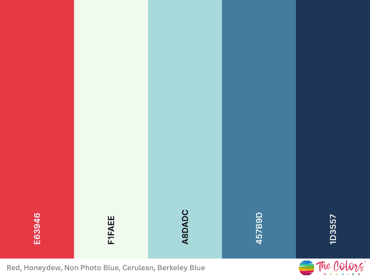
The warm red provides a pop of color, while the blues and honeydew balance and complement each other.
This vibrant red can serve as an accent color in your palette, adding a lot of energy. Honeydew is a light, neutral color that provides a soft backdrop, while blue adds a calming effect.
Cerulean, on the other side, adds sophistication to this color palette. In the end, Berkeley blue adds depth and intensity.
Overall, this combination creates an interesting and harmonious color scheme.
Hex codes: Red #E63946, Honeydew #FaFAEE, Non-photo Blue #A8DADC, Cerulean #457B9D, and Berkeley Blue #1D3557
20. Thistle, pink, and light blue – Enchanted dreams
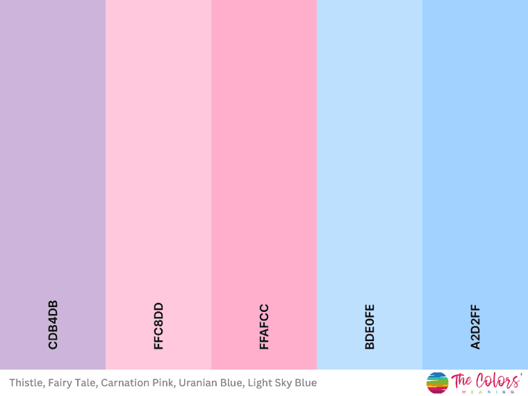
Here is one of the most beautiful color palettes with soft colors.
Thistle, a light purple shade, pairs well with the delicate pastel hues of fairy tale and carnation pink.
Uranian blue and light sky blue offer a refreshing touch of light blue to the color scheme, producing a pleasing contrast.
Hex codes: Thistle #CDB4DB, Fairy Tale #FFC8DD, Carnation Pink #FFAFCC, Uranian Blue #BDE0FE, Light Sky blue #A2D2FF)
21. Green and brown – A harmony blossom with earthy colors
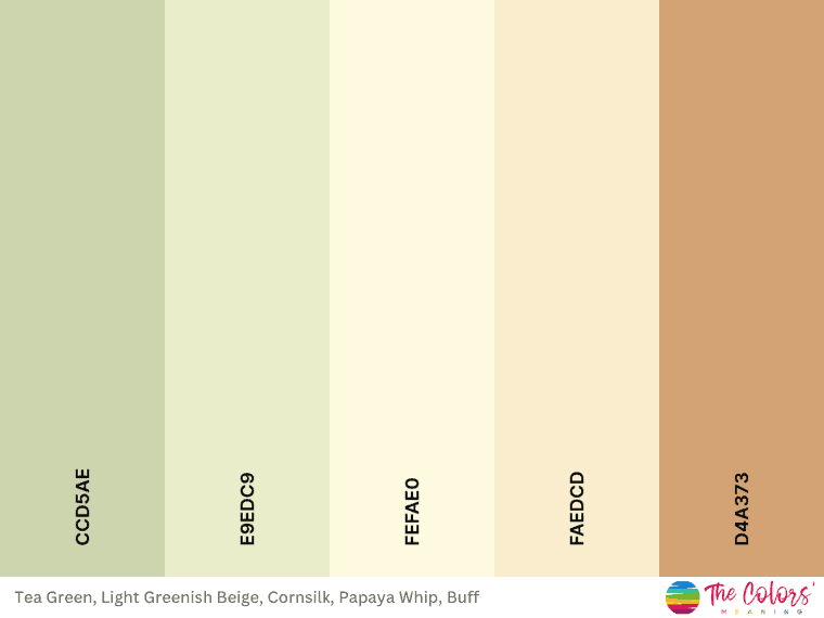
This color combo consists of tea green, beige, and cornsilk. They all together bring forth a sense of tranquility and harmony reminiscent of nature.
This classy color palette creates a harmonious and soothing combination of colors. The tea green serves as a gentle base color, offering a calming and natural backdrop.
Moreover, papaya whip adds a touch of softness and delicacy, while buff adds warmth.
In addition, the pale yellow of cornsilk introduces brightness and lightness to the palette, harmonizing well with the other warm tones.
Hex codes: Tea Green #CCD5AE, Beige #E9EDC9, Cornsilk #FEFAE0, Papaya Whip #FAEDCD, Buff #D4A373
22. Blue, yellow, and orange – Coastal brilliance
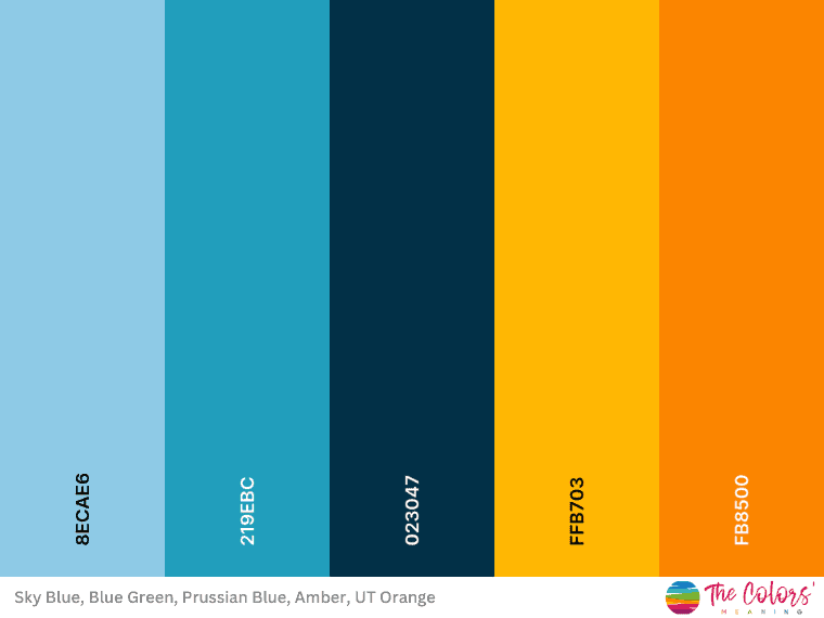
This name reflects the vibrant and refreshing nature of the colors in the palette, evoking imagery of a picturesque coastal landscape.
Sky blue represents the clear and serene sky, while blue-green captures the hues of the ocean waters.
Furthermore, orange tones give energy, recalling sandy beaches at sunset, while Prussian blue adds intensity.
Hex codes: Sky Blue #8ECAE6, Blue Green #219EBC, Prussian blue #023047, Amber #FFB703, and UT Orange #FB8500
23. Blue, orange, and gray – Elegant color combination
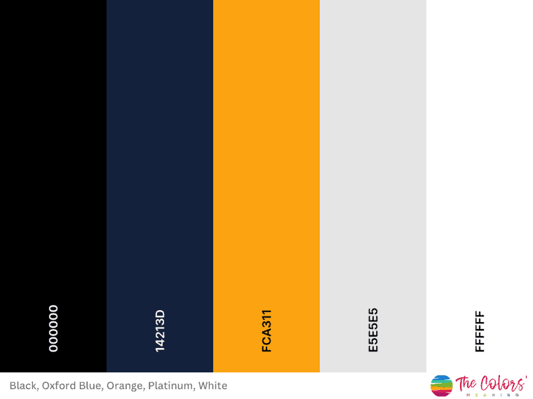
This black and orange combination highlights the striking contrast between the dark and light shades.
The rich black and deep Oxford blue colors create a sense of sophistication and depth, while the vibrant orange adds a bold and energetic touch.
Platinum and white evoke elegance, and cleanliness, complementing the other ones.
Hex codes: Black #000000, Oxford blue #14213D, Orange #FCA311, Platinum #E5E5E5, White #FFFFFF
24. Yellow, pink, and coral – Serene sunrise
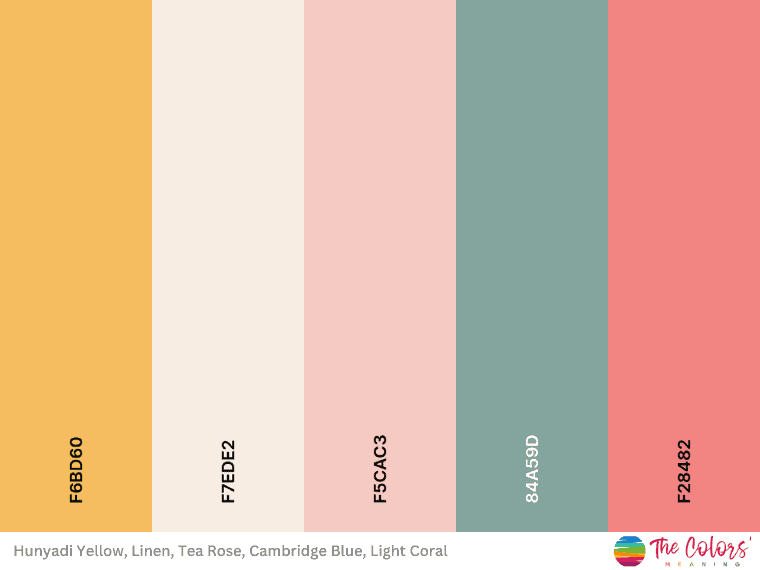
Looking for a palette that evokes calmness and serenity? This one is for you.
This pastel color palette reflects the gentle and calming nature of the colors, evoking the peaceful atmosphere of a serene sunrise.
The warm undertones of tea rose harmonize with the cool tones of the Cambridge blue, resulting in a balanced and aesthetically pleasing contrast.
Hex codes: Hunyadi Yellow #F6BD60, Linen #F7EDE2, Tea Rose #F5CAC3, Cambridge Blue #84A59D, Light Coral #F28482
25. Blue, gray, and red – Eternal contrast
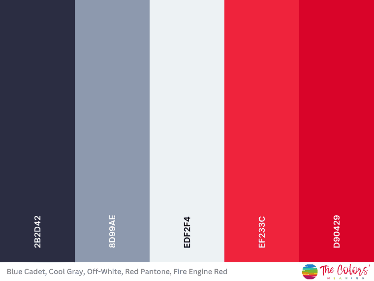
This elegant color palette contrasts the deep blue, cool gray, and vibrant red shades.
The gray tones balance the intensity of blue and the vigor of red.
Moreover, the off-white color adds a timeless and classic touch.
Hex codes: Blue Cadet #2B2D42, Cool Gray #8D99AE, Off-White #EDF2F4, Red Pantone #EF233C, Fire Engine Red #D90429
26. Caribbean blue, pink, and brown – Tropical Waters
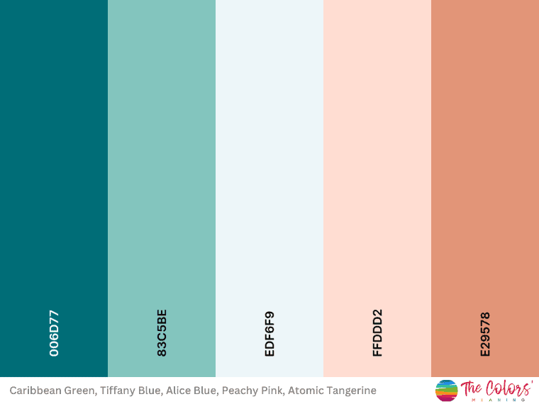
Caribbean Green and Tiffany Blue complement each other well, as both are shades of blue-green with a refreshing and tropical feel.
Moreover, Alice blue is a pale blue shade, adding a sense of tranquility.
And how could the delicacy of peachy pink be missing from this palette?
Hex codes: Caribbean Green #006D77, Tiffany Blue #83C5BE, Alice Blue #EDF6F9, Peachy Pink #FFDDD2, Atomic Tangerine #E29578
27. Buff, pink, and sage – A neutral harmony
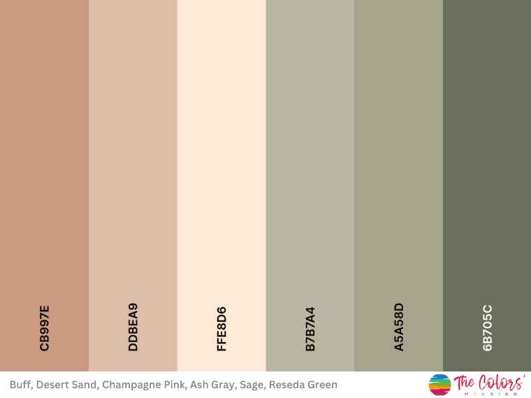
Buff and Desert Sand are warm earthy tones that convey feelings of warmth and comfort.
Furthermore, champagne pink adds a touch of softness and elegance to this combination. At the same time, Ash Gray provides a neutral and balanced tone.
The combination of warm earth tones, soft pink, and natural greens creates a sense of tranquility, connecting you to nature.
Hex codes: Buff #CB997E, Desert Sand #DDBEA9, Champagne Pink #FFE8D6, Ash Gray #B7B7A4, Sage #A5A58D, Reseda Green #6B705C
28. Lavender, Thistle, and gray – A lovely lavender color palette
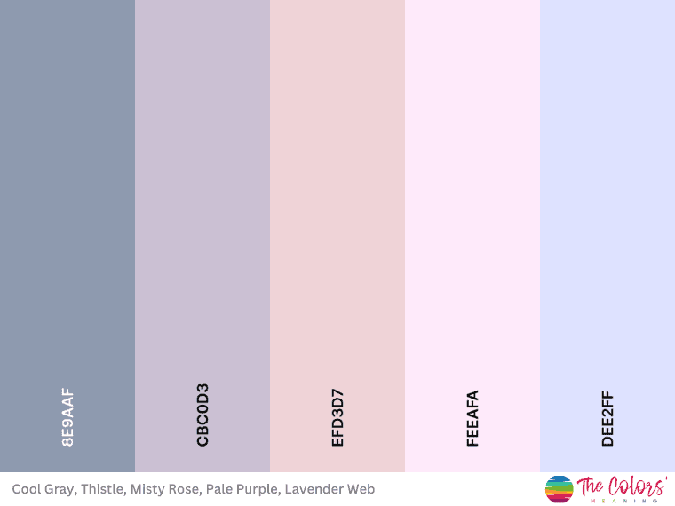
This is one of the most beautiful lavender color palettes, which conveys a calming atmosphere.
The combination of these hues creates a gentle and soothing palette reminiscent of a dreamy haze.
Gray and thistle’s cool undertones combine seamlessly with the delicacy of pink and purple – both in a light variation.
Hex codes: Lavender Haze #8E9AAF, Thistle #CBC0D3, Misty Rose #EFD3D7, Pale Purple #FFEAFA, Lavender Web #DEE2FF
29. Orange and green color scheme
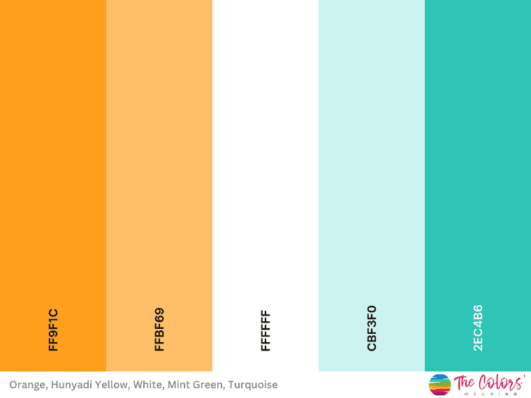
There are many orange color schemes, but not all of them have soothing qualities like this one. That’s thanks to turquoise and mint green.
Mint green and turquoise are adjacent colors on the color wheel, complementing each other naturally. In addition, the vibrant orange and the cheerful yellow enhance their refreshing and calming naturelow.
Some may call this combination an orange and green color scheme because turquoise is a mix of green and blue.
But turquoise can also be made by mixing blue with a splash of yellow. So now makes sense why it works so well with shades of yellow and orange.
Hex codes: Orange #FF9F1C, Hunyadi Yellow #FFBF69, White #FFFFFF, Mint Green #CBF3F0, Turquoise #2EC4B6
30. Green and Pink – A pastel color palette
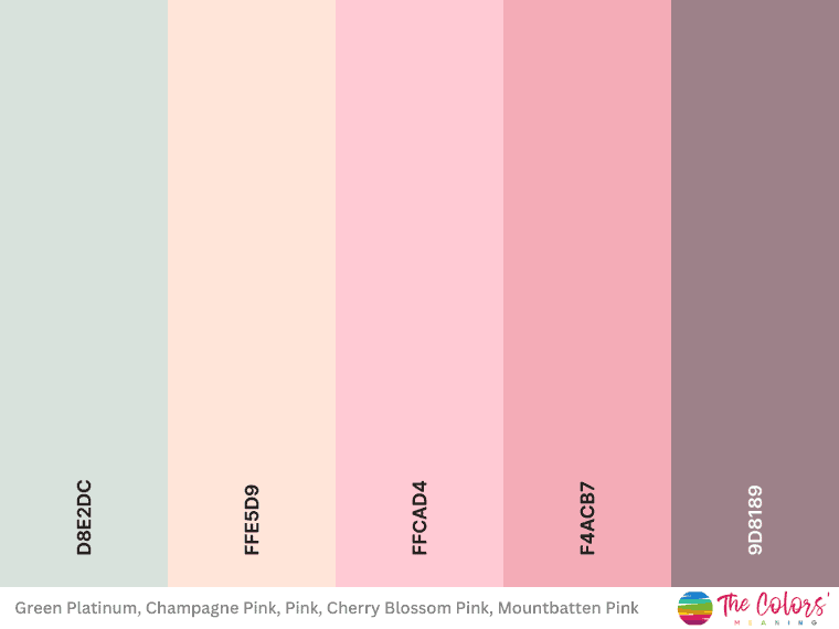
Here is a great example of pastel colors that go together.
This pastel color combination evokes a sense of elegance, charm, and tenderness. Moreover, the soft shades of pink create a romantic vibe.
This palette is well-suited for romance, beauty, and femininity designs.
Hex codes: Romantic Blooms, #D8E2DC, Champagne Pink, #FFE5D9, Pink, #FFCAD4, Cherry Blossom Pink, #F4ACB7, Mountbatten Pink, #9D8189
Last Words on Color Combinations
In conclusion, selecting the right color combinations for your next project is a crucial aspect of design that can significantly impact its success.
Understanding the principles of color theory and staying aware of current trends can help you create eye-catching color schemes and engaging designs.
Did you like this article about color combinations? Share it with your friends interested in bright color palettes and awesome color combos.