
Learn about warm and cool colors and how to use them effectively. Discover how to recognize them easily.
When discussing warm vs. cool colors, color temperature is one of the most significant factors to consider.
You won’t be able to differentiate between cool and warm tones unless you comprehend this notion.
Today’s article will go over cold vs. warm colors, how to identify them, and how to use them to your advantage.
Definition of Warm and Cool Colors
Colors have long been associated with four elements: air, earth, water, and fire.
Later, in 1704, Isaac Newton created a wheel with light spectrum colors. Among them are red, orange, yellow, green, blue, indigo, and violet. As a result, the color wheel was born.
The English-born experimental chemist Robert Dossie published “The Handmaid to the Arts” in 1758, in which he discussed the use of the terms “warmth” and “coolness” by painters. These were the emotions and feelings evoked by each color on the color wheel.
As a result, painters associated red and yellow with warmth, while green and blue were associated with coolness.
Color theories have remained largely unchanged over the last three centuries.
The color wheel is made up of three primary colors (red, yellow, and blue) and three secondary colors (green, orange, and purple). Splitting the color wheel separates cool and warm colors.
Warm and Cool Colors
Color temperature describes a color’s warmth or coolness. This is crucial not just in achieving a color balance but also in eliciting psychological responses.
Warm colors typically appear to advance. Furthermore, cool colors seem to fade. For example, putting a cold purple next to a warm yellow will produce tension. This circumstance will force the eye to focus on the yellow rather than the purple.
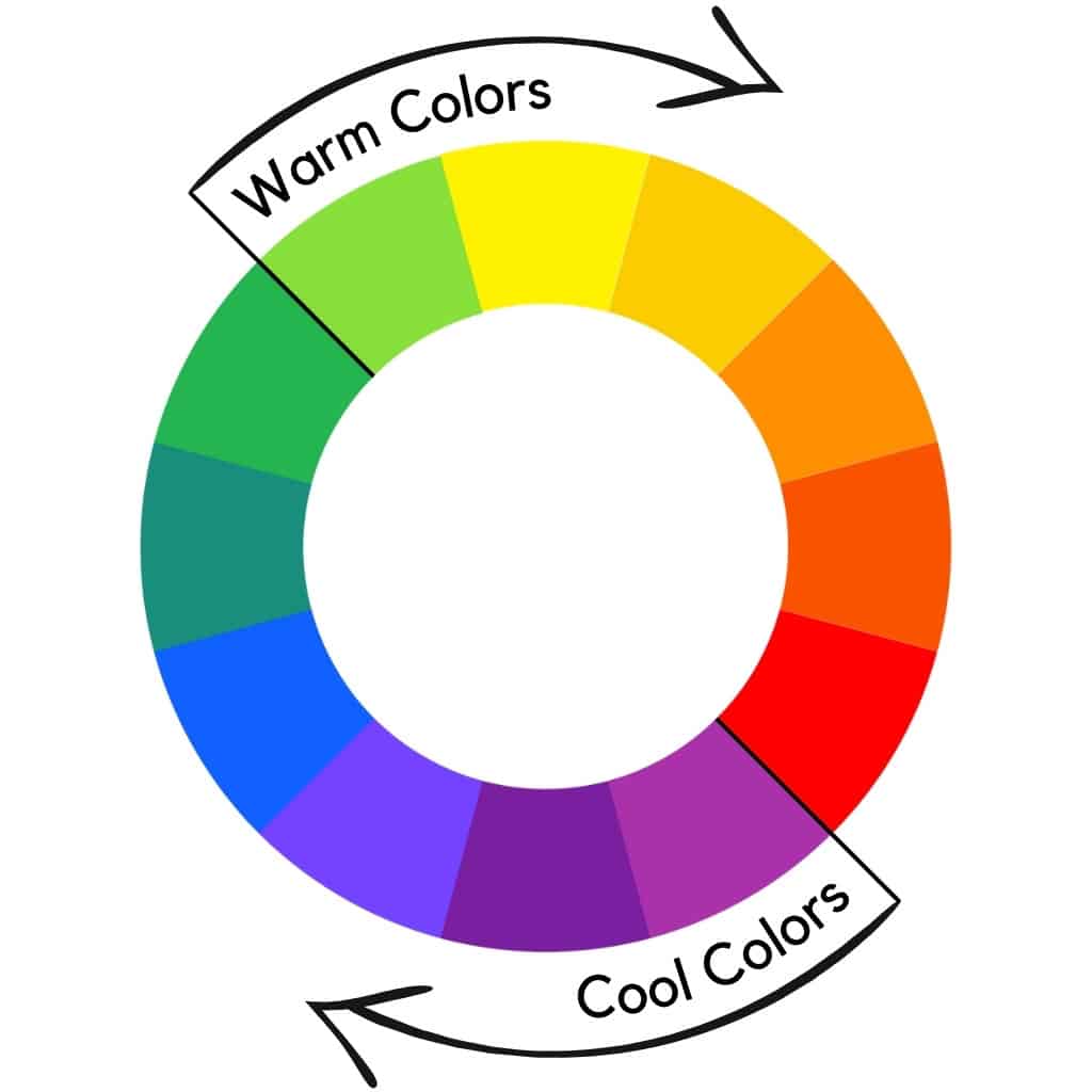
By dividing the color wheel in half, the painters’ color wheel differentiates warm and cool colors.
The warm and cool color wheel denotes that half of it is warm and the other half is cool.
Warm colors include red, orange, and yellow, similar to sunsets’ colors. Green, blue, and purple are cool colors that remind us of the sky, oceans, and nature.
Warm colors convey vitality, optimism, and creativity, while cold colors evoke relaxation and calm. Furthermore, warm colors have a stimulating effect from a psychological standpoint.
Color Theory
According to color theory, cool colors begin on the color wheel with red and progress through orange, yellow, and yellowish green, while warm colors include shades of green, green-blue, blue-violet, and violet.
However, factors such as dimensionality, color temperature and contrast to other colors are important.
Dimensionality
Warm colors appear closer to the human eye than cool colors. Cool colors are used by artists to depict distant objects or elements in 2D or 2.5D.
Interior designers frequently use cool colors to make tiny spaces appear larger. Warm colors, on the other hand, are typically used in larger spaces to generate feelings of warmth and comfort.
Color Temperature and Light
Consider the time of day when thinking of warm and cool colors in a painting. While morning colors are typically colder than midday, late afternoon colors are typically warmer.
In physics, light is a relatively narrow spectrum of electromagnetic waves that the human eye can perceive. It is known as the visible spectrum.
Thus, light wavelengths cause humans to experience colors. Violet and blue have the shortest wavelengths. In addition, yellow, orange, and red have the longest wavelengths.
For example, the human eye perceives blue between 430 and 500 nanometres in the visible spectrum. In comparison, red is perceived between 625 and 740 nanometres.
Color Temperature and Contrast
Color contrasts in the digital world influence your perception of cool and warm colors. As a result, an intermediate color is more likely to be perceived as warmer than a clear, cool color. Conversely, if this intermediate color is placed next to a clear, warm color, the former will appear cooler.
In other words, warm colors with higher intensities will appear warmer than cool colors with lower intensities.
As a result, contrast can influence your impression of color temperature.
On the other hand, colors have various tones, and one color’s temperature may be cooler than another. For example, some blue colors may be warmer than others, while some yellow shades may be cooler.
Cadmium lemon and Cadmium yellow pale are wonderful examples of cold and warm yellow. The first is a cool yellow, but the second is a warm yellow.
Relativity of Warm and Cool Colors
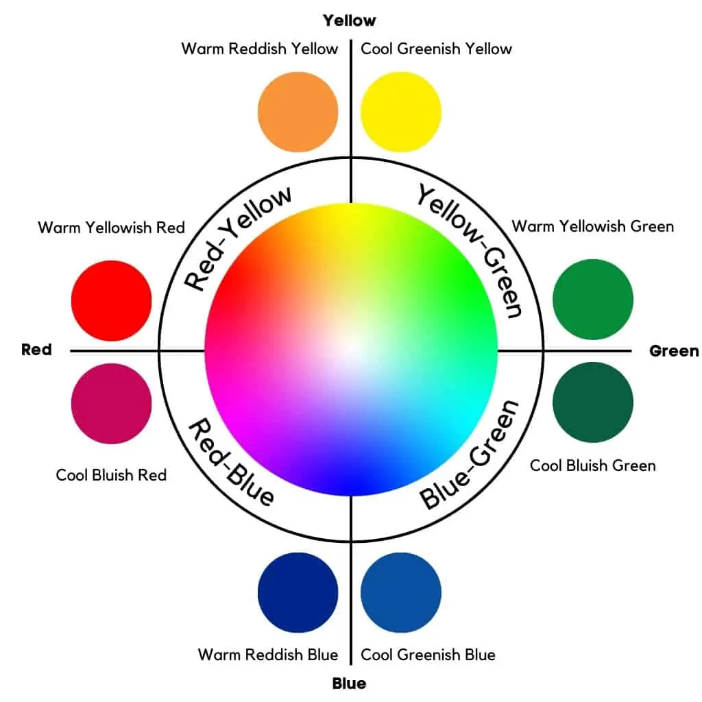
Warm vs. cool colors are relative terms. For example, each color, whether primary or secondary, leans toward another color. This is referred to as color bias. As a result, blue may have a green or red bias, and red may have a yellow or blue bias.
Because of relativity, one hue of red may be warmer than another.
Warm red vs. cool red
You can use both a cool blueish red and a warm yellowish red. Although these are shades of red, they are not the same temperature or equally warm.
Furthermore, red may be biased toward yellow or blue. As a result, warm reds have a yellow bias, whereas cool reds have a blue bias. So, to clarify, warm red vs. cool red equals yellowish red vs. bluish red.
Warm yellow vs. cool yellow
Warm yellows have a reddish bias, whereas cool yellows have a greenish bias. As a result, a reddish shade of yellow is warmer than a greenish yellow hue.
Warm blue vs. cool blue
A reddish blue is warmer than a greenish blue. Therefore, warm greens are yellow-biased, whereas cool greens are blue-biased.
Cool green vs. warm green
Can you imagine a comparison between cool green and warm green? A cool green has a bluish undertone, whereas a warm green has a yellowish undertone.
So, in terms of warm vs. cool colors, comparing two colors is simple.
When comparing two tones, there can be warm and cool greens, blues, reds, and yellows when comparing two tones. In this case, apply the concept of color bias.
You now understand how to distinguish between warm and cool colors. Let’s discover how to determine the color temperature.
How to Identify the Color Temperature
Identifying the temperature of a color is frequently subjective, depending on the color space in question.
Most theories employ a color wheel with three primary and secondary colors. This wheel is divided into warm and cool colors by a line.
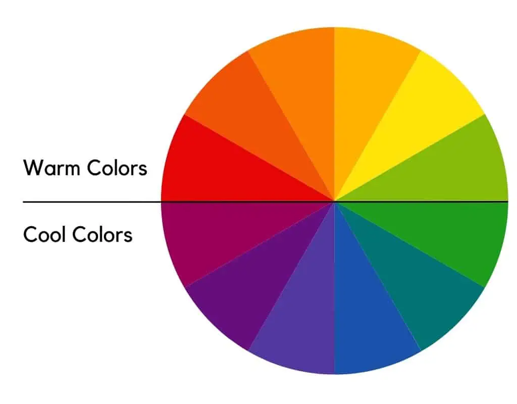
The warm colors are red, orange, and yellow, whereas the cool colors are green, blue, and violet.
Here are the main color spaces and how to determine the color temperature.
RYB Color Wheel
The RYB color wheel is applied in painting and art and is based on the notion of mixing paints.
The RYB color wheel has 12 different colors. The primary colors are red, yellow, and blue.
The secondary colors are orange, green, and purple. Red-orange, yellow-orange, yellow-green, blue-green, blue-violet, and red-violet are the tertiary colors.
The RYB’s tertiary colors are created by combining a secondary and a primary color.
Among the RYB primary colors, red and yellow are warm, whereas blue is cool. Furthermore, among the secondary colors, orange is warm, whereas green and violet are chilly.
You can make a specific color by combining different pigments according to the RYB color scheme.
However, in the world of painting, there are warm and cold greens, blues, reds, and yellows, as well as earth colors, blacks, and whites.
A bluish green is, therefore, cooler than a yellowish green. Furthermore, reddish yellow is warmer than greenish yellow.
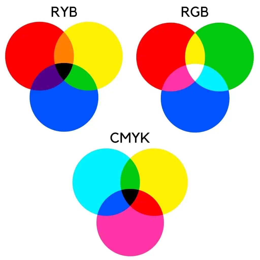
RGB Color Wheel
The RGB color wheel is used in digital applications such as web design, graphics, and digital art. More specifically, any monitor or screen employs the RGB color space.
This color space’s name is derived from the acronym of the colors used: red, green, and blue. Red is a warm color, whereas green and blue are cool colors.
Red, green, and blue are the primary colors in the RGB. In contrast, cyan, magenta, and yellow are secondary colors.
You can use two or more colors to create a specific color in RGB.
In the RGB color space, cool hues have more blue than red. As a result, RGB values of 0, 0, 255 equate to blue, the coolest color.
At the same time, the warmest color has RGB values of 255, 0, 0, linked to pure red.
To determine the color temperature in the RGB system, examine the RGB values of the color. For example, the more red you have, the warmer the color will be. Alternatively, more blue will make your color cooler.
Green in the RGB color space switches between several turquoise, green, and yellow colors. Each of these becomes increasingly warm.
As a result, the closer the green value in RGB approaches 255 (the maximum value), the cooler it becomes. The closer it gets to zero, the warmer it gets.
As a result, warm and cold colors in the RGB color space contain varying amounts of green in their composition.
Finally, darker colors of red have less green than lighter shades. Darker colors of blue, on the other hand, have less green in their composition than lighter ones.
CMYK Color Wheel
The CMYK color wheel is used in printing. When you print something, the printer combines the pigments from the ink cartridges to produce the desired color.
Cyan, magenta, yellow, and black make up the CMYK color space. While cyan and black make a color appear cooler, magenta and yellow make it warmer.
In addition, because it absorbs light wavelengths, it is considered a subtractive model.
The more magenta and yellow you use, the warmer the color. Alternatively, using higher cyan and black values results in cooler hues.
HSV
Unlike RGB and CMYK, which use primary colors, HSV is the closest system to the human eye’s visual perception of color. As a result, whereas RGB and CMYK are hardware-oriented color models, HSV is a user-oriented model.
This system employs three components: hue, saturation, and value. As a result, the HSV model describes colors in terms of saturation and brightness.
Color is encoded by hue, while saturation is encoded by how “full” the color is. The less saturated it is, the closer it is to white. Furthermore, the value denotes how dark the color is. The lower the value, the darker and closer to black the color is.
The hue can have values between 0 and 360, which correspond to the angle of a circle. The saturation and value range from 0 to 100.
As a result, warm and cool colors in HSV color space are highly subjective. Warm colors have hue values ranging from 0-80 to 330-360. In addition, cool colors have hue values ranging from 80 to 330.
Warm vs Cool Colors in Painting
When we talk about color, we might relate its temperature to the seasons. This will make it easier for you to understand the relationship between warm and cold colors.
Furthermore, this will assist you in determining whether a color is warm or cool.
Summer is hot, and the hottest color is red. As a result, red is appropriate for that season.
Autumn features oranges, yellows, red oranges, and mixes of these colors.
Winter provides blues, violets, dark greens, and the season’s coolness. Finally, spring has the darker greens of nature as cool hues on one side and the warm colors of flowers in red, orange, and yellow on the other.
As a result, this natural cycle will assist you in breaking down the color wheel and determining if a color is warm or cold.

In arts and painting, warm colors consist of reds, oranges, and yellows, as well as their mixtures. Furthermore, cool colors include blue, purple, and green, as well as their combinations.
On the other hand, blueish violets and blueish greens are the coolest colors on a palette.
According to the subtractive color system, green is made up of yellow and blue. As a result, the less yellow included, the cooler the resultant color.
Furthermore, adding primary red to blue results in vivid violet blues. The less red used, the cooler the violet.
Furthermore, yellowish green and reddish blue are regarded as the warmest of the cool colors or the coolest of the warm colors, respectively.
Color Psychology
Warm colors evoke energy, strength, optimism, enthusiasm, and creativity. The temperature of warm colors suggests the psychologically established feeling and sensation. The warm colors can be seen in sunsets and fire.
Cool colors are associated with the sky, the ocean, and nature. As a result, they provide feelings of peace, calm, and freedom. Moreover, the cool colors are balancing.
Cool colors, however, evoke feelings of coldness and distance due to their association with wintery landscapes, cloudy skies, and a lack of light.
Have you ever noticed that in cold light, nature appears to have a bluish or violet tone? This is where the connection comes from.
The relationship between warm and cool colors can be linked to people’s ages. Warm colors are stimulating, whereas cool colors are soothing. As a result, children will always prefer warm colors, and as they grow older, they will prefer cooler colors.
So it’s easy to see how color temperature affects color psychology and the emotions associated with it.
Mixing Warm and Cool Colors
Combining warm and cool colors creates a great contrast and one of the most beautiful color effects.
Furthermore, the use of the entire color spectrum, including warm and cool colors, enhances the richness of a painting’s color.
Cool colors are typically complementary to a warm palette.
Yellow-green and red-violet are both cool colors in theory. However, in practice, violets and yellow greens require the addition of blues or greens.
A more subtle color harmony would necessitate using cool and warm colors. This allows you to change their hue or darken them.
Warm colors will predominate in a painting based on a warm harmonic range. Purples, violets, and yellow greens appear as borderline colors. Furthermore, they are the coolest colors in a warm palette.
The standard primary colors of a palette in a harmonic range of cool colors are the coolest blues and greens. As a result, all mixtures of two or more of these colors produce cool colors. When used opaquely, you can lighten them by adding white.
They become lighter or grayer as more white is added. In this manner, you cause them to lose some of their cool.
When to Use Warm and Cool Colors
In painting, warm and cool colors are used differently than in web design. Thus, whereas color temperature is important in painting and interior design, color meanings are more important in web design.
Interior Design
Warm colors in interior design include reds, yellows, oranges, and beige, whereas cool colors include blues, greens, and grays.
We can get a warm green like lime green or a cooler green with a bluish bias depending on the mix of warm and cool colors.
The interior design’s warm colors evoke warmth and comfort and add a cozy note.
Warm colors, which have a narrowing effect, are typically used in large spaces. They also exude optimism and energy, making them ideal for the living room.

Cool colors are ideal for small rooms because they make them appear larger.
Furthermore, cool colors have a calming, relaxing, and soothing effect and are better suited for bedrooms. Moreover, they are appropriate for reading or meditation areas.
As a result, it is not advisable to use warm colors in bedrooms because they have a stimulating effect.
Furthermore, mixing warm and cool palettes is not advisable unless you know how.
The best rule is 80/20. It is best to use 80% neutral and 20% strong colors to punctuate a room. Otherwise, it will appear unusual and funky.
User Interface Design
Warm colors in web design include red, yellow, and orange and convey energy and positivity. On the other hand, cool colors include blue, green, purple, and their variations. They are used to convey trust (blue), safety (green), and luxury (purple).
On the other hand, the colors are chosen based on color meanings and the major color schemes: monochromatic, analogous, complementary, split complementary, triadic, square, or tetradic.
Moreover, red is associated with danger, so it is avoided for call-to-action buttons. Instead, it is more commonly used to announce an alert or warning.

Yellow and orange are used for their cheerful and optimistic notes. Still, they are complemented by darker-shaded elements in the user interface.
As a result, the most popular user interface choices involve using color palettes that contain a mix of warm and cool colors.
Painting
Color temperature is used by artists in painting to:
- Elicit emotion or a specific mood
- Display the dimensionality of various objects.
- Create depth
- Make a connection between things or separate them
Warm colors, for example, appear closer to the human eye than cool colors. This is why artists frequently use cool tones for distant objects in paintings.
This idea is frequently used in landscape painting.
FAQ
What are the 3 warm and cool colors?
The three warm colors are red, orange, and yellow, while green, blue, and magenta are the three cool colors.
What are the 3 hot colors?
The three hottest colors are red, orange, and yellow. Therefore, these and their variations are labeled as warm colors.
Is gray warm or cool?
Even though gray is considered a cool color, there are cool and warm grays. Cool grays have blue undertones, whereas warm grays have more yellow or brown undertones.
Is purple warm or cool?
Purple is situated between warm red and cool blue on the color wheel. As a result, the warm purple shades have more red in their composition, whereas the cool purples have more blue.
Is beige warm or cool?
Because it is a combination of yellow and white, beige is a warm color. Beige is regarded as a warm neutral color by interior designers.
Did you like this article about warm and cool colors? Please help us spread the word by sharing this post with your friends who might be interested.