
Bright colors are intense hues with high saturation that easily attract an individual’s attention. Scientifically, yellow is the brightest color in the spectrum, followed by green. These are the most vibrant colors.
Their use in design has multiple benefits, with aesthetic advantages and profound meanings.
In today’s article, you’ll learn about bright colors, their meaning, and how to use them in your next design project.
What are Bright Colors?
Technically, bright colors are saturated colors with a high percentage of lightness. The higher the saturation, the more intense and purer the color (no gray). That’s why saturation is also known as color intensity.
So the brightest colors are saturated colors, without adding black or white. These additions create shades, tints, and tones – which differentiate them from pure colors. This purity is what makes them unique.
Moreover, the higher the relative lightness, the more the color appears brighter and more intense.
In the HSL model – a 3D representation of the RGB color model – bright colors have a saturation of 100% and a high lightness.
From a visual point of view, some colors are brighter than others, beyond their values.
For example, warm colors (red, orange, and yellow) are brighter than cool colors (green, blue, and purple).
Although any color can be bright, neon colors are by far the brightest on the color spectrum.
According to science, the human eye perceives a color to be brighter the more intensely it reflects light when it passes through it.
It makes sense because humans perceive color through wavelengths that refract back to the eye’s retina.
Lightness and Value in HSL and HSV Color Models
What is HSL?
HSL is a 3D color model that, as opposed to the color wheel that shows only hues, features two more attributes of color: saturation and lightness.
HSL stands for hue, saturation, and lightness (brightness). This is a 3D color model which features
Hue measures the angle (in degrees) at which a particular color lies on the color wheel. Since the color wheel is a circle, the hue can vary between 0 and 360 degrees.
Saturation refers to the color intensity and ranges from gray tone (0% saturation) to vivid color (100% saturation).
Lightness refers to a color’s relative brightness or darkness, ranging from black (0% – darkness) to pure white (100% – lightness).
What is HSV?
HSV is a similar model to HSL, a cone turned upside down (a single hexagon), unlike HSL, which is a double cone (a double hexagon model).
HSV stands for hue, saturation, and value. The first two attributes are the same as HSL.
While the highest lightness in HSL is pure white, the highest value in HSV is the same as shining white light on a colored object.
So in HSV, the maximum saturation is at 100%, while in HSL, it is at medium gray intensity. For example, red in HSV is H:0, S:100, V:100, while in HSL it is H:0, S:100, L:50.
What is The Brightest Color?
The brightest color in the light is yellow. From the visible spectrum, yellow is often perceived as the brightest color to the human eye due to the sensitivity of light receptors in our eyes. When it comes to the dark, the brightest color is green.
1. Bright Yellow #FFFD01
2. Bright Green #01FF07
3. Cyan #00FFFF
In increasing order of frequency, the visible light spectrum consists of red, orange, yellow, green, blue, indigo, and violet. The acronym ROYGBIV is commonly used to remember this.
Among these, yellow and green are considered the most vibrant to human perception because they fall within the wavelengths where our eyes are most sensitive (around 555 nanometers).
Thus, yellow stimulates both the red-sensing (L) and green-sensing (M) cone cells in your retina.
The types of cone cells in the human eye – S, M, and L, responsible for short (blue), medium (green), and long (red) wavelengths have peak sensitivities at different wavelengths due to the different light-absorbing proteins, called opsins, that each type of cone cell contains.
These opsins are molecularly tuned to absorb light at specific wavelengths.
L-cones are the most sensitive to long wavelengths, with a peak sensitivity below the wavelength of yellow light. M-cones are medium wavelength sensitive, with peak sensitivity in the yellow-green range.
The second brightest color is green because this color falls near the peak sensitivity of the M-cones (530 nm). These cones represent about 30% of all cones.
The L- and M-cones account for 90% of all retinal cone cells.
However, lime green can be perceived as more vibrant than green.
The next brightest color after yellow and green is cyan – a greenish-blue color.
Cyan can stimulate both the S cones (which peak in sensitivity to short, bluish wavelengths) and M cones (which peak in sensitivity to medium, greenish wavelengths) relatively strongly, contributing to the perception of brightness.
From a scientific point of view, the top brightest colors include yellow, green, cyan, and light blue – in that order.
The human eye’s sensitivity decreases as you move away from yellow, green, and cyan towards the shorter (blue and violet) or longer (orange and red) spectrum wavelengths.
However, our perception of brightness drops off more quickly towards the red end of the spectrum than it does toward the blue end.
Meaning of Bright Colors
Beyond science, bright colors are often linked to warm colors rather than cool ones. Beyond how people perceive color, their psychological meanings play an important role.
Bright colors symbolize happiness, optimism, and joy. Moreover, they are associated with cheerfulness, harmony, vitality, and new beginnings.
Also, they make us happy because they help release endorphins, making us feel positive and energetic.
So colors have specific associations:
- Cool colors (green, blue, and purple) make people feel calm and relaxed.
- Warm colors (yellow, orange, and red) are associated with happiness, optimism, and energy.
- Dark colors represent power, somberness, and seriousness.
- Pastel colors evoke feelings of relaxation and are perceived as mild and soothing.
- Neon colors are vibrant hues that stand out effortlessly. That’s why they are often used to signal warnings and danger.
Pros and Cons of Using Bright Colors
Cand creezi un design folosind aceste culori, ar trebui sa iei in considerare atat their pros cat si cons.
Pros
- Attract Attention: Bright colors are very eye-catching and can help draw attention to a specific area or item. This makes them excellent for use in advertising, marketing, and any scenario where you want to highlight specific information.
- Evoke Emotion: Vibrant colors often stimulate strong emotional responses. They can evoke feelings of happiness, excitement, and energy. For instance, bright yellows are often associated with joy and positivity, while bright reds can signal importance or urgency.
- Enhance Visibility: Bold colors can enhance visibility, especially in low-light conditions or from a distance. This makes them ideal for use in safety gear, warning signs, and any situation where high visibility is crucial.
Cons
- Overstimulation: Too many bold colors can be overwhelming and create visual clutter. This can lead to discomfort or confusion, especially if the colors are used in a small space or on a detailed design.
- Can Appear Unprofessional: Depending on the context, these colors may be seen as childish, casual, or unprofessional. Thus, they can detract from a message if used inappropriately rather than enhance it.
- Color Associations: These hues carry strong associations and can convey specific moods or messages. If these aren’t considered, the colors may communicate the wrong message. For example, bright red can signal danger or urgency, which might not be appropriate in a calming or relaxed setting.
Thus, they are a powerful tool but must be used cautiously. Consider the audience, the context, and the message to be conveyed. Balancing these hues with more neutral or subdued tones can help mitigate some of the potential downsides.
Examples of Bright Colors with Hex Codes
The brightest color hex code is #FFFD01, called bright yellow.
This is followed by bright solid colors such as yellow-green (#9DFF00), bright green (#01FF07), spring green (#0AFF99) and cyan (#00FFFF), azure (#147DF5), electric purple (#BE0AFF), magenta (#FF00FF), bright red (#66F200) and orange (#FF8700).
Here are some examples of bright colors, along with their names, Hex, RGB, and CMYK codes.
Bright Yellow
Hex #FFFD01
RGB 255, 253, 1
CMYK 0, 1, 100, 0
Bright Yellow Green
Hex #9DFF00
RGB 157, 255, 0
CMYK 38, 0, 100, 0
Bright Lime
Hex #87FD05
RGB 135, 253, 5
CMYK 46, 0, 97, 1
Bright Green
Hex #01FF07
RGB 1, 255, 7
CMYK 100, 0, 97, 0
Bright Teal
Hex #01F9C6
RGB 1, 249, 198
CMYK 97, 0, 20, 2
Cyan
Hex #00FFFF
RGB 0, 255, 255
CMYK 100, 0, 0, 0
Bright Sky Blue
Hex #02CCFE
RGB 2, 204, 254
CMYK 99, 20, 0, 0
Bright Blue
Hex #0165FC
RGB 1, 101, 252
CMYK 98, 59, 0, 1
Bright Purple
Hex #BE03FD
RGB 190, 3, 253
CMYK 25, 98, 0, 1
Magenta
Hex #FF00FF
RGB 255, 0, 255
CMYK 0, 100, 0, 0
Bright Pink
Hex #FE01B1
RGB 254, 1, 177
CMYK 0, 99, 30, 0
Bright Orange
Hex #FF5B00
RGB 255, 91, 0
CMYK 0, 64, 100, 0
How to Use Vibrant Colors Like a Pro
Before you begin using bright solid colors, it’s crucial to understand basic color theory. This includes knowing about primary, secondary, and tertiary colors and concepts like color harmony, contrast, and saturation.
According to color theory, any color can look harmonious in a complementary color combination.
Also, there are seven major color schemes. For example, complementary colors provide the highest contrast. Each has advantages and disadvantages, but using one ensures your combination does not fail.
Bright colors can quickly become overwhelming if used excessively. One strategy is to use bright colors as accents or focal points in your design and balance them with more neutral colors.
Moreover, colors evoke different emotions. For example, red is associated with feelings of passion or urgency, while blue can be calming and trustworthy. Keep these associations in mind when choosing which colors to use.
Furthermore, bright can be very effective when used in contrast with each other or with more subdued colors.
Bright Color Schemes
Electric Summer
This bright color scheme combines the caln and relaxation of cool colors with the energy and happiness of warm colors.
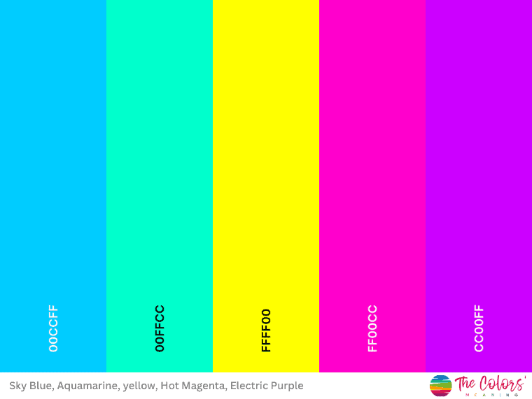
Vivid Sky Blue #00CCFF
Aquamarine #00FFCC
Yellow #FFFF00
Hot Magenta #FF00CC
Electric Purple #CC00FF
Vibrant Color Scheme
This vibrant color palette consisting of magenta, yellow, and light blue features energy, optimism, and great contrast that is visually striking.
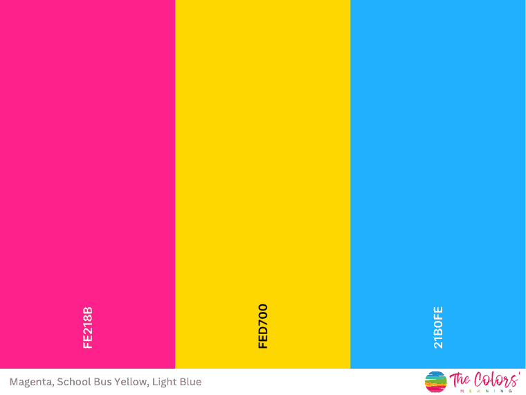
Magenta #FE218B
School Bus Yellow #FED700
Light Blue #21B0FE
Tropical Sunset
Here’s a tropical sunset color scheme. The blue and greens create a color palette inspired by nature’s colors—the yellow and hot pink balance the cool colors, creating perfect harmony.
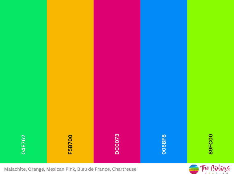
Malachite #04E762
Selective Yellow #F5B700
Mexican Pink #DC0073
Bleu De France #008BF8
Chartreuse #89FC00
Galactic Aurora
This palette is reminiscent of the beautiful aurora phenomenon in the sky over the North or South Pole regions.
The sun causes this phenomenon by sending bubbles of electrified gas into the magnetic field at the Earth’s two poles during solar storms. These react with atmospheric gases, producing green and red light (caused by oxygen) and blue and violet light (caused by nitrogen). [1]
These lovely transitions between vibrant hues are reminiscent of those in this palette.
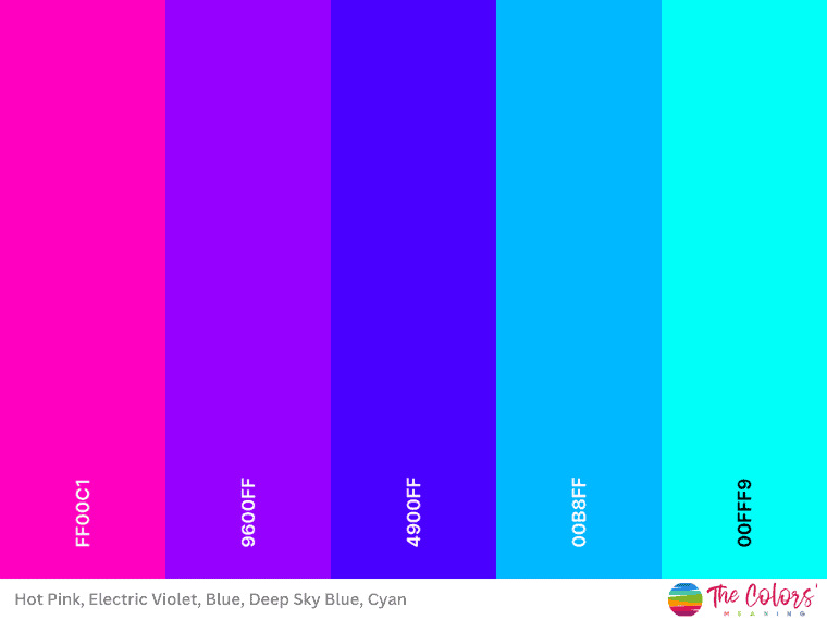
Shocking Pink #FF00C1
Electric Violet #9600FF
Blue #4900FF
Deep Sky Blue #00B8FF
Cyan RGB #00FFF9
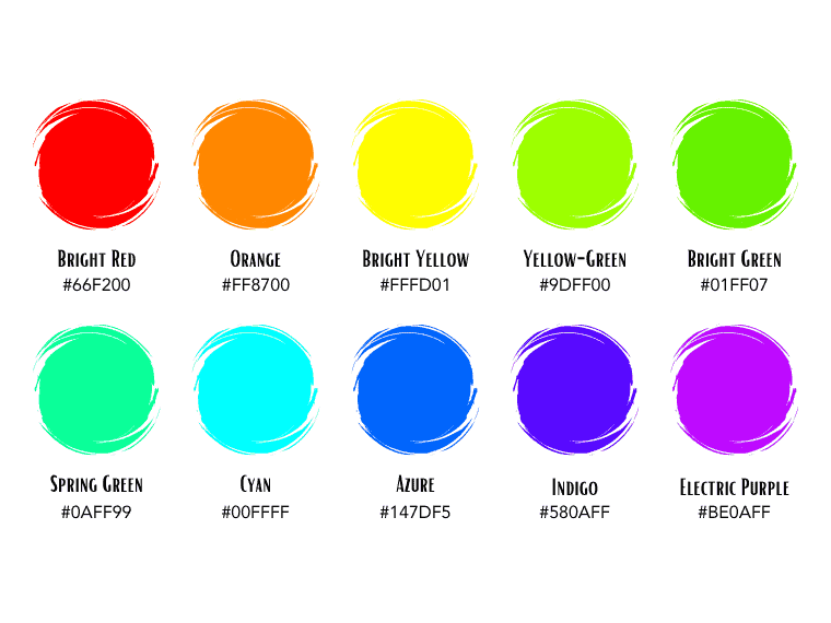
A Bright Perspective on the Visible Light Spectrum
Here is the spectrum of visible light made up of bold colors only.
Red #FF0000
Orange FF8700
Gold FFD300
Chartreuse #DEFF0A
Spring Bud #A1FF0A
Spring Green #0AFF99
Electric Blue #0AEFFF
Azure #147DF5
Electric Indigo #580AFF
Electric Purple #BE0AFF
Last Words on Brightest Colors
Bright colors easily draw attention, elicit strong emotions, and have a visual impact. They symbolize happiness, joy, energy, creativity, and positivity.
However, like any color, they must be used thoughtfully. They often shine best when used sparingly and in contrast with more subdued hues, so balance and harmony are essential.
Did you like this post about bright colors? Share it with your friends looking for colors that make them happy.