
Understanding complementary colors helps you choose colors that work well together, creating bold contrast and an eye-pleasing effect.
In today’s article, we’ll discuss complementary colors, including definitions, examples of opposite colors in traditional art and graphic design, and why they look good together.
What Are Complementary Colors?
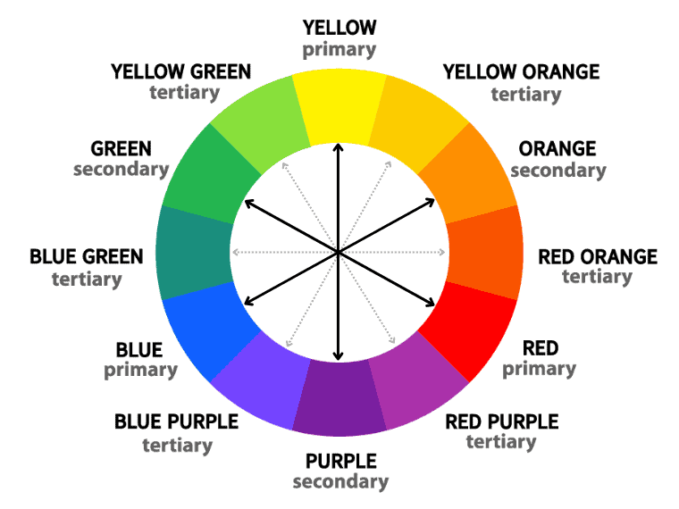
A definition of complementary colors is the use of two colors facing each other on the color wheel. These opposite colors produce a strong contrast when paired. Furthermore, mixing them has a neutralizing effect on their hue (they lose hue).
However, the opposite colors differ depending on the color theory used.
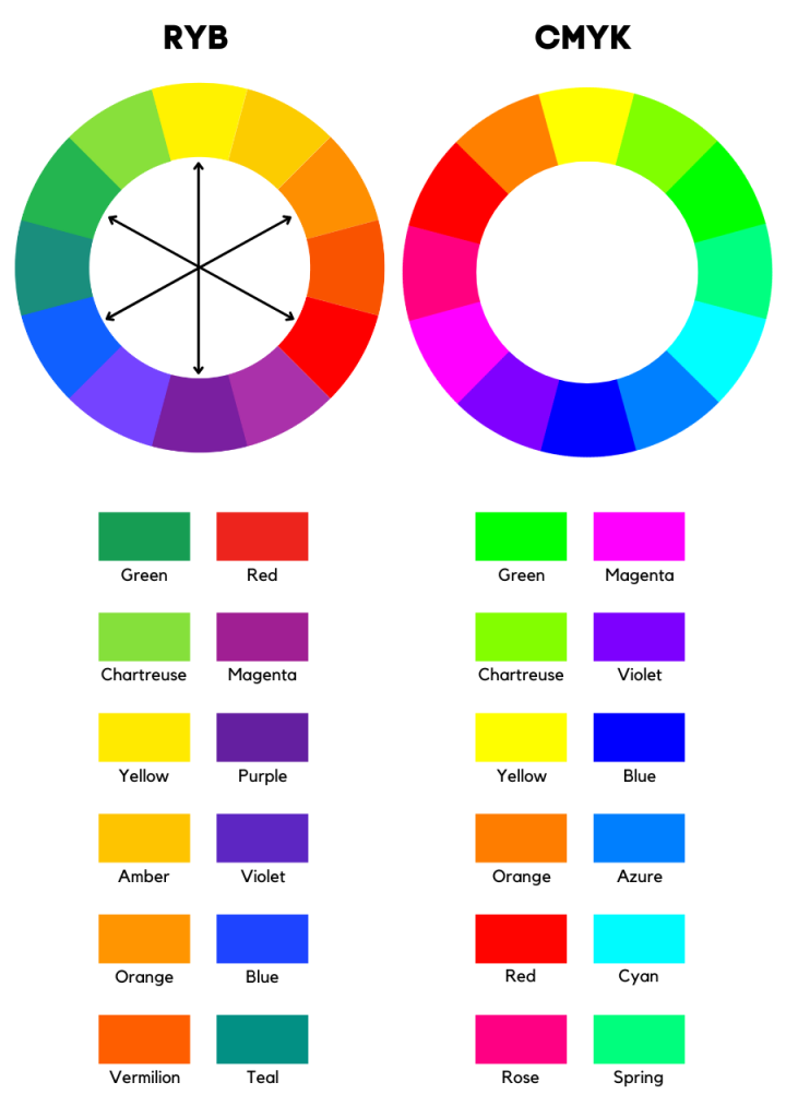
For example, the RYB color model used in traditional art has six pairs of opposite colors. In contrast, the modern color theory that uses the additive RGB (which deals with light) or the subtractive CMY (with pigment and ink) has other sets.
A Short Brief of Complementary Color Theory
Sir Isaac Newton is the inventor of the color wheel, the basis of color theory. Even though it only describes one property of color – the hue – the color wheel depicts the relationship between colors and is still used by artists today to choose the best color harmonies.
But today, we are dealing with three color models: RYB, RGB, and CMY.
RYB is a subtractive color model used in traditional art. It is also the longest-lasting. Its name is an abbreviation for the primary colors red, yellow, and blue.
The RGB additive model deals with light. This color space uses red, green, and blue as primary hues.
The CMY subtractive model deals with ink and pigments and uses cyan, magenta, and yellow as primary colors. To produce deeper tones and dark colors, this model also uses black. That’s why you’ll often hear of CMYK.
Before discussing complementary colors, let’s look at some of the most important terms in color theory.
Hue: refers to the dominant color family. Pure hues are primary colors (red, yellow, and blue) and secondary colors (green, orange, and purple). Even the intermediates are hues, but they are not pure as they do not have a dominant hue – they are mixtures (primary + secondary).
Color Saturation: this indicates the amount of gray in the composition of a hue. The more desaturated it is, the more gray it has in its composition.
Color Value: This refers to how light or dark a color is. The higher the value, the more vibrant the color.
Tints: These are hues or mixtures of colors with an addition of white. Thus, they become lighter versions of the base hue.
Tones: They are created by adding grey to a hue. Thus, the more gray they contain, the duller (desaturated) they become.
Shades: unlike tints, shades are darker variations of a hue that are created by adding black.
Learn more about hues, tints, tones, and shades.
What Are Complementary Colors in Art?
In art, complementary colors are those that are opposite each other on the color wheel. Paired together, they provide a strong contrast. Moreover, one of their properties is that when mixed, they lose their hue, neutralizing each other.
In art, the primary complementary colors are:
- red and green;
- yellow and purple;
- blue and orange.
Considering the intermediate colors – mixtures of a primary and secondary hue – yields three additional pairs of complementary hues:
- amber and violet;
- vermillion and teal;
- red-violet and chartreuse.
Complementary Color Examples
There are three primary examples of complementary colors:
- red and green;
- yellow and purple;
- blue and orange.
The term “primary” in this expression refers to color combinations involving a primary color (red, yellow, or blue).
To easily remember which color complements a primary color, consider what the other two primary colors do when mixed.
For instance, the complementary color to blue is the color created by mixing the other two primary colors – red and yellow. It is, indeed, orange!
The complementary color to yellow is purple, an equal mixture of red and blue. So, if you want to figure out what color complements yellow without looking at the color wheel, consider what color the other two primary colors – red and blue – do when mixed.
The complementary color to blue is orange – the result of mixing yellow and red.
What about red?
The complementary color to red is green – the result of combining blue and yellow.
If we talk about the six intermediate colors, often called “tertiary,” they form three more complementary pairs:
- yellow-green and red-purple;
- yellow-orange and blue-purple;
- red-orange and blue-green.
These are the more technical names for amber, violet, vermillion, teal, magenta, and chartreuse.
But these are just a few complementary pair examples on the color wheel.
Here are more examples:
Pistachio and Puce
Pistachio #A9D39E
Puce #D39EA9
Baby Blue and Tangerine
Baby Blue #89CFF0
Tangerine #F0AC89
Pastel Pink and Tea Green
Pastel Pink #F8C8DC
Tea Green #DCF8C8
Sage Green and Mountbatten Pink
Sage Green #9CAF88
Mountbatten Pink #AF889C
Navy Blue and Chocolate
Navy Blue #000080
Chocolate #804000
Teal and Maroon
Teal #008080
Maroon #802000
Rose Gold and Mantis
Rose gold #B76E79
Mantis Green #79B76E
Apricot and Light Blue
Apricot #FBCEB1
Uranian Blue #B1D1FB
Thistle and Cream
Thistle #D8BFD8
Pearl Cream #D8D8BF
Plum and Moss Green
Plum #673147
Moss Green #476731
Salmon and Mint
Salmon #FA8072
Mint #72FAAB
Lavender and Beige
Lavender #E6E6FA
Linen #FAF0E6
Midnight Blue and Sepia
Midnight Blue #191970
Sepia #704519
Mikado Yellow and Electric Violet
Mikado Yellow #FFC600
Electric Violet #8C00FF
Naples Yellow and Heliotrope
Naples Yellow #FFE66D
Heliotrope #CC6DFF
Sage and Lilac
Sage #C8C8A2
Lilac #C8A2C8
Robing Egg Blue and Burnt Sienna
Robing Egg Blue #4ECDC4
Burnt Sienna #CD6C4E
Magenta and Asparagus
Magenta Haze #A74482
Asparagus #83A744
Peach and Light Blue
Peach #F3D8C7
Columbia Blue #C7DBF3
What Are Complementary Colors in Modern Color Theory?
When it comes to the modern color theory, opposite colors change. That’s because we’re talking about other color models (RGB and CMY), with other hue wheels.
The additive RGB color model that deals with light uses red, green, and blue as primaries. Mixing pairs of these produce subtractive colors: cyan, magenta, and yellow.
The subtractive CMYK color model that deals with ink and pigment uses cyan, magenta, and yellow as primary colors.
In light, the complementary colors are cyan and red, magenta and green, yellow and blue.
If we also consider tertiary colors, we get three more pairs of opposite colors:
- violet and chartreuse
- spring green and rose
- orange and azure
These opposite colors differ from traditional art (RYB).
Examples of Complementary Colors in Light
Pistachio and Wisteria
Pistachio #A9D39E
Wisteria #C89ED3
Baby Blue and Orange Tangerine
Baby Blue #89CFF0
Tangerine #F0AA89
Pastel Pink and Mint Green
Pastel Pink #F8C8DC
Mint Green #C8F8E4
Sage Green and Pale Violet
Sage Green #9CAF88
African Violet #9B88AF
Navy Blue and Olive Green
Navy Blue #000080
Olive #808000
Teal and Maroon
Teal #008080
Maroon #800000
Rose Gold and Verdigris
Rose gold #B76E79
Verdigris #6EB7AC
Apricot and Light Blue
Apricot #FBCEB1
Uranian Blue #B1DDFB
Thistle and Tea Green
Thistle #D8BFD8
Tea Green #BFD8BF
Plum and Hunter Green
Plum #673147
Hunter Green #316751
Salmon and Neon blue
Salmon #FA8072
Electric Blue #72ECFA
Lavender and Beige
Lavender #E6E6FA
Beige #FAFAE6
Midnight Blue and Olive
Midnight Blue #191970
Olive #707019
Yellow and Blue
Naples Yellow #FFE66D
Cornflower Blue #6D85FF
Magenta and Green
Magenta #FF0090
Spring Green #00FF6F
Why do Complementary Colors Look Good Together?
Have you ever wondered why complementary colors are so pleasing to the eye, even though they contrast sharply?
Have you ever looked at something colorful for a few seconds, then looked away or closed your eyes and saw a different color? This is known as an “afterimage.” This effect happens thanks to the science behind the human eye.
Prolonged exposure to a specific colored light generates an afterimage effect. This optical illusion is also called an aftereffect.
Look at a yellow light bulb for a few seconds, and then close your eyes. You will see blue – the complementary color to yellow. Just try it!
Also, if you expose yourself to a red light and look at a white wall for a second, you will see cyan – the complementary color to red.
If you stared at something red and then looked at a white wall instead of seeing green (like the RYB color wheel suggests), you might see cyan. [1]
This effect is related to the CMY subtractive model. If you look at the CMY color wheel, you will see that the primary complementary colors are:
- red and cyan
- magenta and green
- yellow and blue
What Causes The Complementary Afterimage Effect?
So this effect is caused by the way the human eye works. Specifically, a healthy human eye has cells in the retina called cones, which respond to different light colors.
These cells are a photoreceptor type, which gives us color vision.
Cone cells are classified into three types in a healthy human eye:
- Red-sensing cones (L)
- Green-sensing cones (M)
- Blue-sensing cone (S)
They are long (L), middle (M), and short-wavelength (S) sensitive.
The cones are helped by other cells called rods – another type of photoreceptor located in the retina. Rods are sensitive to light levels, helping us to see in low light conditions. When rods are stimulated, we see white.
A healthy human eye has about 120 million rods and 6 million cones. [2]
Let’s go back to our example. If you look for a second at a yellow light and then at a white wall, you will see blue. This afterimage effect occurs as a result of the fatigue of these cells, suppressing the visual spectrum you have just looked at.
So, after looking at an image for a few seconds and then looking at a white wall, you see the white spectrum of light, minus the wavelength of the color you just looked at. Subsequently, this signal is interpreted as orange by the brain.
Translated with www.DeepL.com/Translator (free version)
Interestingly, although the eyes do the hard work, the brain interprets color. Light stimulates these retinal cells, which then send signals to the brain. The brain then interprets these signals and perceives the color.
Using Complementary Colors in Art
Understanding the complementary color theory can help you choose combinations that work while creating a visually pleasing effect.
If you haven’t noticed, complementary colors are sets of two colors of opposite temperatures. So each complementary pair contains one warm and one cool color.
Combining a warm with a cool color is called simultaneous contrast. This combo gives the highest color contrast.
Besides its boldness, it easily catches the eye.
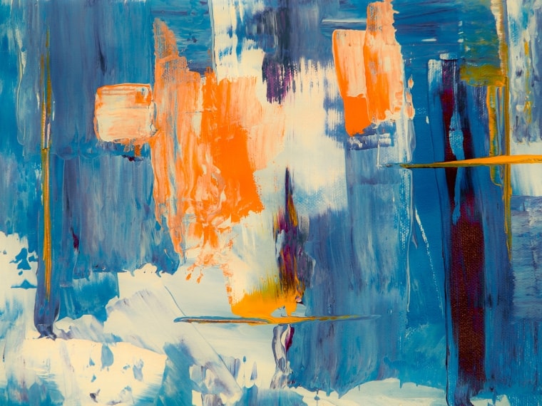
Complementary colors are often used in art, from painting a sunset to creating shadows by mixing them. Yes, you can create effective shadows by mixing the main color with a small amount of its complementary.
An interesting quality of complementary colors is that they neutralize each other, losing their hue when mixed. For example, mixing red and green in equal quantities will give you a warm dark brown.
Complementary Colors in Interior Design
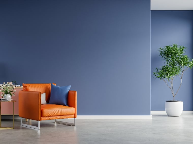
When it comes to interior design, using opposite colors brings energy to the space and a pleasing effect to the eye.
However, what matters is the proportion used for each of them.
As a result, the most effective approach is to use a dominant color and its complementary hue only for accent pieces. For example, if you choose a purple theme, you can add a yellow armchair.
If you want to use more than two colors, choose one main color and use the others as accents.
Another color combination often used by designers is orange and blue. The secret is to use the same tones.
When using complementary colors, it is advisable to choose a similar tone of the complementary color as the dominant color. This way, you will highlight what you want while maintaining color harmony.
So, if you use a pastel orange, the blue should also be in the same tone. For example, you can use powder blue and tangerine.
Last Words on Color Opposites
Complementary colors are pairs of opposite colors on any color wheel, whether traditional art (RYB model), light (RGB), or printing (CMY). They contrast dramatically but look good together, creating a lovely color scheme.
Did you enjoy this post? Feel free to share it with your friends who might like these color combinations.