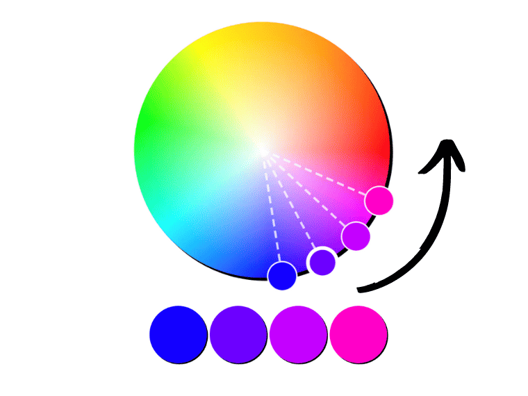
The color wheel is a graphic representation of colors that shows their relationship. Thus, it features seven major geometric relationships, each representing a different color scheme.
Here is a complementary color wheel picker that helps you create harmonious color schemes.
Before we get into these schemes, let’s take a look at how many different types of color wheels there are and what each one is made of.
Color Wheel Types
The main color wheel types are RYB (red, yellow, blue), RGB (red, green, blue), and CMY (cyan, magenta, yellow). These are based on different color models, each serving a specific purpose in different mediums and applications.
RYB Color Wheel
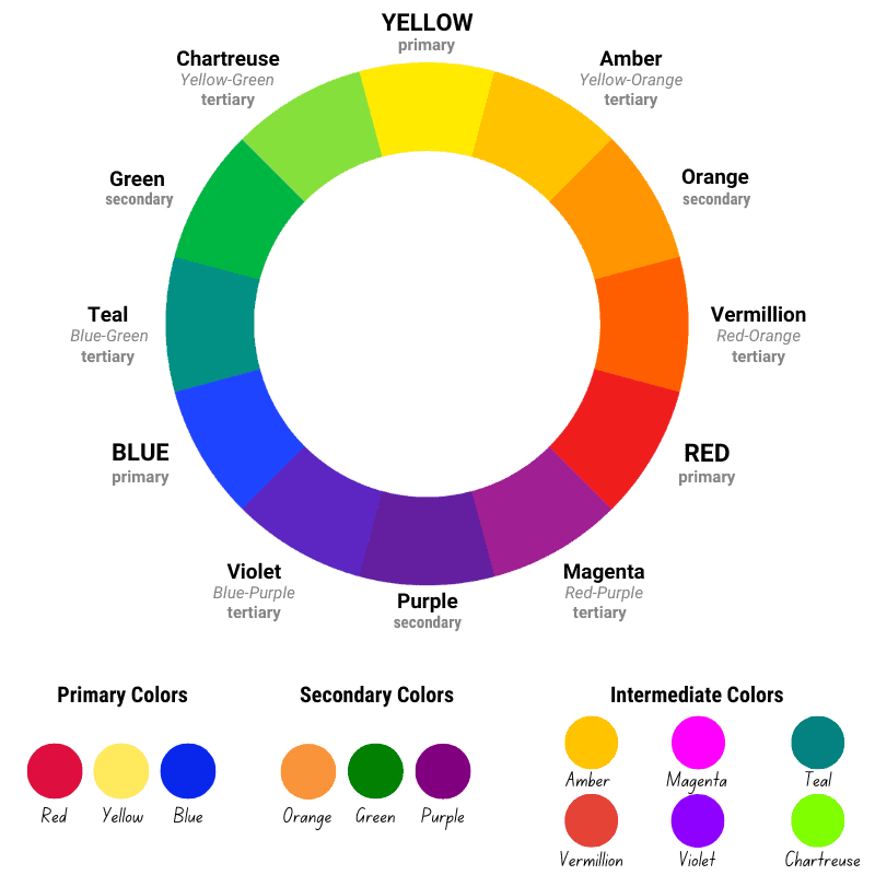
The RYB color wheel is the traditional subtractive color model that deals with pigments. This model is used in art and education, particularly in painting. It’s often called the “artists’ color wheel” and is based on subtractive color mixing.
The RYB’s primary colors are red, yellow, and blue.
Mixtures of primary colors produce secondary colors. The secondary colors are:
- Green: yellow + blue
- Orange: yellow + red
- Purple (or Violet): red + blue
On the RYB space, in contrast to other models, primary and secondary color mixtures are called intermediate colors.
The intermediate colors are:
- Yellow-Orange
- Red-Orange
- Red-Purple
- Blue-Purple
- Blue-Green
- Yellow-Green
On the traditional wheel, tertiary colors are mixtures of two secondary colors, which form different browns, grays, or muddy variations of both colors.
RGB Color Wheel
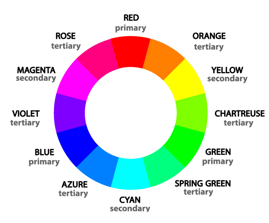
The RGB color wheel is an additive color space that deals with light. It’s used in digital design, photography, TVs, smartphones, and computer screens. In this model, the primary colors of light (red, green, blue) are combined to create other colors.
When all colors are combined at full intensity, white light results.
The RGB color wheel works hand-in-hand with the CMY one.
The secondary colors of light (RGB) are the primary colors of CMY: cyan, magenta, and yellow (and vice-versa).
The tertiary colors of light are:
- Orange: red + yellow
- Chartreuse Green: yellow + green
- Spring Green: green + cyan
- Azure: cyan + blue
- Violet: blue + magenta
- Rose: magenta + red
CMY Color Wheel
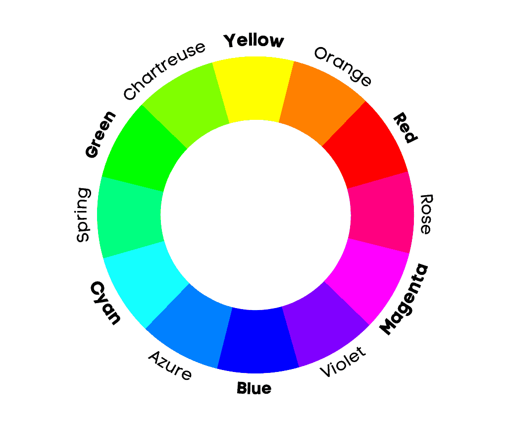
The CMY color wheel is a modern subtractive color model that deals with dyes. It’s used in the printing industry, along with the addition of black (key), resulting in CMYK.
The primary colors of the CMY color wheel are cyan, magenta, and yellow.
Combining two colors creates the secondary colors: red, green, and blue. These are the primary colors of light.
Mixing primary and secondary colors produces tertiary colors, just like on the RGB model.
Modern subtractive mixing can produce a wider range of colors compared to RYB.
However, the RYB model is often more successful in painting compared to the CMY model due to the physical properties of pigments versus dyes.
The Seven Major Color Schemes
The major color schemes are analogous, complementary, split complementary, triadic, tetradic (or rectangle), square, and monochromatic.
Analogous Colors
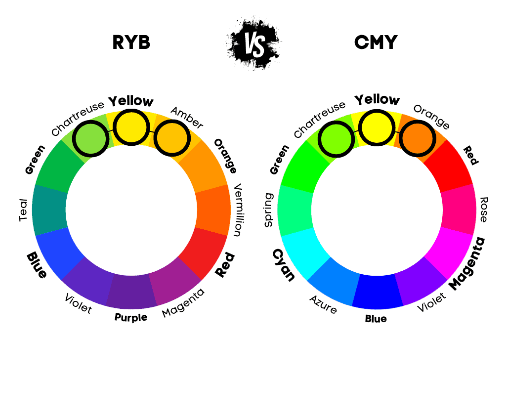
Analogous colors are groups of three colors next to each other on the color wheel. Even though traditionally analogous schemes consist of three colors, designers choose up to five hues.
Analogous colors offer visual cohesion and are extremely pleasing to the eye. Moreover, they offer visual interest without becoming obtrusive. So, this is the ideal choice if you don’t want a bold scheme.
Designers often choose this color combination to give their designs a temperature. For example, if you want warm analogous colors, you can choose red, vermillion, amber, and orange.
On the RGB color space, analogous colors include red, orange, and pink; purple, blue, and azure; blue, blue-cyan, and cyan; yellow, orange, and red; magenta, purple, and blue; and so on.
Examples of analogous colors on the traditional color wheel (RYB) would be blue, teal, and indigo; red, magenta, and vermillion; yellow, amber, and chartreuse.
Complementary Colors
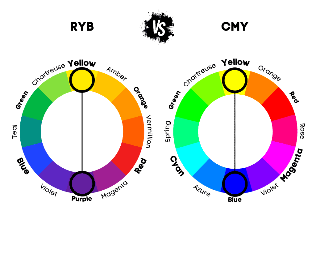
Complementary colors are two colors facing each other on the color wheel, 180 degrees apart. They are also known as opposite colors. Once paired together, they offer the strongest visual contrast.
Examples of complementary colors include: red and cyan, green and magenta, blue and yellow.
Whether you want to wear a bold outfit or make a design, the complementary colors generator above will help you find all the complementary color combinations.
When it comes to art and painting, there are other complementary colors because artists use the RYB color wheel. These sets include red and green, yellow and purple, and blue and orange.
Although complementary colors are technically two colors facing each other on the color wheel, this name is generically given to all harmonious color schemes.
Split Complementary Colors
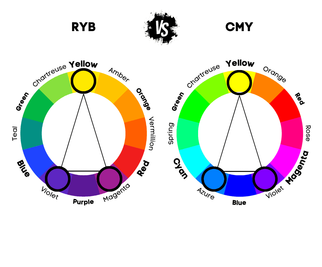
Complementary split colors consist of a base color and the two neighbors of its complement. They are similar to complementary colors, but the complement of the base color is split.
The benefit of complementary colors is that they offer an extra color over complementary colors.
An example of split-complementary colors on the modern color wheel would be red, spring green (green-cyan), and azure (blue-cyan).
This color scheme is pleasing to the eye, providing a nice balance between warm and cool colors.
However, the contrast is affected, and they are less vibrant compared to the two-color version.
Triadic Colors
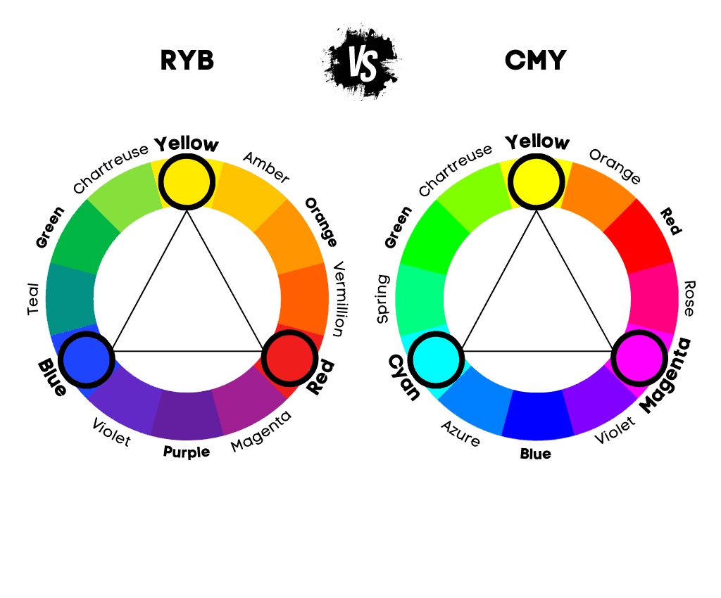
Triadic colors are groups of three equally spaced colors that form a triangular shape with all sides equal (equilateral) on the color wheel.
The most popular triadic color combination is made up of primary colors or secondary colors. While on the RGB model, the primary colors are red, green, and blue, on the traditional RYB, they are red, yellow, and blue.
This color combination offers a strong contrast, similar to complementary colors.
In modern color theory, triadic colors include magenta, cyan and yellow; red, green, and blue; azure, rose, and chartreuse; orange, spring green, and purple.
On the traditional wheel (RYB), examples of triadic colors include red, yellow, and blue; amber, magenta, and teal; purple, orange, and green)
Tetrad Colors
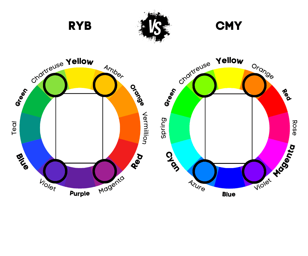
Tetrad colors, also called tetrad colors or double complementary colors, refer to a color scheme of four colors organized into two complementary pairs, forming a rectangle shape on the wheel.
This means that you choose two colors that are opposite each other and then select another pair similarly.
This scheme is frequently used in design because it provides high contrast while maintaining color harmony.
This four-hue color scheme forms a square or a rectangle shape on the wheel.
However, in recent years, combinations that form a square shape are called square colors, while those that create a rectangular shape are called tetradic colors.
Square Colors
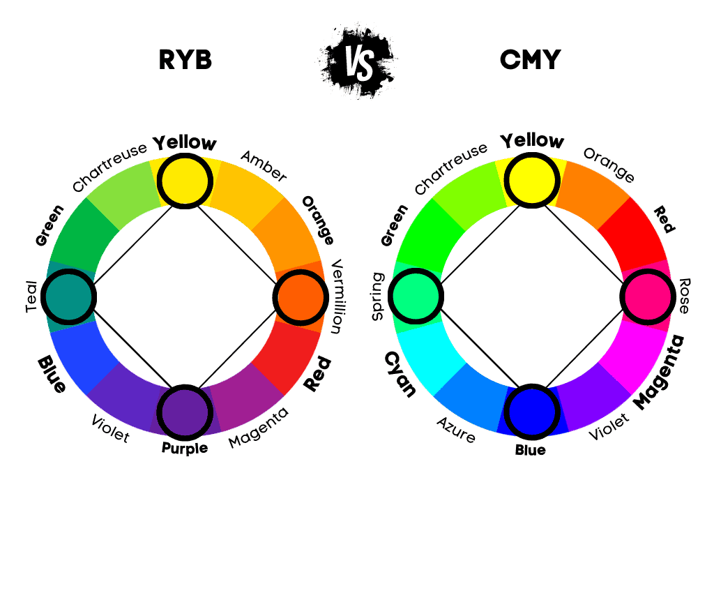
Square colors are groups of four equally spaced colors on the color wheel, forming a square shape. They are similar to tetradic colors.
The difference between square and tetrad colors is that square colors are groups of four equally spaced colors that form a square shape. In contrast, tetrad colors are groups of two pairs of complementary colors that form a rectangle on the wheel.
Like the tetrad colors, the square colors provide a vibrant look and a high contrast. However, it can be tricky to balance.
In order to use a square color scheme effectively, it’s essential to balance the warmth and coolness of the colors used.
In addition, it’s best to pick a dominant color and use the others as accents when using this color combination.
Monochromatic Colors
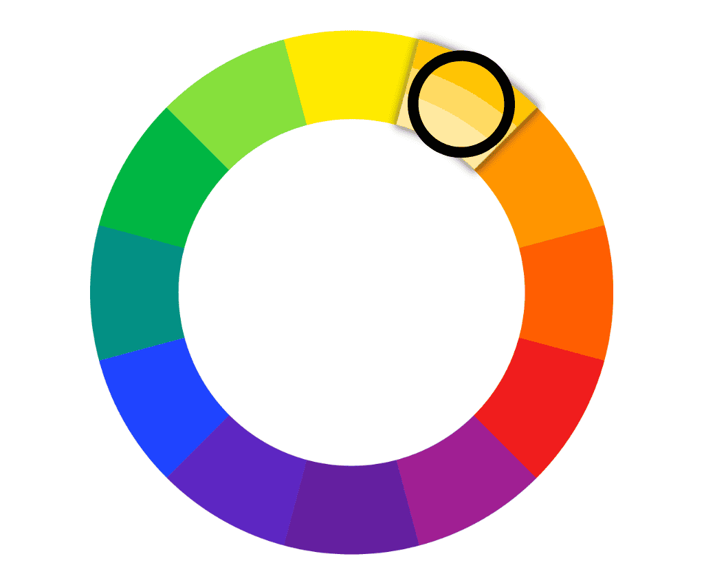
Monochromatic colors refer to a color scheme derived from a base hue and extended using its shades, tones, and tints. In short, a monochromatic color scheme consists of a base hue and different variations in terms of value (lightness and darkness) and saturation (intensity).
For instance, if you choose blue as your base color, a monochromatic color scheme may include light blue (a tint created by adding white to the base color), dark blue (a shade produced by adding black to the base color), and grayish-blue (a tone made by adding grey or both white and black to the base color).
Monochromatic color schemes are harmonious and pleasing to the eye because they are simple and cohesive. They are often used in design and art for their ability to create a sense of unity and harmony.
Monochromatic and analogous colors are often mistaken, but they are different.
A monochromatic color scheme originates from a single hue and extends through its shades, tints, and tones. On the other side, an analogous color scheme incorporates colors adjacent to each other.
Also, analogous color schemes offer more contrast than monochromatic ones, which provide greater visual cohesion but look duller.
The Advantages of Each Color Combination
Monochromatic: Visual Cohesion
Monochromatic color schemes provide a visually cohesive and harmonious look due to their use of a single base color in varying shades, tints, and tones.
Analogous: Smooth Transition
Analogous color schemes offer smooth transitions and a sense of harmony as they utilize colors adjacent to each other on the color wheel.
Complementary: High Contrast
Complementary color schemes generate the highest contrast, using colors opposite each other.
Split-Complementary: Balanced Contrast
Split-complementary color schemes provide the contrast of the complementary scheme but with less tension, as they use a base color and two colors adjacent to its complement.
Triadic: Vibrant Diversity
Triadic color schemes are vibrant and diverse, using three colors equally spaced on the wheel.
Tetradic (Double Complementary): Rich Variety
Tetradic color schemes offer various color combinations involving two pairs of complementary colors.
Square: Evenly Spaced Variety
Square color schemes also offer a wide variety, with four colors evenly spaced on the wheel.

