
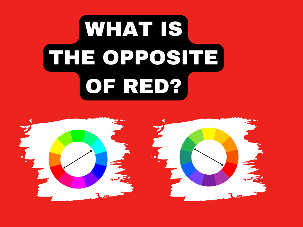
Have you ever wondered what the opposite of red is on the color wheel? When it comes to color opposites, everyone refers to the color wheel, but this can differ depending on the color space you are using.
If you are a graphic designer, you work with the RGB color space, while a painter deals with the RYB space. When it comes to printing, you will use CMYK.
Whether additive or subtractive, each space uses different primary colors.
In today’s article, you’ll learn which color is the opposite color of red in each of the three primary color spaces: RYB, RGB, and CMYK.
In short, this guide will answer the following questions:
- What is the opposite of red in painting and digital design?
- What are the opposites of different shades of red?
- How can you find the opposite of a specific shade of red?
Let’s find out.
Why Does the Opposite of Red Differ?
The opposite of a color is also called complementary color. In art, one of the qualities of complementary colors is that when you mix them, they neutralize each other, resulting in a muddy brown.
The general quality of complementary sets is that they look pleasing to the eye.
When it comes to color perception, your eye can perceive different hues because of the amount of light in colors. That’s because the structure of the retina involves specialized cells called photoreceptors.
These are of two types: rods and cones. While rods are good at detecting light, cones are responsible for detecting color. Moreover, the latter can adapt quickly to light changes.
But how color is produced and how they interact when you mix them depends on the type of color space.
If the color space is subtractive, such as RYB used in painting or CMYK used in the printing industry, the pigment produces color using reflected light.
If the color space is additive, such as RGB, transmitted light produces color by combining different wavelengths of light. Here, the primary colors are red, green, and blue.
What Is the Opposite of Red?
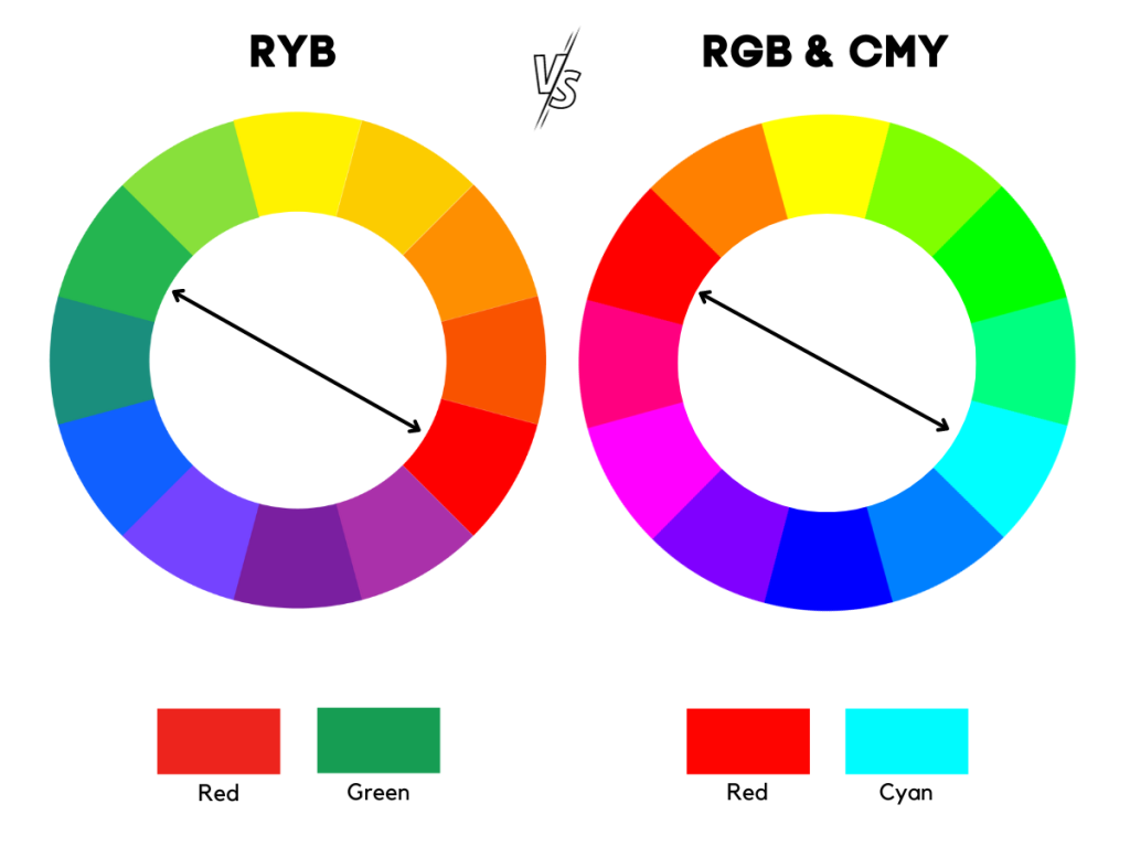
Although many consider the opposite color of red is green, its complementary hue differs depending on the color space you use. The three primary spaces are RGB (red, green, blue), CMY (cyan, magenta, yellow) and RYB (red, yellow, blue).
What Is the Opposite of Red in RGB?
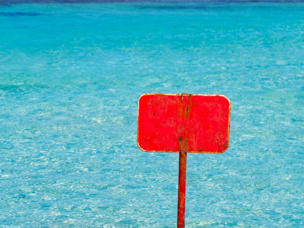
In the RGB color space, the opposite of red is cyan. Cyan is bold greenish-blue and a secondary additive color created by mixing green and blue light.
In the world of printing (CMYK), cyan is a primary color. But RGB and CMYK go hand in hand, meaning that the primary colors of one are the secondary colors of the other color space.
The opposite color of a primary color – in this case, red – is a secondary one – cyan – made by mixing the other two primary colors of light – green and blue.
The RGB space – a digital representation of colors – is used in everything that emits light, from computer and laptop screens to smartphones and tablets.
This model uses transmitted light to produce color, starting with black or lack of light. Adding the primary colors of light (red, green, and blue) at different intensities produces the colors of the visible spectrum.
When you overlap the three colored lights at maximum intensity, you get white.
Red
Hex #FF0000
RGB 255, 0, 0
CMYK 0, 100, 100, 0
Cyan
Hex #00FFFF
RGB 0, 255, 255
CMYK 100, 0, 0, 0
What Is the Opposite of Red in CMY?

When it comes to the CMY color model, we refer to a subtractive color model that deals with pigments, inks, and dyes.
This model is used in the printing world and is often referred to as CMYK. This is a color mode that combines four inks: cyan (C), magenta (M), yellow (Y) and black (K) the printing color gamut.
Since it goes hand in hand with the additive RGB model, the opposite color in the CMY color model is cyan.
Unlike RGB, the CMY starts with white or a sheet of paper, which is a white substrate. As you add pigment or ink, it absorbs part of the spectrum and reflects the rest. So, as you add ink, you subtract light from the substrate.
This quality means that mixing colors in CMY produces a darker color.
So, in CMY, you produce a new color by removing wavelengths. For example, red is created by mixing magenta and yellow. This mixing absorbs the wavelengths of green and blue and reflects red. Thus, you see red.
On the other hand, cyan absorbs the wavelengths of red, reflecting green and blue, which appears as cyan.
Unlike the RGB color model, which has a gamut size of 16.7 million possible colors, the CMYK color space can produce only 16,000 unique colors.
Red
Hex #FF0000
RGB 255, 0, 0
CMYK 0, 100, 100, 0
Cyan
Hex #00FFFF
RGB 0, 255, 255
CMYK 100, 0, 0, 0
What Is the Opposite of Red in RYB?

RYB is a subtractive color pattern used in traditional art. It is the oldest color model, using red, yellow, and blue as primary colors.
These primary colors, when mixed, produce the secondary colors green, orange, and purple.
This model starts with white and produces darker colors as you add pigment. Thus, as pigments are added, their wavelengths combine and cancel each other out, creating a new color.
As in RGB, the complementary color of red in RYB is a secondary color.
The opposite color of red is green. Red and green are natural complements, appearing opposite each other on the traditional color wheel.
Green is a secondary color in RYB, created by mixing blue and yellow – the other two primary colors that complement red through mixing.
Green and red provide an eye-pleasing effect, creating one of the most popular Christmas color palettes.
Although they look good together, if you mix them, they neutralize each other – as I said above, resulting in a muddy brown.
Red
Hex #ED1C24
RGB 237, 28, 36
CMYK 0, 88, 85, 7
Green
Hex #28BA1A
RGB 48, 186, 26
CMYK 78, 0, 86, 27
What Are the Opposites to Different Reds?
As you have seen, the opposite colors differ depending on the color model.
In traditional art (RYB), the opposite color of red is green, while in modern color theory spaces (RGB and CMYK), this is complemented by cyan.
But there are many shades of red. Whether discussing tints, tones or shades, red comes in many variations ranging from pink and magenta to red-orange. So, the opposite color can vary from green to blue.
Here is the complementary color for different reds:
What is the Opposite of Pink?
Pink is a very light variation of red created by mixing red and white. Technically, this is a tint of red. Its opposite color is celeste – a pale greenish-blue.
Pink
Hex #FFC0CB
RGB 255, 192, 203
CMYK 0, 25, 20, 0
Celeste
Hex #C0FFF4
RGB 192, 255, 244
CMYK 25, 0, 4, 0
What is the Opposite of Maroon?
Maroon is a dark brownish-red color, named after the French “marron,” meaning “chestnut.” It looks similar to burgundy but leans more towards a deep reddish brown, unlike burgundy, which has purple undertones. The complementary color of maroon is teal – a deep blue-green color.
Maroon
Hex #800000
RGB 128, 0, 0
CMYK 0, 100, 100, 50
Teal
Hex #008080
RGB 0, 128, 128
CMYK 100, 0, 0, 50
What is the Opposite of Magenta?
Magenta is a purplish-red or reddish-purple produced by mixing an equal amount of red and blue. The complementary color of magenta is green.
Magenta
Hex #FF00FF
RGB 255, 0, 255
CMYK 0, 100, 0, 0
Green
Hex #00FF00
RGB 0, 255, 0
CMYK 100, 0, 100, 0
What is the Opposite of Coral Pink?
Coral Pink is an orangish pink color named after the marine invertebrates of the same name. It is obtained by mixing red, yellow and pink. The complementary color of coral pink is Robin’s egg blue – a shade of cyan.
Coral Pink
Hex #F88379
RGB 248, 131, 121
CMYK 0, 47, 51, 3
Robin’s Egg Blue
Hex #79EDF8
RGB 121, 237, 248
CMYK 51, 4, 0, 3
What is the Opposite of Crimson Red?
Crimson is a rich, deep red with purple undertones. The complementary color of crimson red is turquoise – a mixture of blue and green.
Crimson
Hex #DC143C
RGB 220, 20, 60
CMYK 0, 91, 73, 14
Turquoise
Hex #14DCB4
RGB 20, 220, 180
CMYK 91, 0, 18, 14
What is the Opposite of Raspberry?
Raspberry is a vibrant pinkish red next to purple on the color wheel. Its complementary color is aqua green – a bluish green or a variation of cyan that is between blue and green.
Raspberry
Hex #E30B5C
RGB 227, 11, 92
CMYK 0, 95, 59, 11
Aqua Green
Hex #0BE394
RGB 11, 227, 148
CMYK 95, 0, 35, 11
What is the Opposite of Burgundy?
Burgundy is a dark reddish-brown with purple undertones, named after the color of wine produced in the Burgundy region of France. Its complementary color is forest green – a dark green color.
Burgundy
Hex #800020
RGB 128, 0, 32
CMYK 0, 100, 75, 50
Forest Green
Hex #008060
RGB 0, 128, 96
CMYK 100, 0, 25, 50
What is the Opposite of Vermillion?
Vermillion is a bright orange-red named after the orangish-red pigment derived from the powdered mineral cinnabar. The complementary color of vermillion is Robin’s Egg Blue, a shade of teal. It lies between blue and green on the color wheel.
Vermillion
Hex #E34234
RGB 227, 66, 52
CMYK 0, 71, 77, 11
Robin’s Egg Blue
Hex #34D4E3
RGB 52, 212, 227
CMYK 77, 7, 0, 11
What is the Opposite of Mahogany?
Mahogany is a reddish-brown, named after mahogany wood – a precious wood known as the “wood of kings.” Its complementary color is blue (NCS).
Mahogany
Hex #C04000
RGB 192, 64, 0
CMYK 0, 67, 100, 25
Blue (NCS)
Hex #0080C0
RGB 0, 128, 192
CMYK 100, 33, 0, 25
What is the Opposite of Cerise?
Cerise is a deep pinkish-red color, whose name comes from the French “sleise,” which means “cherry.” This color appeared for the first time in English in 1858. The complementary color of cerise is aquamarine – a greenish-blue color.
Cerise
Hex #DE3163
RGB 222, 49, 99
CMYK 0, 78, 55, 13
Aquamarine
Hex #31DEAD
RGB 49, 222, 173
CMYK 78, 0, 22, 13
What Does Red and Its Opposite Symbolize
The meaning of the color red is related to strong emotions such as love, passion, energy, strength, determination, action and courage.
Green is a down-to-earth color that is closely related to nature, symbolizing new beginnings, peace, prosperity, hope, generosity and relaxation.
Green balances and revitalizes the energy and passion of red, creating a perfect combo.
Cyan is associated with tranquility, youth and liveliness. It is a color that inspires and relaxes, combining the invigorating qualities of green with the tranquility of blue.
How to Use Red and Its Complementary in Design
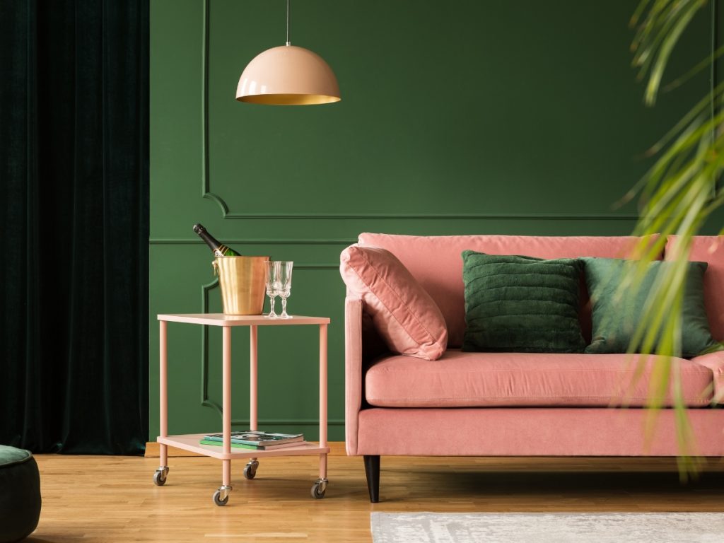
Although red and green might be the colors of Christmas, they can be a stylish choice if you use them in the right combination.
For example, you can use deeper tones for a more sophisticated setting. If darker tones are down-to-earth and help you avoid the festive atmosphere, warmer tones create a cozy environment.
A spectacular combination is burgundy and forest green. It adds a luxurious feel to your space, especially when you add gold accessories.
A secret to using these complementary colors is to avoid their primary hues and use tonal shades. For example, you can choose forest, teal, sage or mint as your green shade and rust, terracotta, or scarlet as your red. Matching rusty red with a soft green is also a nice choice.
Also, if you add beige or gold you can ground the scheme and thus avoid a tired effect. If you want a more calming effect, scatter them around the room.
Another option is to combine these colors with other complementary hues. For example, yellow, blue, or pink can add a chic touch.