
Have you ever wondered, “What are pastel colors?” or “What makes them special?”. Pastel colors are pale colors created by adding white to pure, vibrant hues, resulting in gentle, soothing shades resembling chalk pastels’ softness.
Technically, they’re known as tints – which can be described as light colors created by mixing saturated hues with white.
Depending on how they’re used, they can evoke serenity, delicacy, playfulness, and sophistication.
In this article, we’ll discuss the pastel colors, exploring what they are and how you can incorporate them into your design projects.
What Are Pastel Colors?
Pastel colors are a family of colors characterized by their pale, light, and desaturated appearance. They are created by adding white to pure hues, resulting in soft and muted shades. Pastels include soft pink, baby blue, lavender, mint green, and pale yellow. These gentle tones are often associated with springtime, feminity, and a sense of innocence.
Technically, a pastel color refers to a tint created by mixing a hue with white. This addition of white increases the lightness, making the color soft enough without affecting the integrity of the base hue. As brightness increases, its saturation decreases, making it appear pale but muted.
The Meaning of the Pastel Colors
Pastel colors are associated with calmness, serenity, and innocence. Pastels also represent meanings of tenderness, optimism, elegance, creativity, freshness, delicacy, feminity, and youthfulness.
They somewhat share common meanings with bright colors, but the latter evoke more fun and energy. These include neon colors as well.
Depending on the base hue, they can have different meanings. For example, pastel shades of pink are associated with tenderness and youthfulness, while pastel yellows and light oranges uplift moods and inspire optimism.
Meanwhile, pastel blues and greens promote serenity and balance, while pastel purples stimulate creativity and imagination.
Here are the meanings of pastel colors:
- Calmness: They are known for their calming and soothing qualities, evoking peaceful vibes. Thus, they create a sense of tranquility and relaxation, making them ideal for design projects.
- Serenity: Pastel blue and green are linked to feelings of serenity and peace. They evoke feelings of harmony and balance, promoting a peaceful state of mind.
- Innocence: Pastels, especially soft pink and lilac, are associated with innocence, friendliness, and youthfulness.
- Tenderness: Pastel pink and lavender are associated with tenderness, gentleness, and compassion. They can also represent love, care, and affection.
- Optimism: Pastel yellows and pale oranges symbolize optimism, positivity, and a sunny outlook. These colors uplift moods and convey a sense of hope.
- Elegance: Because they are soft and subtle, these hues are associated with elegance and sophistication. They don’t stand out, but they have a unique charm.
- Gentleness: Although lighter than the base hue, they are less saturated, making them more inviting. This pale, muted look symbolizes gentleness.
- Delicacy: Associated with delicacy and subtlety, these hues are used to convey a sense of refinement and understated beauty. They do not overwhelm you but provide a gentle and soothing aesthetic backdrop, allowing other shades to take center stage.
- Youthfulness: Even though pastels are pale, some are brighter than others, and these shades symbolize youthfulness and playfulness. That’s why they are used to target younger demographics and create a sense of youthful energy.
Examples of Pastel Colors and Their Meanings
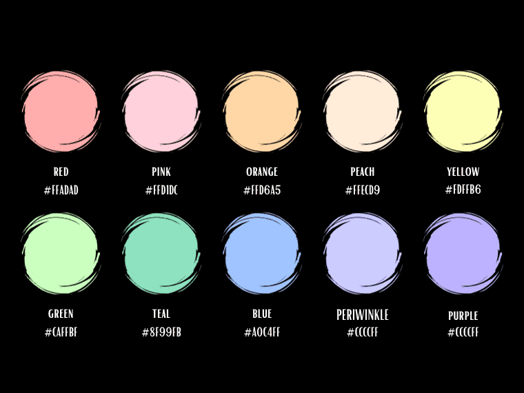
Pastel Red
Pastel Red
Hex #FFADAD
RGB 255, 173, 173
CMYK 0, 32, 32, 0
Pastel red is associated with love and romance, featuring a dreamy appearance. Unlike the passion and energy of red, this pastel is more about romantic love.
Pastel Pink
Pastel Pink
Hex #FFD1DC
RGB 255, 209, 220
CMYK 0, 18, 14, 0
Pastel pink is associated with feelings of sweetness, love, and feminity. It also evokes romance, tenderness, innocence, and youthfulness. In contrast to the vibrant pink, this version is peaceful and soft.
Pastel Orange
Pastel Orange
Hex #FFD6A5
RGB 255, 214, 165
CMYK 0, 16, 35, 0
Pastel orange is a pale, muted orange that symbolizes friendliness, positivity, and warmth. The color of free spirit and enthusiasm encourages and uplifts any mood. As a mixture of red and yellow, this pale shade has a bit of the energy of red and a splash of creativity from yellow.
Pastel Peach
Pastel Peach
Hex #FFECD9
RGB 255, 236, 217
CMYK 0, 7, 15, 0
Pastel peach combines the warmth of orange with the softness of pink. It symbolizes friendliness, approachability, and a sense of well-being. Peach can also evoke feelings of comfort and joy.
Pastel Yellow
Pastel Yellow
Hex #FDFFB6
RGB 253, 255, 182
CMYK 1, 0, 29, 0
Pastel yellow is associated with positivity, happiness, and optimism. Moreover, pastel yellow represents sunshine and warmth. Joyful, this pastel evokes energy, cheerfulness, and a childlike energy.
Pastel Green
Pastel Green
Hex #CAFFBF
RGB 202, 255, 191
CMYK 21, 0, 25, 0
Pastel green is associated with nature, harmony, and balance. Known for its refreshing and rejuvenating qualities, this color also has meanings of health, renewal, and luck.
Mint
Mint
Hex #BDFCC9
RGB 162, 207, 240
CMYK 32, 14, 0, 6
Mint is a very pale green color derived from the homonymous plant. This pastel tone is a combination of green and white.
Pastel Teal
Pastel Teal
Hex #8F99FB
RGB 143,153,251
CMYK 43, 39, 0, 2
This is a soft and muted shade of teal, typically characterized by a light and subdued greenish-blue appearance. It evokes freshness and calmness.
Pastel Blue
Pastel Blue
Hex #A0C4FF
RGB 160, 196, 255
CMYK 37, 23, 0, 0
Pastel blue is linked to feelings of tranquility, calmness, and serenity. It also symbolizes clarity, open skies, and a sense of freedom. Pastel blues include light blue, powder blue, sky blue, and baby blue.
Powder Blue
Powder Blue
Hex #B6D0E2
RGB 182, 208, 226
CMYK 19, 8, 0, 11
Powder blue is reminiscent of clear skies and evokes feelings of freshness, serenity, and cleanliness. It’s often used in baby-related themes and designs.
Pastel Purple (Soft Violet)
Pastel Purple
Hex #BDB2FF
RGB 189, 178, 255
CMYK 26, 30, 0, 0
Pastel purple is described as a soft and gentle color associated with grace, silence, innocence, purity, youthfulness, and calmness. Moreover, it is synonymous with royalty and luxury. Purple pastels include periwinkle, lilac, and lavender.
Periwinkle
Periwinkle
Hex #CCCCFF
RGB 204, 204, 255
CMYK 20, 20, 0, 0
Periwinkle is a pastel indigo color whose pale appearance resembles the flower of the same name. This pastel color, situated between violet and blue, symbolizes calmness, serenity, and friendship. Moreover, it’s optimistic, uplifting, and motivating.
Lavender
Lavender
Hex #E6E6FA
RGB 230, 230, 250
CMYK 8, 8, 0, 2
Lavender, named after the flower of the same name, is associated with elegance, grace, and refinement. Lavender also represents serenity, purity, femininity, and sophistication. Lavender also has calming qualities and is used to promote relaxation.
Where to Use Pastels?
Pastel colors can effectively convey peaceful vibes in various design contexts. Here are some examples:
Web Design: When it comes to web design, the color scheme is essential for the user experience. And it all begins with what you want to communicate to your audience. Choose pastels, for example, if you want a light, welcoming site that evokes calm and gentleness.
Interior Design: Pastel tones often create serene and inviting spaces. They work well for walls, furniture, and decor in bedrooms, nurseries, and living rooms.
Home Decor: They can also be incorporated into home decor items like curtains, pillows, and tableware to infuse living spaces with tranquility and charm.
Fashion: Pastels are popular in clothing, especially during spring and summer. Pastel dresses, suits, and accessories can convey a sense of elegance, freshness, and femininity.
Weddings: They are frequently chosen for weddings and special events, as they evoke romance and elegance. Bridesmaids’ dresses, floral arrangements, and decor often feature pastel hues.
Children’s Products: Pastels are commonly used in products and packaging designed for children, as they are associated with innocence and youthfulness.
Pastel Color Palette Ideas
Choosing the right pastel color palette is essential in design. We’ll showcase popular pastel color combinations that work harmoniously to create visually stunning results.
Lovely Innocence
Pink pastels look fantastic with light shades of blue and purple. They have an innocent and soft appearance, and the combination of warm and cool pastel tones creates a warm and relaxing atmosphere.
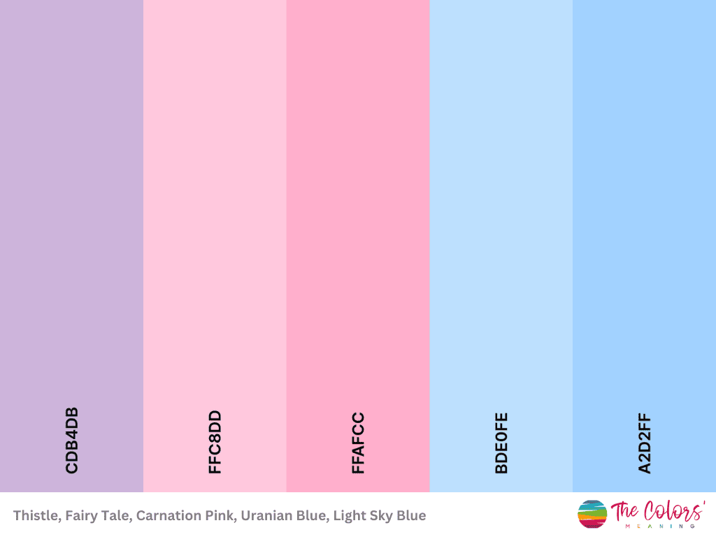
Hex codes: #cdb4db, #ffc8dd, #ffafcc, #bde0fe, #a2d2ff
Summer Vibes
The warm, muted yellow and coral shade provide vibrancy and energy, while the light pink adds a delicate touch.
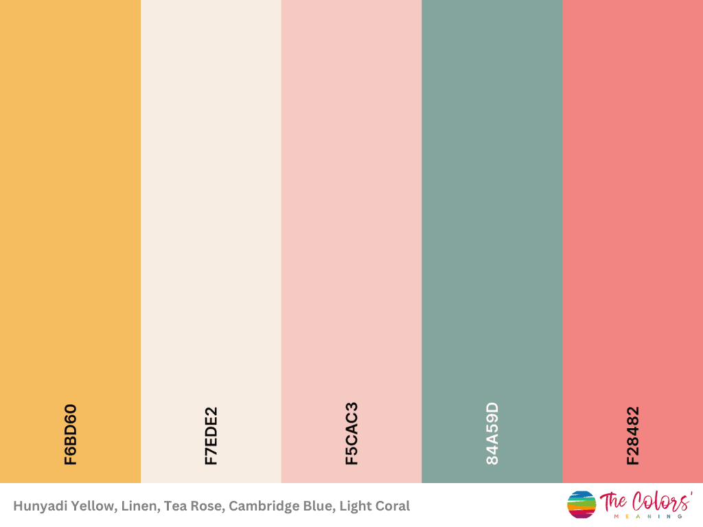
Hex codes: #f6bd60, #f7ede2, #f5cac3, #84a59d, #f28482
Winter Atmosphere
These pastel blue and purple shades complement each other well, conveying serenity and calmness. Because they are analogous, their proximity on the color wheel maintains a cohesive feel.
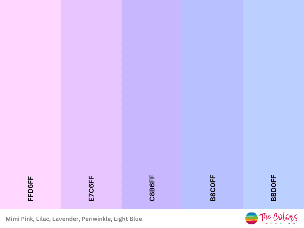
Hex codes: #ffd6ff, #e7c6ff, #c8b6ff, #b8c0ff, #bbd0ff
Coziness of Fall
This blend of soft peachy-orange tones creates a warm and inviting palette, while the very pale pink-beige offers a complementary neutral. It looks like a gradient of orange shades that lean toward red.
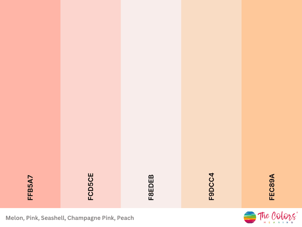
Hex codes: #ffb5a7, #fcd5ce, #f8edeb, #f9dcc4, #fec89a
Short Rainbow
This appears to be a fun and energetic pastel-rainbow palette.
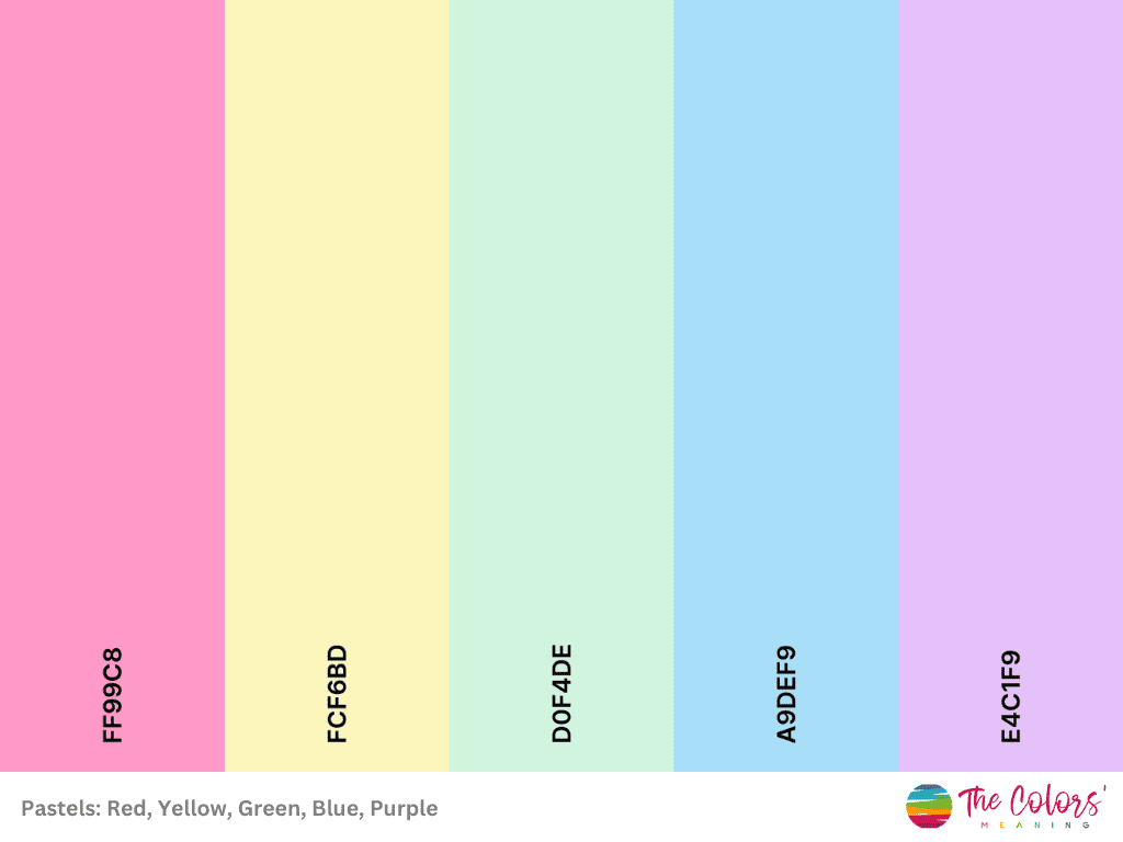
Hex codes: #ff99c8, #fcf6bd, #d0f4de, #a9def9, #e4c1f9
Tropical Beach
Despite being pastels, this combination adds contrast and depth, with the teal colors adding a refreshing touch to the warm peach and earthy shade of brown. It’s relaxing and soothing.
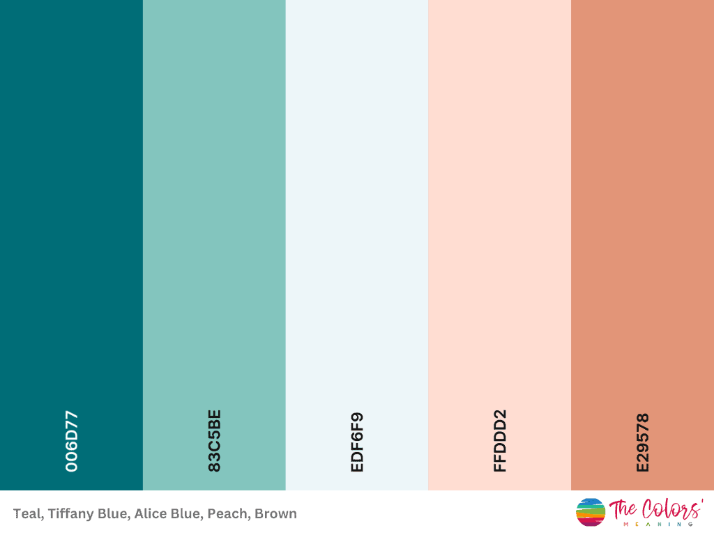
Hex codes: #006d77, #83c5be, #edf6f9, #ffddd2, #e29578
Neutrals
Isabelline #EDEDE9
Timberwolf #D6CCC2
Linen #F5EBE0
Champagne Pink #E3D5CA
Pale Dogwood #D5BDAF
Pastel Pinks
Platinum #D8E2DC
Champagne Pink #FFE5D9
Pink #FFCAD4
Cherry Blossom Pink #F4ACB7
Mountbatten Pink #9D8189
Peaceful Mistery
African Violet #9C89B8
Lavender Pink #F0A6CA
Pink Lavender #EFC3E6
Lavender Blush #F0E6EF
Periwinkle #B8BEDD
Rainwbow Tones
Melon #FFADAD
Sunset #FFD6A5
Cream #FDFFB6
Tea Green #CAFFBF
Electric Blue #9BF6FF
Jordy Blue #A0C4FF
Periwinkle #BDB2FF
Mauve #FFC6FF
Amethyst Hour
Tropical Indigo #9381FF
Periwinkle #B8B8FF
Ghost White #F8F7FF
Antique White #FFEEDD
Apricot #FFD8BE
The Charm of Winter in Pastel Colors
Thistle #CDB4DB
Fairy Tale #FFC8DD
Carnation Pink #FFAFCC
Uranian Blue #BDE0FE
Light Sky Blue #A2D2FF
How to Use Pastels in Graphic Design
Brands often turn to pastels as they offer a mix of elegance and soothing design aesthetics that can resonate with a wide audience.
Their desaturated appearance allows them to harmonize beautifully, making them perfect for evoking a summery, vintage, or nostalgic feel in design.
Also, their soft and muted tones create a sense of warmth and nostalgia reminiscent of retro aesthetics while also capturing the carefree and cheerful essence of summer.
Traditionally associated with femininity, they are highly appropriate for women audiences. But that’s not all; pastels can be used anywhere in graphic design:
- Web Design: Before incorporating pastels, you need to know your website’s purpose and target audience. Consider the emotions and moods you want to evoke and how pastels align with these goals. Also, use white space (negative space) in your layout to balance pastel colors and create a clean, uncluttered design. Excessive use of pastels can become overwhelming, just as with vibrant colors.
- Graphic Art: Using pastels in digital art can give a retro feel similar to the 80s.
- Infographics: These pale colors are a popular choice for infographics because they can create a soft, pleasing, and approachable visual aesthetic. Pastels are typically less saturated and have a lighter tone than bold and vibrant colors, making your infographic more visually appealing and easy to read.
- Packaging: Using pastels in fashion, food (especially desserts), and baby clothing industries can be an excellent choice, as these colors convey various emotions and associations often relevant to these sectors.
While individual pastel colors may appear desaturated, they truly come to life when used collectively in a cohesive color palette.
Pros and Cons of Using Pastel Colors
Pros
Even if light and muted, they create a pleasing contrast when paired with neutrals or darker shades.
Moreover, they can convey calm and relaxation while maintaining a touch of elegance. Thus, they are suitable for many industries.
They can be combined with other pastels or brighter colors without looking kitschy.
They are versatile, soothing, and elegant and excellent for drawing attention to or emphasizing certain elements without becoming overwhelming.
Cons
Pastel tones lack the vibrancy and energy associated with bolder, more saturated colors. This can be a drawback if you want your design to be attention-grabbing and exciting.
Because they are less saturated, they may be less visible in some situations, such as poor lighting.
In addition, the excessive use of pastels can make a design appear childish or infantile.